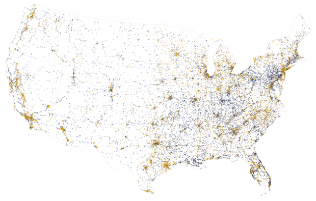
In an update to his two-party map, political scientist David Sparks shows the evolution of the two-party system across the country, since 1920. Red and blue. Keeps on moving.
-
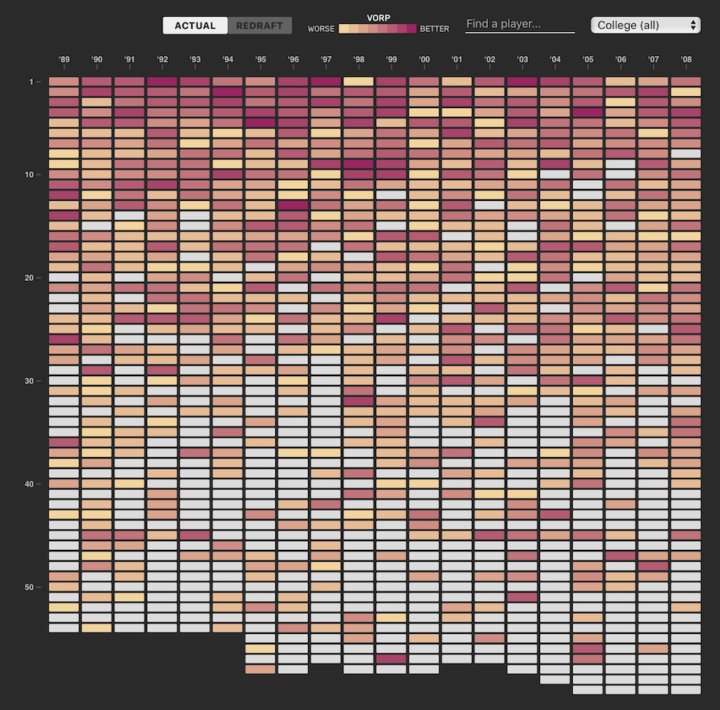
Picking basketball players for a professional team is no easy task. College and high school players picked high in the draft might end up average in the NBA, and those picked low might actually be fine professional players. Russell Goldenberg for Polygraph dives into 20 years of NBA draft picks to find the biggest busts, the biggest steals, and convergence to the mean.
-
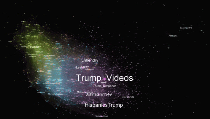
After the first presidential debate, #TrumpWon was a trending topic on Twitter, which led many to believe that there were bots involved — maybe from Russia. It didn’t help that a fake map of Saint Petersburg with a bunch of bubbles on it went viral too. The real reasons for the trending hashtag are much more mundane.
-

The general public kind of knows about data privacy issues. But not really. Or they know, and they’re willing to trade for the ability to share things easily on social media.
I liken it to people who eat hot dogs but avoid animal parts that aren’t in the shape of a steak. As long as it’s packaged right and you can’t see the bits, it must be okay. It’s similar to why people burn the American Community Survey but flip through their phone no problem.
ProPublica aims to dig into the black box a bit in their ongoing coverage on machine bias. Most recently they released the first of a four-episode video series: Breaking the Black Box. They started with Facebook. The video is accompanied by a Chrome extension that “lets you see what Facebook says it knows about you” and more interestingly, lets you rate the items and send accuracy back to ProPublica for analysis.
-
Each year, the National Highway Traffic Safety Administration releases data for traffic accidents that resulted in deaths. I briefly looked at the data a while back. Others did too. For years, there have been fewer deaths than the year before, but the 2015 data shows a 7.2 percent increase.
So, the NHTSA released the data earlier this year and, along with the White House, formally reached out to the data community to analyze the data.
DOT is aggressively seeking ways to improve safety on the roads. From our work with the auto industry to improve vehicle safety, to new solutions to behavioral challenges like drunk, drugged, distracted and drowsy driving, we know we need to find novel solutions to old challenges.
We’re also looking to accelerate technologies that may make driving safer, including connected and highly automated vehicles.
But we need your help, too! Data Science is a team sport.
Yes.
-
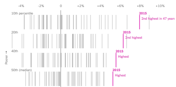
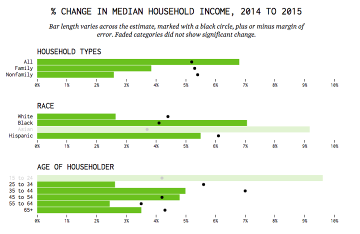
We know that income increased by a lot in 2015, but for who? If it’s just the rich getting richer, then the rise doesn’t mean much for a lot of people, but as Quoctrung Bui for the Upshot points out, this was not the case.
Real median incomes rose 5.2 percent in 2015 — phenomenal growth by economic standards. And 3.5 million people moved out of poverty. But more important, 2015 was encouraging to economists because of where income growth was concentrated: the poor and middle class.
I’m not 100% sure what to call this chart type, but the going term seems to be barcode chart. Each vertical line represents a year, and each row represents an income bracket. Mouse over a bar and you see the change in income for all brackets during the corresponding year.
-

How to Visualize Proportions in R
There are many ways to show parts of a whole. Here are quick one-liners for the more common ones.
-
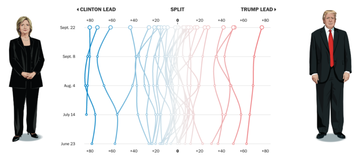
Using data from their Washington Post-ABC News polling, the Washington Post compares shifting support for Clinton and Trump among several demographic groups.
The presidential contest is often compared to a horse race, with the candidates fighting to finish in first place on Election Day. We offer a bit of a different metaphor here. The campaign is also a series of simultaneously fought tug-of-war matches for different demographic groups — based on gender, age, and race/ethnicity, among others.
By rotating the time series to put time on the vertical and candidate lead values on the horizontal, the graphic provides a different metaphor: more left, more right, and mostly middle. I like it.
-

Thermal cameras, which use infrared to detect heat, provide images of temperature. Firefighters can use them to find people in smokey rooms, law enforcement can use them for surveillance, and technicians can use them to detect power faults. Brea Souders used one to take pictures of everyday foods. [via kottke]
-

A look at the rise for each state over three decades, for men and women.
-

Missing data is everywhere. Or, I guess technically it’s nowhere. You know what I mean. Missing data is common, especially with temporal data over long periods of time. Just look at country-level estimates for anything over ten years, and you’ll understand. Peter Beshai for Bocoup provides five solutions for line charts with missing data, using d3.js.
-
This is what happens when there is a disconnect between data and what it represents. So much wrong.
Read More -
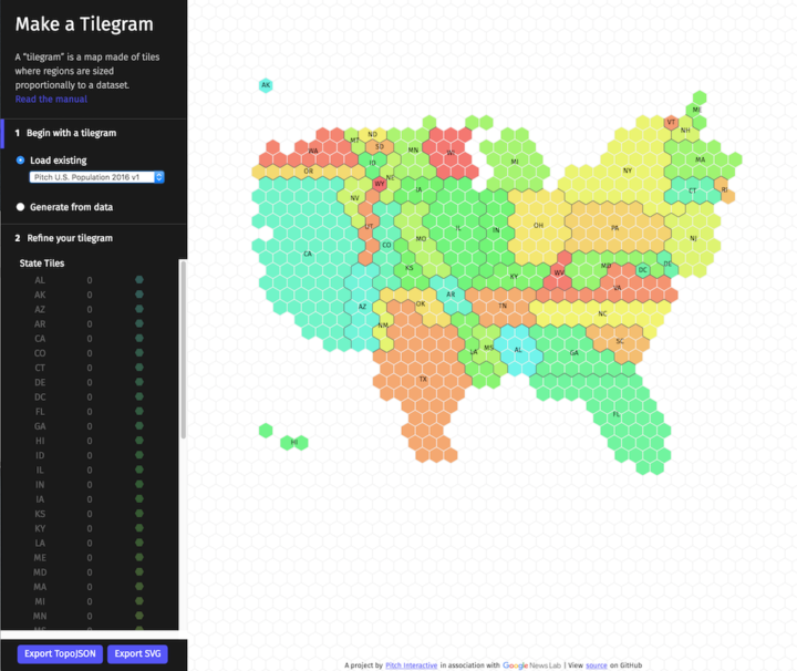
A challenge of using geographic maps to show data is that larger regions inevitably get more visual real estate. Cartograms try to solve this problem by sizing regions by the data instead of land mass. Tilegrams by Pitch Interactive makes it easy to construct tiled versions at the US state level.
Upload your data, adjust the resolution to your liking, and export for your own purposes. Nice.
-
In case you didn’t know, there’s a drought here in California so there are rules for when you can and can’t water your grass and plants. Not everyone adheres to those rules though. And some households really don’t follow the rules. In Los Angeles, or more specifically, Bel Air, there are a handful of households using millions of gallons per year. Michael Corey and Lance Williams for Reveal used satellite data to guess which ones.
I mainly share this though for the title of their post that explains how they did it: Now this is a story all about how we found the Wet Princes of Bel Air. Genius.
-
Nate Cohn for the Upshot provides a statistics lesson in the context of election forecasts and why they differ so much.
[P]ollsters make a series of decisions when designing their survey, from determining likely voters to adjusting their respondents to match the demographics of the electorate. These decisions are hard. They usually take place behind the scenes, and they can make a huge difference.
To make the point, the Upshot gave four pollers the same raw data to interpret. Results varied.
-
In a 2005 paper “If I look at the mass I will never act”: Psychic numbing and genocide, Paul Slovic discusses big numbers, how we perceive them as they increase, and the importance of designing for our emotional and analytical systems.
[W]e are incapable of feeling the humanity behind the number 1,198,500,000. The circuitry in our brain is not up to this task. This same incapacity is echoed by Nobel prize winning biochemist Albert Szent Gyorgi as he struggles to comprehend the possible consequences of nuclear war: “I am deeply moved if I see one man suffering and would risk my life for him. Then I talk impersonally about the possible pulverization of our big cities, with a hundred million dead. I am unable to multiply one man’s suffering by a hundred million.”
Chris Jordan’s work immediately comes to mind.
This of course is in the context of individual numbers. What does 100 look like? What does a billion look like? It soon gets more complicated when you try to compare a lot of big numbers or small numbers against big numbers. Our brains are weird things, and we must accommodate.
-
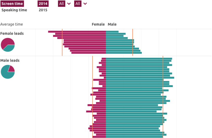
In a collaborative effort, the Geena Davis Institute on Gender in Media computed screen time for men and women algorithmically, in contrast to the more crude measurement of script lines. Key findings:
Male characters received two times the amount of screen time as female characters in 2015 (28.5% compared to 16.0%).
When a film has a male lead, this gender gap is even wider, with male characters appearing on screen nearly three times more often than female characters (34.5% compared to 12.9%).
In films with a female lead, male characters appear about the same amount of time as female characters (24.0% compared to 22.6%). This means that even when women are featured in a leading role, male characters appear on screen just as often.
Interesting work here. I just wish they included movie names in their charts. It would’ve provided a better connection to the data.
-
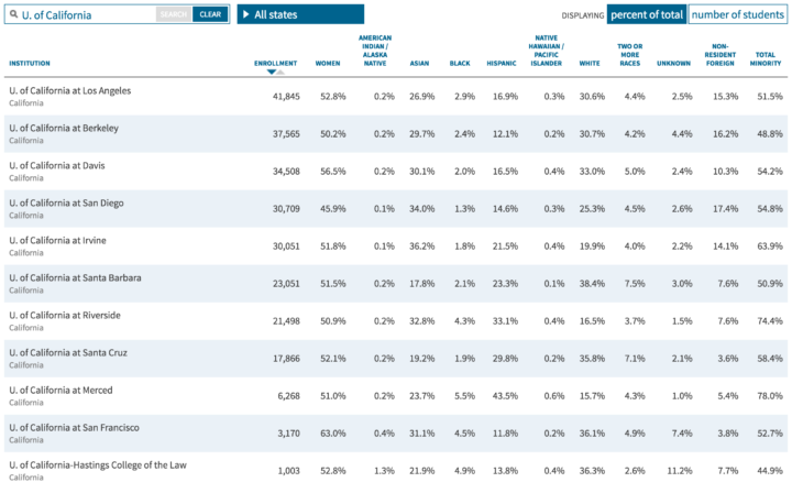
Based on 2014 estimates from the U.S. Department of Education, the Chronicle of Higher Education compiled a straightforward searchable and sortable table that shows the race percentages for more than 4,600 institutions.
FYI: The search function is basic, and you have to enter a school’s name to match as it is entered in the system. For example, a search for “Berkeley” only shows the schools that start with that but not University of California at Berkeley. And a search for “University of California” pulls up zero results, because it’s listed as “U. of California.”
-
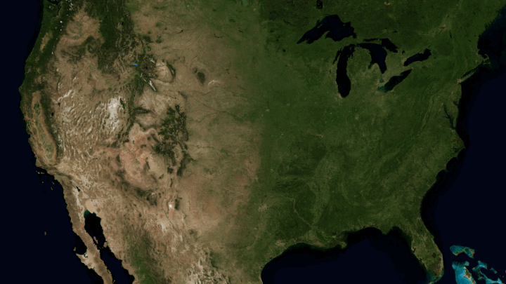
Horace Mitchell for NASA’s Scientific Visualization Studio mapped the massive drainage basin that is the Mississippi Watershed.
The Mississippi Watershed is the largest drainage basin in North America at 3.2 million square kilometers in area. The USGS has created a database of this area which indicates the direction of waterflow at each point. By assembling these directions into streamflows, it is possible to trace the path of water from every point of the area to the mouth of the Mississippi in the Gulf of Mexico.
Redirect to California, please. Thanks.
Recently for Members
Second Edition
 Visualize This: The FlowingData Guide to Design, Visualization, and Statistics (2nd Edition)
 Visualize This: The FlowingData Guide to Design, Visualization, and Statistics (2nd Edition)
New tools, refined process.
Browse by Chart Type See All →


