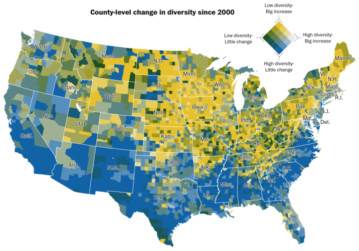
• Membership
  • Newsletter
  • Projects
  • Learning
  • About
  • Member Login
  • The different trends in American crime

    August 19, 2016

    Topic

    Statistics  /  crime, Marshall Project

    Crime is up? Crime is down? It depends on who you ask and where. The Marshall Project analyzed violent crime trends over the past 40 years to show how things are moving across the country.

    In the process, we were struck by the wide variation from community to community. To paraphrase an aphorism about politics, all crime is local. Each city has its own trends that depend on the characteristics of the city itself, the time frame, and the type of crime. In fact, the trends vary from neighborhood to neighborhood within cities; a recent study posited that 5 percent of city blocks account for 50 percent of the crime. That is why most Americans believe crime is worse, while significantly fewer believe it is worse where they live.

    They eventually narrowed down trends to four main categories, across 68 cities.

    Don’t see what you’re looking for. The data is available for download.

  • Data Underload  /  arbitrary, food

    All the National Food Days

    Keep track of the 214 days out of the year that are a national food or drink days.

    Read More
  • Global terrain maps from Stamen

    August 18, 2016

    Topic

    Maps  /  Stamen, terrain

    Missed this one from last month. Stamen announced the release of a whole lot of new terrain map tiles for around the world. Four billion of them.

    The original Terrain style only covered the United States. As part of a new Knight Foundation grant, we expanded Terrain to cover the entire world. The Knight grant also funded prototyping for some totally-different new terrain styles, so to avoid confusion we are calling the this reboot of the old style “Terrain Classic.”

    I don’t know if I’ll get the chance to use these any time soon, but they sure are pretty to look at.

  • Heptathlon rankings with parallel coordinates

    August 17, 2016

    Topic

    Infographics  /  Guardian, Olympics, parallel coordinates

    The Guardian covered the rankings for the women’s heptathlon, specifically how Nafissatou Thiam from Belgium pulled off a surprise gold.

    The main chart is a variant of a parallel coordinates plot. However, the chart type, which is usually read left to right, is rotated for vertical reading, and instead of straight connecting lines, a path of right angles is used instead. Nice. [Thanks, Matthew]

  • Long-exposure bird flights

    August 16, 2016

    Topic

    Data Art  /  long-exposure, nature, photography

    Using a long-exposure photography technique, Xavi Bou captured bird flight patterns in his series Ornitographies.

    Unlike other motion analysis which preceded it, Ornitographies moves away from the scientific approach of chronophotography used by photographers like Eadweard Muybridge and Etienne-Jules Marey.

    The approach used by Xavi Bou to portray the scene is not invasive; moreover, it rejects the distant study, resulting in organic form images that stimulate the imagination.

  • Every fastest man on one track

    August 16, 2016

    Topic

    Infographics  /  New York Times, Olympics, Usain Bolt

    The New York Times has been pulling from the vault for this year’s Olympics, adapting previous graphics to current results. If it ain’t broke, don’t fix it. With Usain Bolt making the 100-meter look entirely too easy, NYT compares his time to times from winners of Olympics past — all on the same track.

    If you like that, be sure to check out the original video versions from 2012.

  • Open data board game

    August 15, 2016

    Topic

    Data Sharing  /  game, open data

    Datopolis is a board game by Ellen Broad and Jeni Tennison from the Open Data Institute, and as you might expect, it promotes the use of open data.

    Datopolis is a board game about building things — services, websites, devices, apps and research — using closed and open data. It’s set in a town called Sheridan, which is gradually declining as shops close, teachers quit, hedgehogs go extinct and pollution rises. The tools that players build contribute to making Sheridan a healthier, wealthier, happier place to live.

    Sounds good to me.

    For a limited time, you can buy the game on Game Crafter. You can also download the components from GitHub and print them yourself, because it’s all openly licensed, fittingly.

  • Why all the swimming ties in the Olympics

    August 15, 2016

    Topic

    Statistics  /  Olympics, precision

    As the Olympics are all about reaching peak physical potential, it shouldn’t surprise that a lot of races are close, but there’s been a good number of ties this year. The measurement system allows for precision up to the millionth of a second. So what gives? Timothy Burke for Deadspin provides the explanation.

    In a 50 meter Olympic pool, at the current men’s world record 50m pace, a thousandth-of-a-second constitutes 2.39 millimeters of travel. FINA pool dimension regulations allow a tolerance of 3 centimeters in each lane, more than ten times that amount. Could you time swimmers to a thousandth-of-a-second? Sure, but you couldn’t guarantee the winning swimmer didn’t have a thousandth-of-a-second-shorter course to swim.

    Always consider the bottlenecks.

  • Generate your own fantasy map

    August 12, 2016

    Topic

    Maps  /  fantasy

    Martin O’Leary made a Twitter bot, Uncharted Atlas, that posts automatically generated fantasy maps. Recently, he described how these maps are generated and how you can do it yourself, complete with a step-by-step clickety explanation and Python/JavaScript code for the backend.

  • DrawMyData lets you plot points manually and then download the data

    August 12, 2016

    Topic

    Statistics  /  teaching

    When you have graphs to draw or statistical concepts to teach, you need your data and you need it now. You can look for a suitable dataset, or you can simulate a result, but that can be annoyingly tedious. DrawMyData by Robert Grant is a simple tool that lets you click an x-y plot to draw points, and then you can just download the the x-y coordinates as a CSV file.

    Tools like this always seem kind of frivolous at first, but then you use it a few times and becomes indispensable. [via @albertocairo]

  • Michael Phelps race times since his first Olympics

    August 11, 2016

    Topic

    Visualization  /  Michael Phelps, Olympics

    That Michael Phelps. He is a crazy man, in the best possible way. Derek Watkins and Larry Buchanan for the New York Times compare race times of young Michael Phelps against those of current Michael Phelps. The piece as a whole serves as a quick visual history of the legendary swimmer’s career, that we still get to watch more of (if I can figure out NBC’s broadcasting schedule, that is).

  • Trump tweets from Android are angrier than from iPhone

    August 11, 2016

    Topic

    Statistics  /  election, Twitter

    Sometimes I check Donald Trump’s Twitter feed, as many find themselves doing and quickly regretting. There’s definitely a certain style to some of the tweets. But there are also tweets that don’t seem so “sad!” David Robinson was curious if you can see this difference if you look at tweets sent from an iPhone and those sent from an Android phone.

    There appears that you can. Angrier tweets tend to come from the Android and the less angrier ones tend to come from an iPhone. Do what you want with that information.

  • Streamgraph of Olympic medal wins

    August 10, 2016

    Topic

    Infographics  /  New York Times, Olympics, streamgraph

    Gregor Aisch and Larry Buchanan for the New York Times visualized Olympic medal dominance with a streamgraph for each event. Time is on the horizontal axis, and each stack represents a country. The greater the height is at any point, the more medals the country won that year. Nice labels, too.

  • Data Underload  /  households

    Household Types, Then and Now

    Here’s how common each household type is and was — and how the makeup compares to a few decades ago.

    Read More
  • Katie Ledecky domination charted

    August 8, 2016

    Topic

    Infographics  /  Guardian, Katie Ledecky, Olympics

    One of the best parts of the Olympics is watching an athlete from your country dominate the competition. Katie Ledecky is one of those athletes this year. Carlo Zapponi and Apple Chan Fardel for the Guardian provide a recap of Ledecky’s world record performance in the 400-meter freestyle. Typically these races are close, but last night Ledecky might as well have been in the pool by herself.

  • What makes the Olympic athletes great

    August 8, 2016

    Topic

    Infographics  /  New York Times, Olympics

    Rather than a focus on the events and their details, the New York Times looks at the individual athletes and the small things that make them great. It’s called The Fine Line, and it’s a combination of video, information graphics, and interviews. The storytelling flow is really good. And by the end of each you’re left with a greater appreciation for the work the athletes put in.

    So far they have Simone Biles for gymnastics, Ryan Lochte for swimming, Derek Drouin for high jump, and Christian Taylor for triple jump.

  • Games to test your skillz against Olympians, from your computer

    August 5, 2016

    Topic

    Infographics  /  games, Olympics, Wall Street Journal

    The last couple of Olympics, news graphics desks went with gloriously detailed explainers about the intricacies of the main events. This year seems to be a bit different. The opening ceremony is today, and I haven’t even seen much coverage. I think everyone has their hands tied with the horribly weird election season.

    Anyways, to get away from the horribly weird election season, the Wall Street Journal offers a set of mini-games to test a very specific subset of skills that help Olympians succeed. Test your reaction time against sprinters or your rhythm-keeping against rowers.

    Good, simple, and fun.

  • Building a generator for stuff

    August 4, 2016

    Topic

    Statistics  /  generator

    There comes a time in every data scientist’s life when an idea for a weird Twitter bot pops into your head. Or some one-off game based on dataset you played with recently. How does one go about making something like this? Kate Compton provides a beginner’s guide.

    This is a beginner-level advice essay for people just getting started with building generators. It’s also for practiced experts who want a way to organize their knowledge. The advice is meant for any kind of generators: humorous twitterbots, fanciful art-making bots, level generators, planet builders, makers of music, architecture, poetry, and cocktails.

  • Practical tips for scraping data

    August 4, 2016

    Topic

    Coding  /  NPR, scraping

    It’s an unpleasant feeling when you have an idea for a project and the data you need is sitting right in front of you on a bunch of random-looking webpages instead of a nice, delimited file. You could either forget about your idea (which is what most people do), you can record manually, or you can take an automated route with a bit of scraping know-how.

    I often find myself taking the tedious, manual route out, but sometimes scraping is clearly the best option. David Eads from the NPR Visuals Team describes how they use a model-control approach to scraping data.

    Step 1: Find the data and figure out the HTML and/or JavaScript format and pattern. Step 2: Setup a way to parse and spit out the formatted data. Step 3: Optimize.

    Oh, and before all that, make sure it’s legal.

  • Star Trek character network

    August 3, 2016

    Topic

    Network Visualization  /  fiction, Star Trek

    Star Trek fans rejoice. Mollie Pettit from Datascope Analytics visualized the interactions between all the characters in all the movies, series, and episodes.

    This visualization shows interactions between characters in the Star Trek Universe based on the episodes or movies you have selected.

    Each circle represents a character, and links represent interactions between characters. The more interactions between two characters, the thicker the link between them; similarly, the more interactions linked to a particular character, the larger the circle representing that character.

    Just select the episodes or movies and click, “Engage!” Bonus points for the nerdy theme. [Thanks, Brian]

  • Page 175 of 392
  • <
  • 1
  • ...
  • 172
  • 173
  • 174
  • 175
  • 176
  • 177
  • ...
  • 392
  • >

Analyze, visualize, and communicate data usefully, beyond the defaults.

Become a member →

Recently for Members

May 8, 2025
When the data is not what it seems

May 1, 2025
Finding the Right Charts

April 24, 2025
Visualization Tools, Datasets, and Resources – April 2025 Roundup

April 17, 2025
Breaking Out of Chart Software Defaults

April 15, 2025
Line Chart with Decorative Neon Accents

Browse by Chart Type See All →

Calendar Grid Map Square Pie Chart Dot Map Bubble Chart Voronoi Diagram Heatmap Network Graph Stacked Bar Chart Surface Plot

Browse By Topic

  • Visualization

    Seeing data

  • Maps

    Seeing geographic data

  • Infographics

    Explaining data

  • Networks

    Connecting data

  • Statistics

    Analyzing data

  • Software

    Working with data

  • Sources

    Getting data

  • Design

    Making data readable

Get the Book

Visualize This: The FlowingData Guide to Design, Visualization, and Statistics

Available now.

Order: Amazon / Bookshop

Made by FlowingData

  • The Process

  • Data Underload

  • Chart Everything

  • Guides

  • Books

  • Shop

  • About
  • Contact
  • Newsletter
  • LinkedIn
  • Instagram
  • Bluesky
  • RSS
Copyright © 2007-Present FlowingData. All rights reserved.