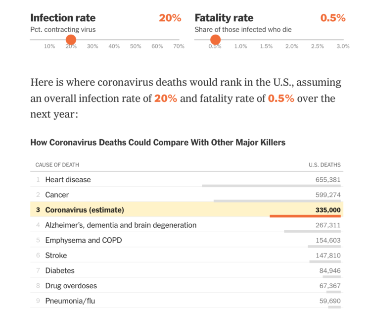
Based on estimates from public health researcher James Lawler, The Upshot shows the range of coronavirus deaths, given variable infection and fatality rate. Adjust with the sliders and see how the death count (over a year) compares against other major causes of death:
Dr. Lawler’s estimate, 480,000 deaths, is higher than the number who die in a year from dementia, emphysema, stroke or diabetes. There are only two causes of death that kill more Americans: cancer, which kills just under 600,000 in a year, and heart disease, which kills around 650,000.
A coronavirus death toll near the top of the C.D.C. range (1.7 million) would mean more deaths from the disease than the number of Americans typically killed by cancer and heart disease put together.
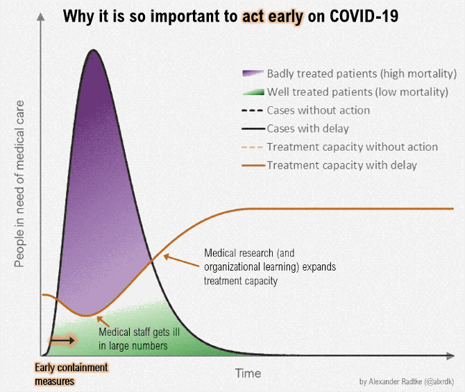
Can we all agree now that brushing off coronavirus by floating annual flu numbers is a bad comparison? The most worrisome part of the data we have is the uncertainty and then the range of possibilities that come out of that uncertainty.


 Visualize This: The FlowingData Guide to Design, Visualization, and Statistics (2nd Edition)


