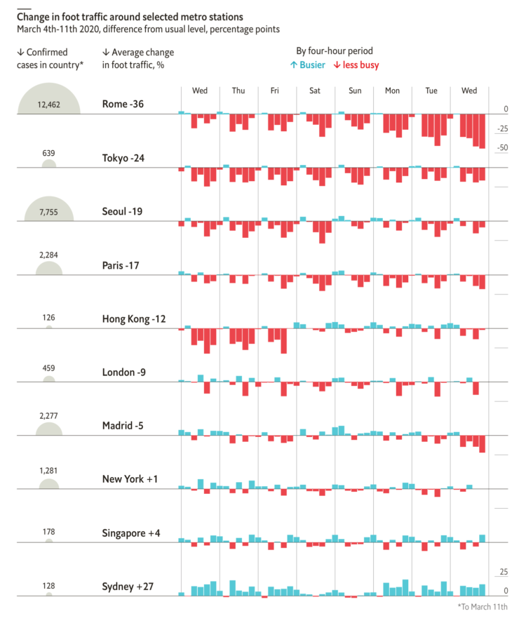
From The Economist, this chart shows the (mostly) decrease in foot traffic in major cities with coronavirus outbreaks. It’s based on data scraped from that section in Google Maps that shows how busy a location is, which I’m kind of surprised the Google limits allowed for. See James Fransham’s thread for more details on their process.
Change in foot traffic in outbreak cities
Second Edition
 Visualize This: The FlowingData Guide to Design, Visualization, and Statistics (2nd Edition)
 Visualize This: The FlowingData Guide to Design, Visualization, and Statistics (2nd Edition)
New tools, refined process.