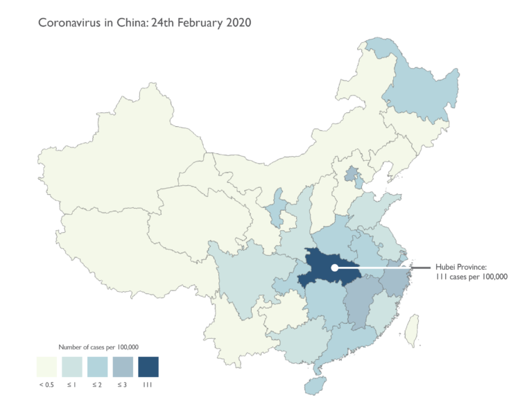
We’re seeing a lot of maps now about coronavirus. There are a lot counts, rates, and a little bit of panic involved. Kenneth Field provides guidance on mapping this data responsibly:
We’ll focus just on data for China in the following series of maps. They are designed to look like small maps you might find on a news media web site. Relatively simple, and with just the basic facts. Many of the issues I’ll note are equally applicable whether you’re making a small static map or an interactive web map.
 Visualize This: The FlowingData Guide to Design, Visualization, and Statistics (2nd Edition)