The numbers are fuzzy. You take them at face value, and you end up with fuzzy interpretations. Starting at the end of this month, Johns Hopkins is providing a two-week epidemiology course on understanding these numbers better:
This free Teach-Out is for anyone who has been curious about how we identify and measure outbreaks like the COVID-19 epidemic and wants to understand the epidemiology of these infections.
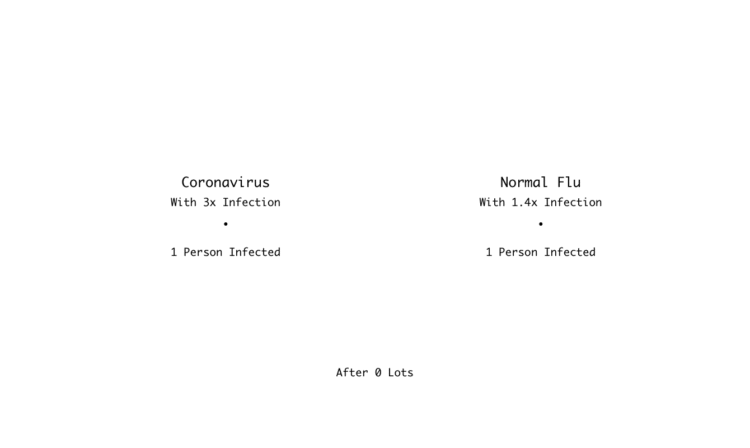
The COVID-19 epidemic has made many people want to understand the science behind pressing questions like: “How many people have been infected?” “How do we measure who is infected?” “How infectious is the virus?” “What can we do?” Epidemiology has the tools to tell us how to collect and analyze the right data to answer these questions.
Yes.
 Visualize This: The FlowingData Guide to Design, Visualization, and Statistics (2nd Edition)


