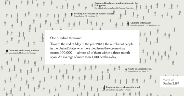
The New York Times used their full front page to list 1,000 names of the 100,000 who died due to the virus. There is an online version, which is equally moving.
The New York Times used their full front page to list 1,000 names of the 100,000 who died due to the virus. There is an online version, which is equally moving.

This is The New York Times front page for Sunday, May 24, 2020.
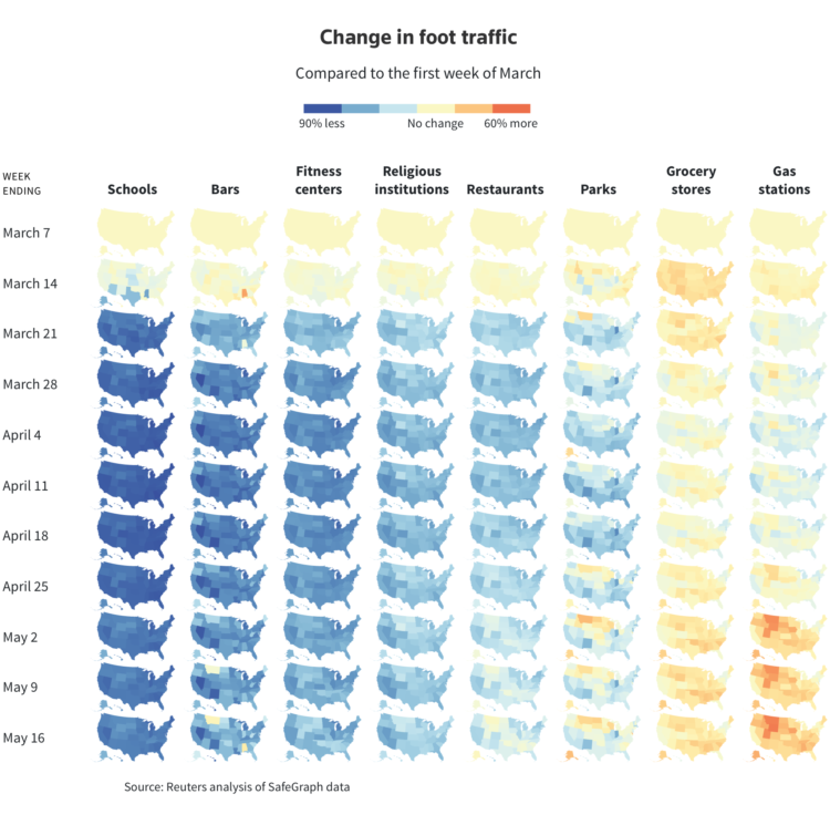
Using anonymized cellphone data from SafeGraph, Reade Levinson and Chris Canipe for Reuters mapped the change in foot traffic for different types of businesses over time.
Orange represents more movements since the first week of March. Blue means less. Yellow means about the same. We’re working towards all orange. Fingers crossed.
Sidenote: Now isn’t really the time, but when it is, we’re gonna have to come back to this mobile data stuff. Clearly it has its uses, but with so many offerings, there’s bound to be a less than useful leak.
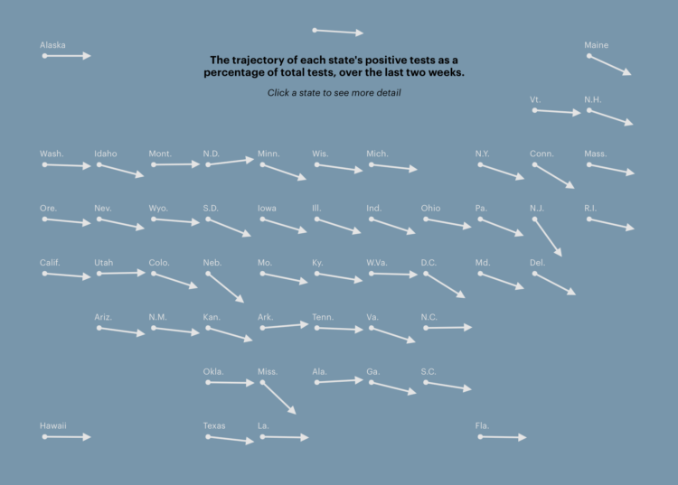
With coronavirus testing, many governments have used the percentage of tests that came back positive over time to gauge progress and decide whether or not it’s time to reopen. To calculate percentage, they divide confirmed cases by total tests. The denominator — total tests — often comes from the CDC, which apparently hasn’t done a good job calculating that denominator, because not all tests are the same.
Alexis C. Madrigal and Robinson Meyer for The Atlantic:
Mixing the two tests makes it much harder to understand the meaning of positive tests, and it clouds important information about the U.S. response to the pandemic, Jha said. “The viral testing is to understand how many people are getting infected, while antibody testing is like looking in the rearview mirror. The two tests are totally different signals,” he told us. By combining the two types of results, the CDC has made them both “uninterpretable,” he said.
Oh.
The Georgia Department of Public Health published a questionable chart showing confirmed Covid-19 cases over time. Intentionally misleading or poorly made chart?
States are reopening. Some seem ready, and some less so. Lena V. Groeger and Ash Ngu for ProPublica made a reference so that you can quickly see how your state is doing in five important metrics:
To give people context on state reopenings, and what happens afterward, we are tracking metrics derived from a set of guidelines published by the White House for states to achieve before loosening restrictions. Even if these criteria are met, without a vaccine, reopening may cause an increase in cases. What’s more, some states may meet all of the criteria and still have a high infection rate.
There’s a national overview, as shown above, and then it quickly goes to the individual states.
Check out Groeger’s thread for some process.
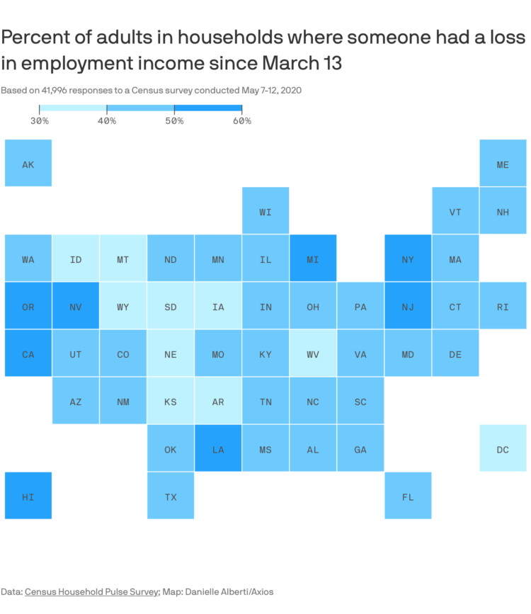
This straightforward grid map by Danielle Alberti for Axios shows the percentage of adults in a household where someone lost employment income. In all likelihood, you know someone affected in one way or another.
The data comes from the Census Household Pulse Survey, which is an effort to gauge the impact of Covid-19.
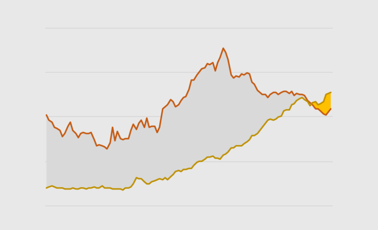
Also known as a bivariate area chart, the plot type focuses on the comparison between two time series.

What does the coronavirus look like? Rebekah Frumkin for The Paris Review highlights various illustrations and renderings, focusing on why each looks the way it does:
The disease that has put the entire world on pause is easily communicable, capable of stowing silently away in certain hosts and killing others, and, to the human eye, entirely invisible. In media parlance it’s become our “invisible enemy”: a nightmarish, oneiric force that can’t be seen, heard, or touched. But with the use of modeling software, scientists and illustrators have begun to visualize coronavirus, turning it into something that can be seen, understood, and, hopefully, eventually vanquished by science. Many of us imagine the virus as a sphere radiating red spikes—but why? Certain elements of these visualizations are based on the way coronavirus appears under a microscope, and others are choices that were made, an exercise of artistic license.
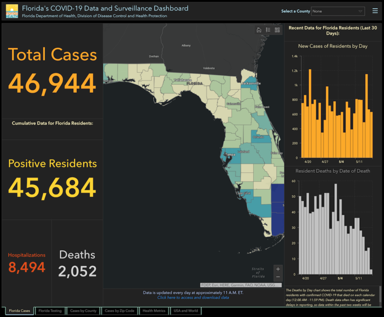
Rebekah Jones, GIS manager for the Florida Department of Health, was fired a couple of weeks ago, apparently for making the state’s Covid-19 data more accessible and transparent. Florida Today reports on an email that Jones sent to researchers:
She warned that she does not know what the new team’s intentions are for data access, including “what data they are now restricting.”
“I understand, appreciate, and even share your concern about all the dramatic changes that have occurred and those that are yet to come,” she wrote.
“As a word of caution, I would not expect the new team to continue the same level of accessibility and transparency that I made central to the process during the first two months. After all, my commitment to both is largely (arguably entirely) the reason I am no longer managing it.”
Hm.
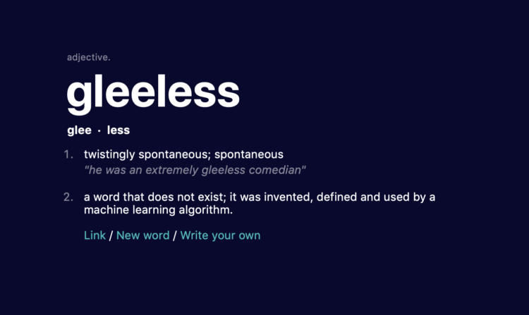
Thomas Dimson trained a model to generate words that don’t exist in real life and definitions for said imaginary words. If you didn’t tell me the words were machine-generated, I’d believe a lot of them were actual parts of the English dictionary.
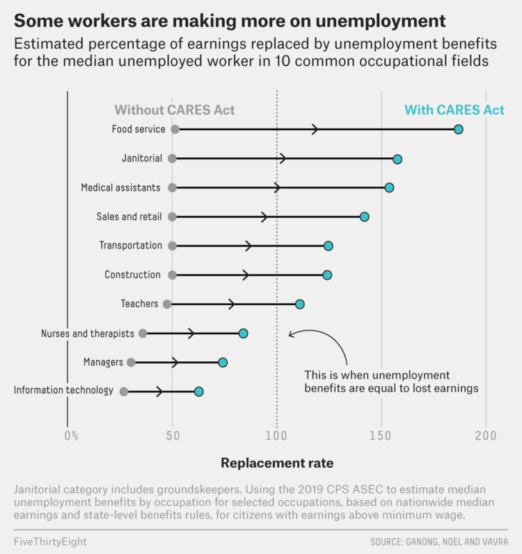
Economists at the University of Chicago analyzed unemployment benefits from the CARES act and compared them against median salaries for different occupations and by state. FiveThirtyEight highlighted the differences:
The researchers uncovered other kinds of inequality, too. In some professions, like janitorial work, people who are employed by essential businesses are continuing to show up to their jobs under hazardous conditions. But in doing so, they may be eligible for less money than janitors who have been laid off or furloughed by a nonessential business. In an ideal world, Ganong said, the people who have kept working at hospitals or grocery stores would be receiving some kind of hazard pay. “But that’s generally not the reality, which means there’s a weakness in the current system,” he said. “We’re giving more money to certain workers to stay home than to other workers who are putting themselves at risk by going to work.”
I don’t know the right answers to any of this, but it underscores the difficulties of making decisions based on averages. The system is built for simplicity and basic values. How do we adjust or rebuild the system for real-world variation and distributions?
Let’s just animate all statistical concepts with LEGO from now on:
My daughter loved the @FryRsquared Christmas Lectures so much she made this Lego Statistics Animation https://t.co/Q3X2FUYS2m pic.twitter.com/caavfR8ESD
— Caroline Lear (@CarolineLear) May 15, 2020
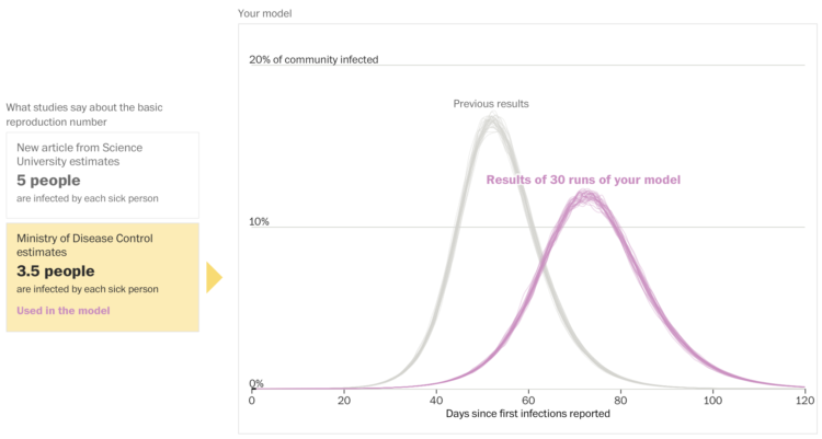
Harry Stevens and John Muyskens for The Washington Post put you in the spot of an epidemiologist receiving inquiries from policymakers about what might happen:
Imagine you are an epidemiologist, and one day the governor sends you an email about an emerging new disease that has just arrived in your state. To avoid the complexities of a real disease like covid-19, the illness caused by the novel coronavirus, we have created a fake disease called Simulitis. In the article below, we’ll give you the chance to model some scenarios — and see what epidemiologists are up against as they race to understand a new contagion.
Fuzzy numbers, meet real-world decisions.
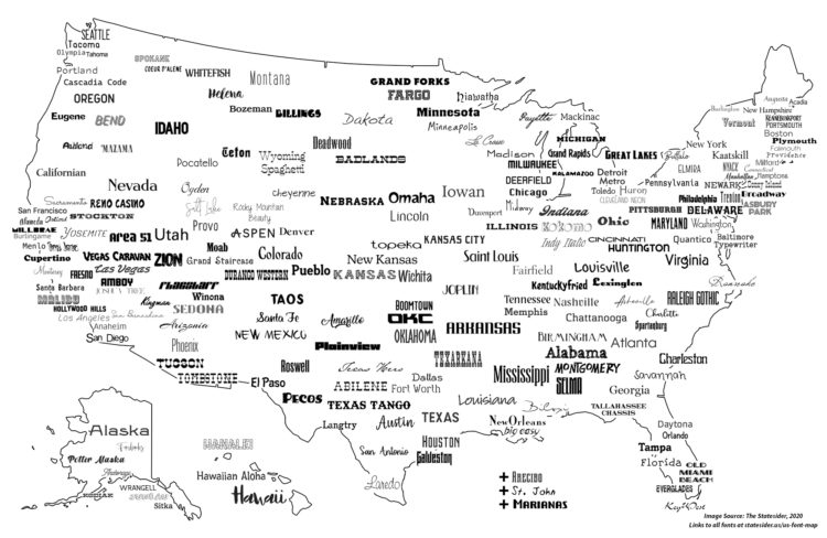
For The Statesider, Andy Murdock wondered how many typefaces are named after American locations. Then he put those typefaces on a map. So how many?
The answer is 222. That’s not actually the answer, it’s just where I had to stop, because the more I looked the more I found. What started as a quirky challenge to make a US font map during COVID-19 quarantine days started to edge into obsessive-compulsive territory. I’d wake up in the middle of the night thinking, “Did I check to see if there’s a Boise font?” (I did. There isn’t.) I finally found the limit to how many fonts I could use in one place.

This issue of The Process is public.
Hi,
Nathan here. This is The Process, the weekly newsletter for FlowingData members where I look at charts closer.
This issue is public, but if you’d like to support FlowingData, becoming a member is the best way to do it. Membership keeps the blog running as a free resource for everyone and gets you bonus access to tutorials, courses, and more.
A new tutorial on animated charts went up yesterday. Maarten Lambrechts explains step-by-step, using the ggplot and gganimate packages in R.
This week, I follow up on the coronavirus visual rundown from two months ago, when there were only 1,190 confirmed cases in the United States. (omg.) A lot has happened since then.
From Andy Kirk, there’s a new visualization podcast in town:
Explore Explain is a new data visualisation podcast and video series. Each episode is based on a conversation with visualisation designers to explore the design story behind a single visualisation, or series of related works. The conversations provide an opportunity to explain their design process and to share insight on the myriad little decisions that underpin the finished works. It also shines a light on the contextual circumstances that shaped their thinking.
Audiences will gain an appreciation of the what, the why and the how, learning about the hidden problems and challenges, the breakthroughs and the eureka moments, the pressures and frustrations, the things that were done and the things that were not done, as well as the successes and the failures.
My main podcast-listening mode was while driving, so I’m way behind, but this sounds promising. It’s right in line with Kirk’s Little of Visualization Design blog project.
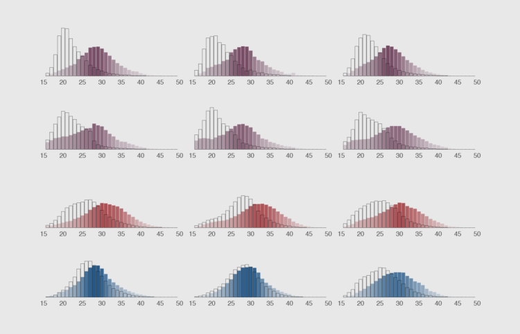
Make them move to show a shift in distributions over time.
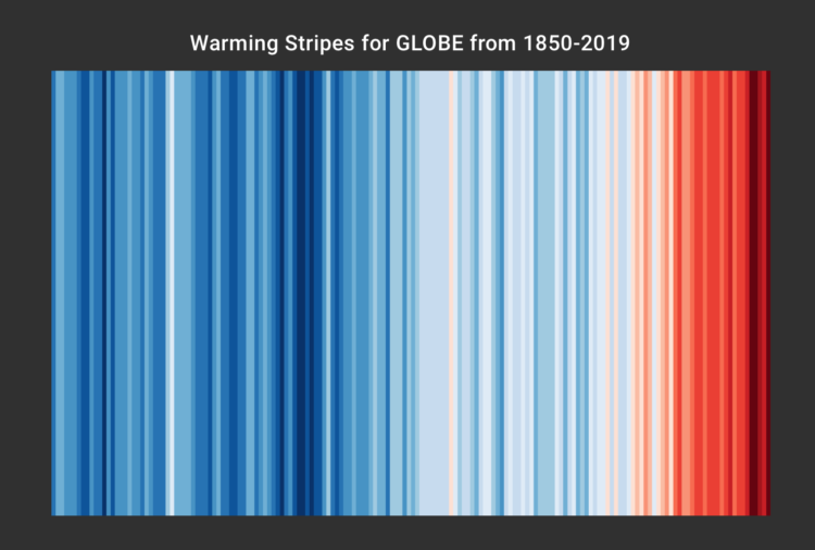
Ed Hawkins, who you might recognize from charts such as spiraling global temperature and the aforementioned temperature grid, encourages you to show your stripes. Select your region, and see how average temperature increased. I saw this last year, but I just realized that people are using this chart to print, knit, and decorate.
Read More
 Visualize This: The FlowingData Guide to Design, Visualization, and Statistics (2nd Edition)
New tools, refined process.


