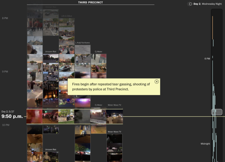
From a distance, it’s difficult to build an understanding of the scale and nature of protests. A soundbite here. A video clip there. So, to show the Minneapolis protests more completely, The Washington Post and The Pudding stitched together 149 livestreams with timestamps and location:
Videos were collected by searching Youtube, Facebook, Twitter, Twitch and other sources and then limited to live streams to ensure accuracy of time, location and remove reposted clips. Each video was reviewed and tagged to a location by hand to remove any videos that were replays as live streams. Thumbnails were then extracted using FFMPEG and links to the original videos were provided. Interesting quotes and context setting annotations were called out to provide a deep experience while allowing for quick scanning. Finally links and inline play of the original videos is provided for those wishing to see the videos as streamed.
With so much footage, it’s easy to imagine any sense of narrative getting lost in a bunch of moving pictures. But the layout and structure of this story, organized as a timeline and categorized by area, really help you see what happened over a week.
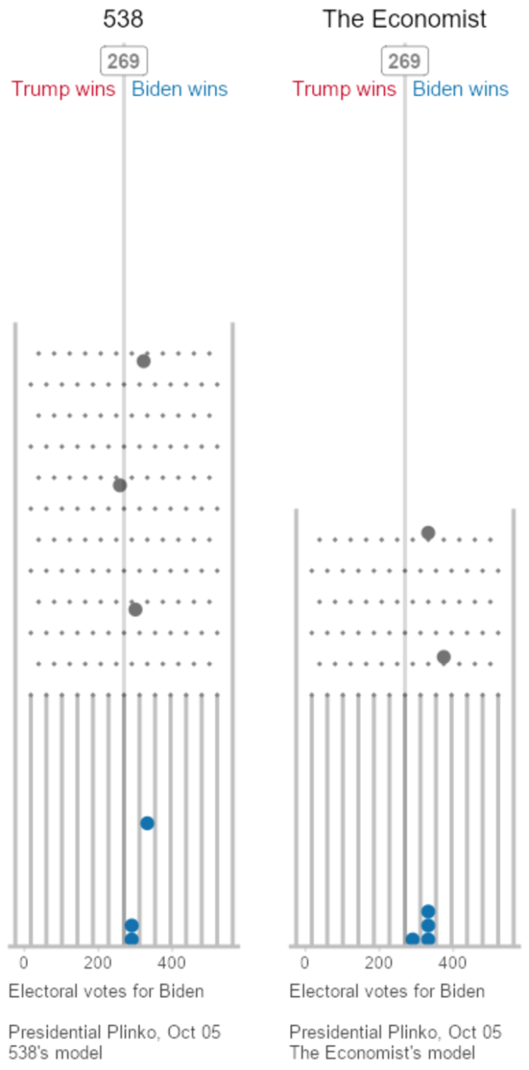 To visualize uncertainty in election forecasts, Matthew Kay from Northwestern University used a Plinko metaphor. The height of each board is based on the distribution of the forecast, and each ball drop is a potential outcome. The animation plays to eventually shows a full distribution.
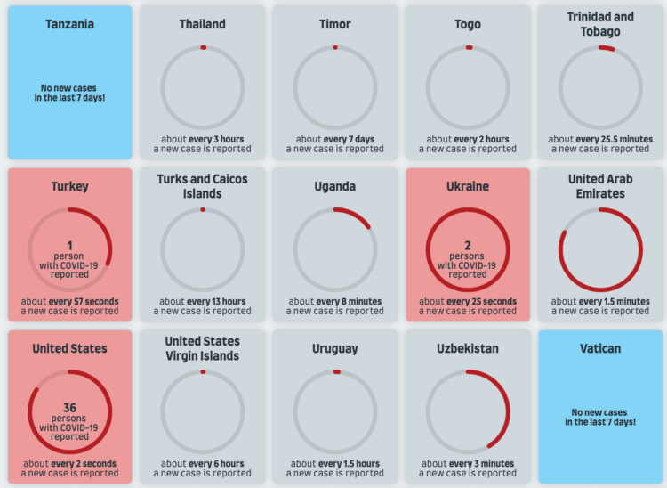
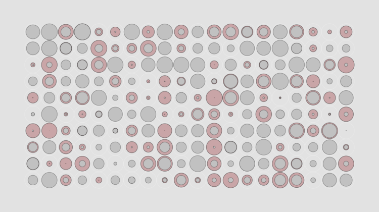
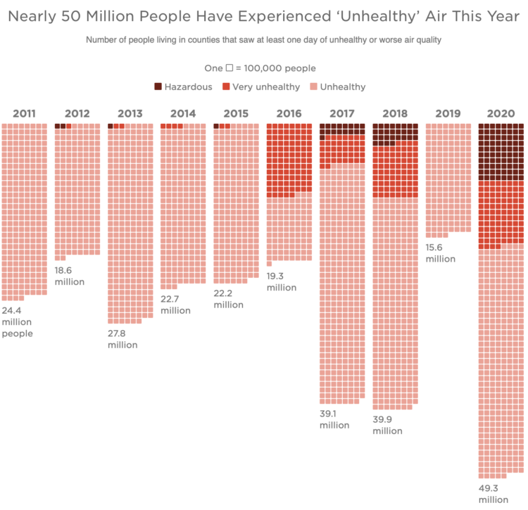
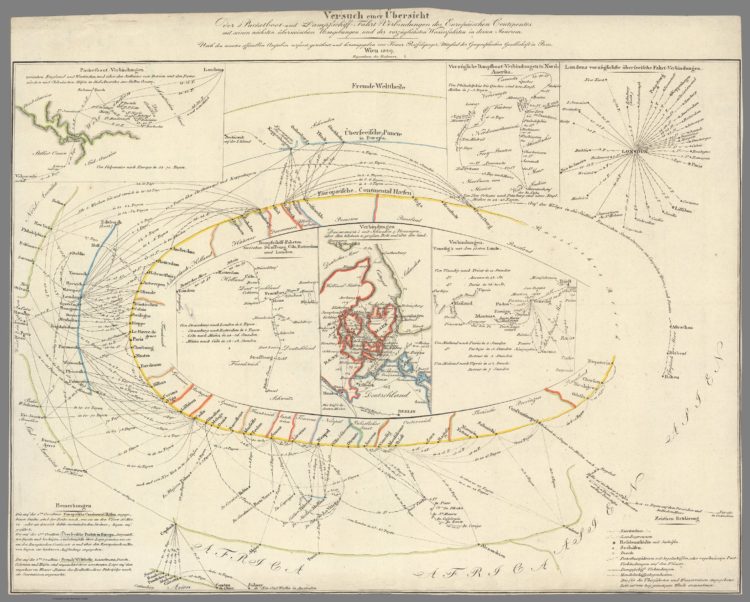
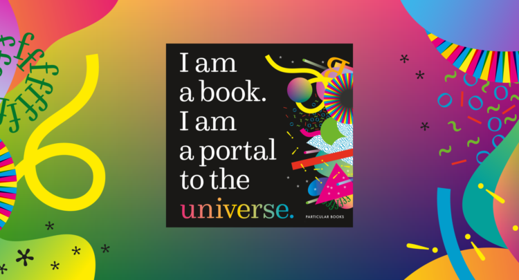
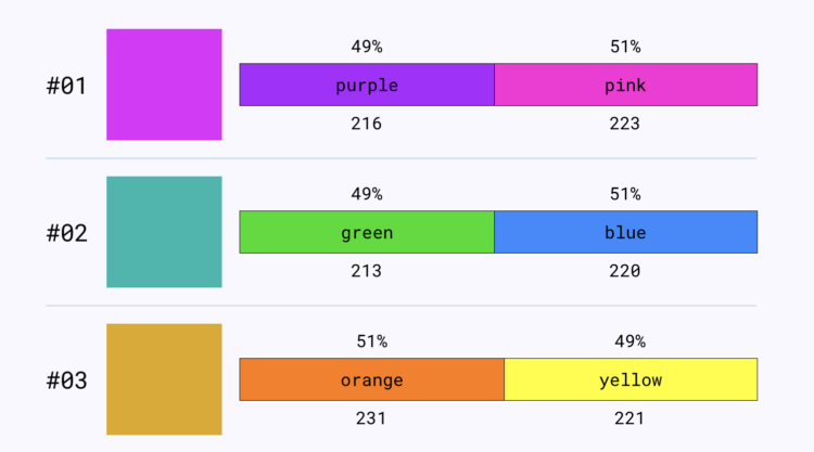
 Visualize This: The FlowingData Guide to Design, Visualization, and Statistics (2nd Edition)


