Microsoft Excel is useful for many things, but it has its limitations (like all software), which led to an undercount of 15,841 Covid-19 positive tests recorded by Public Health England. For the Guardian, Alex Hern reports:
In this case, the Guardian understands, one lab had sent its daily test report to PHE in the form of a CSV file – the simplest possible database format, just a list of values separated by commas. That report was then loaded into Microsoft Excel, and the new tests at the bottom were added to the main database.
But while CSV files can be any size, Microsoft Excel files can only be 1,048,576 rows long – or, in older versions which PHE may have still been using, a mere 65,536. When a CSV file longer than that is opened, the bottom rows get cut off and are no longer displayed. That means that, once the lab had performed more than a million tests, it was only a matter of time before its reports failed to be read by PHE.
The gut reaction seems to dunk on Excel, but the whole infrastructure sounds off. Excel wasn’t meant to handle that many rows of data, and as a non-Excel person, I think it’s been like that forever.
Why are these records manually entered and transferred to a database? Why is the current solution to work off this single file that holds all of the data?
I bet the person (or people) tasked with entering new rows into the database aren’t tasked with thinking about the data. Who eventually noticed no new records were recorded after a week?
Such important data. So many questions.
It’s not so much an Excel problem as it is a data problem, and what looked like downward trend was actually going up.
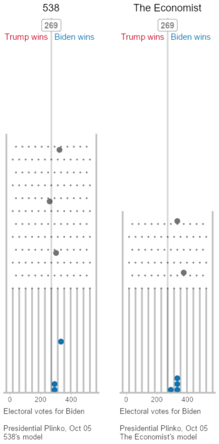 To visualize uncertainty in election forecasts, Matthew Kay from Northwestern University used a Plinko metaphor. The height of each board is based on the distribution of the forecast, and each ball drop is a potential outcome. The animation plays to eventually shows a full distribution.


 Visualize This: The FlowingData Guide to Design, Visualization, and Statistics (2nd Edition)


