Age Generation Populations
Based on estimates from the United States Census Bureau released for July 2019, Millennials are the largest living generation in the country now. They moved ahead of Boomers by about 432,000.
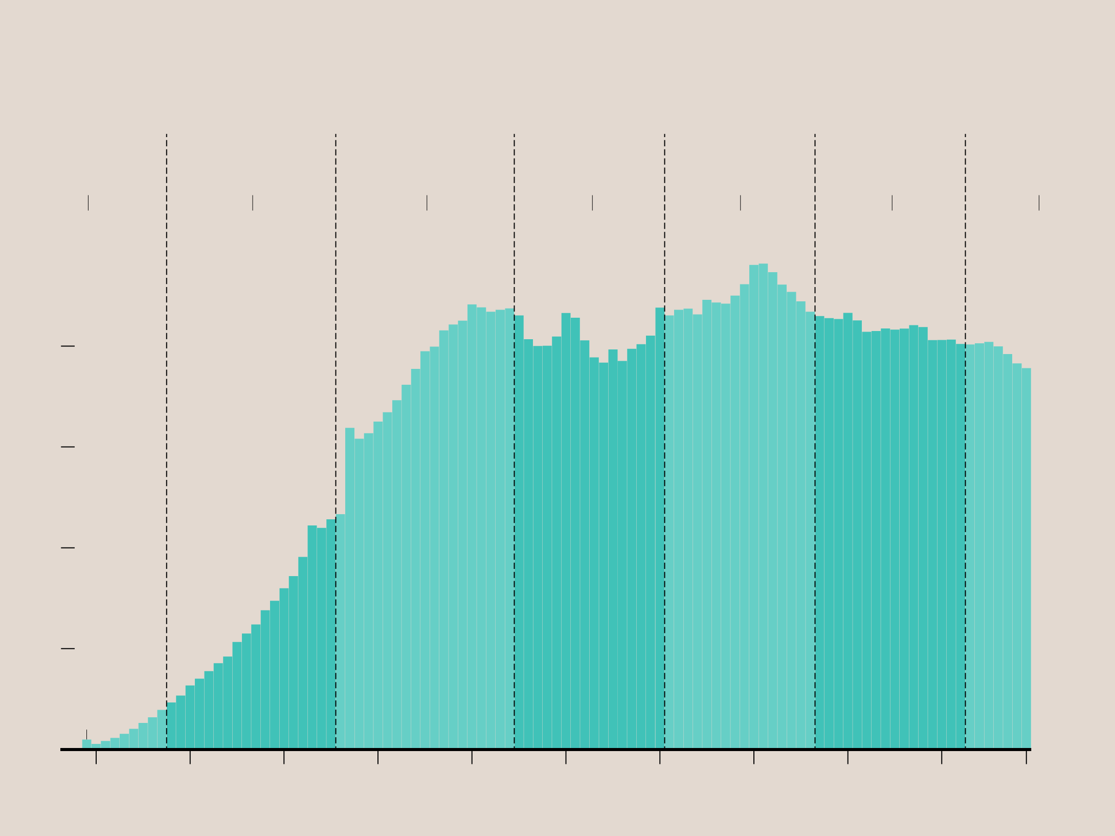
BY BIRTH YEAR
GENERATION POPULATIONS
WITH RANKINGS BY MOST NUMBER OF PEOPLE ALIVE
#7
#6
#2
#4
#1
#3
#5
GREATEST GENERATION
SILENT GENERATION
BOOMERS
GENERATION X
MILLENNIALS
GENERATION Z
GENERATION ALPHA
1.7M
0.5%
23.2M
7.1%
71.6M
21.8%
65.2M
19.9%
72.1M
22.0%
66.9M
20.4%
27.6M
8.4%
TOTAL
PCT. POP.
1946
1965
1997
1928
1981
2013
MILLION PEOPLE
4
3
2
1
Those born before 1920 were grouped together.
0
1920
1930
1940
1950
1960
1970
1980
1990
2000
2010
2019
BIRTH YEAR
Compiled from population estimates from the United States Census Bureau for July 2019
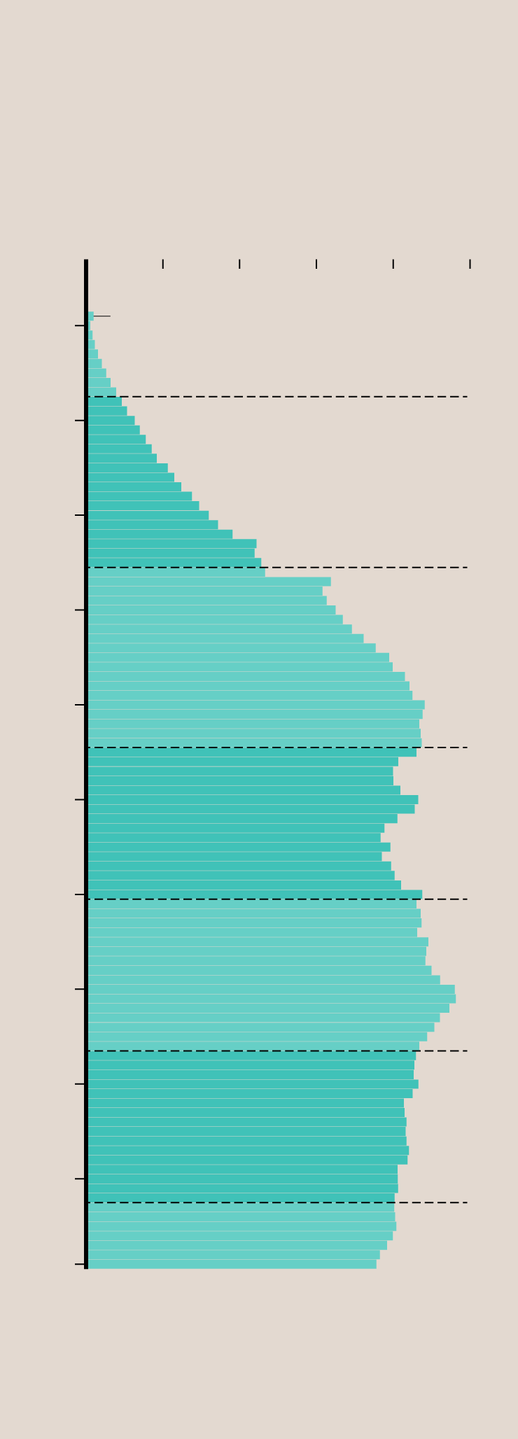
BY BIRTH YEAR
GENERATION POPULATIONS
WITH RANKINGS BY MOST NUMBER OF PEOPLE ALIVE
MILLION PEOPLE
1
2
3
4
5
0
BIRTH
YEAR
#7
Those born before 1920 grouped together.
1920
GREATEST GENERATION
1.7M — 0.5%
TOTAL
PCT. POP.
1930
#6
SILENT GENERATION
23.2M — 7.1%
1940
1950
#2
BOOMERS
71.6M — 21.8%
1960
#4
1970
GENERATION X
65.2M — 19.9%
1980
#1
MILLENNIALS
1990
72.1M — 22.0%
2000
#3
GENERATION Z
66.9M — 20.4%
2010
#5
GENERATION ALPHA
2019
27.6M — 8.4%
Compiled from population estimates from the United States Census Bureau for July 2019
The generation years are from the Pew Research Center. Although Generation Alpha isn’t fully a thing yet, I think. You can find the Census data here.
Become a member. Support an independent site. Get extra visualization goodness.
See What You Get