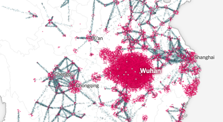
Using a combination of estimates based on cell phone movements and outbreak size, The New York Times shows how the coronavirus started with a few cases and then spread around the world.
The particle flows to represent travel volume from city to city is something else. NYT used a scrollytelling format that starts on a geographic map. You see a few points at first, the virus spreads, and then there’s a transition to an abstract view that looks like a subway map. You end up in the United States with a view of the current estimates.
 Visualize This: The FlowingData Guide to Design, Visualization, and Statistics (2nd Edition)