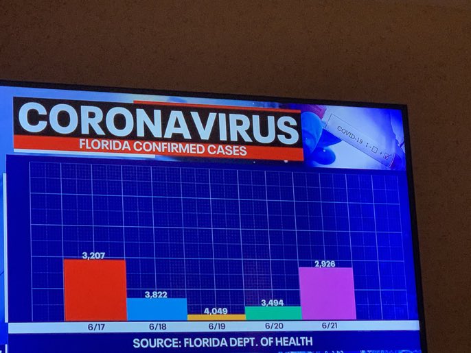
Welcome to whose bar chart is it anyway: where the geometries are made up and the numbers don’t matter. [via @dannypage]
Bad bar chart
Second Edition
 Visualize This: The FlowingData Guide to Design, Visualization, and Statistics (2nd Edition)
 Visualize This: The FlowingData Guide to Design, Visualization, and Statistics (2nd Edition)
New tools, refined process.