The structure of a dataset can help you pick a visualization method or…
Statistical Visualization
Finding patterns, distributions, and anomalies.
-
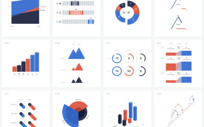
100 visualizations from a single dataset with 6 data points
-
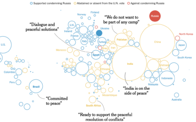
Trying to isolate Russia
The New York Times shows how the west tried to isolate Russia and…
-
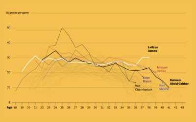
LeBron James’ longevity
Okay, one more LeBron James thing, mostly because I like seeing different looks…
-
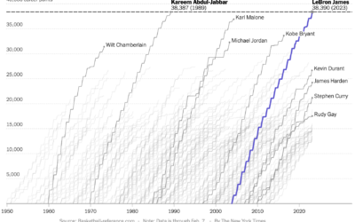
Cumulative points scored by LeBron James and other top scorers
Never fear, Sopan Deb, K.K. Rebecca Lai, and Eve Washington, for The New…
-
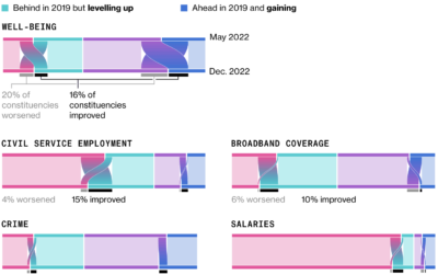
Sankey diagrams to show change in opinion
For Bloomberg, Joe Mayes, Andre Tartar, and Demetrios Pogkas show shifts in public…
-
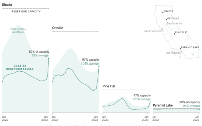
Reservoir refills in California
There’s been a lot of rain in California, which has been good to…
-
Tom Brady of other jobs
Tom Brady, the quarterback for the Tampa Bay Buccaneers, is 45 years old,…
-

Animal extinction over time
Animals are going extinct at a faster rate. Reuters shows a developing pattern…
-
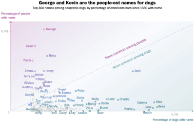
Names that are more dog or more human
There appears to be a trend of using human names for pets. Alyssa…
-
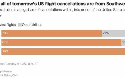
Southwest flight cancellations
There were a lot of flight cancellations this week, but Southwest Airlines is…
-

VIS 2022 talks are online
With the holidays just about here, I’m sure there’s nothing you’d rather do…
-

xkcd on optimal bowling metrics
xkcd charted optimal bowling in terms of aim, speed, spin, and weight. This…
-
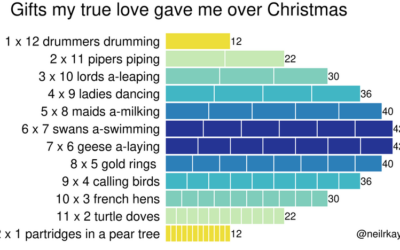
Gifts my true love gave to me over the 12 days of Christmas
From Reddit user neilrkaye. This is very important.…
-
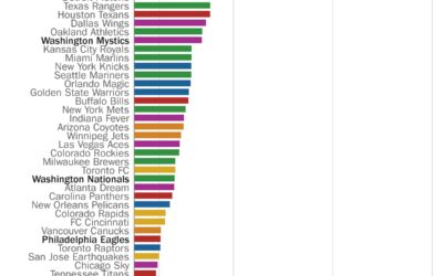
Perfect seasons needed to get over .500 overall
Here’s a fun one from Philip Bump for The Washington Post. Bump simply…
-
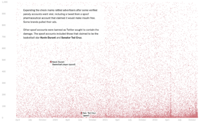
Who pays for Twitter
Twitter Blue is a subscription service from Twitter that primarily provided premium features…
-
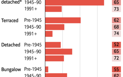
Retrofitting old British homes to improve energy efficiency
Speaking of old homes and energy efficiency in the UK, The Economist describes…
-
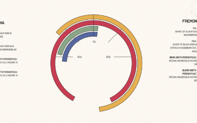
Upward mobility through a personal lens
Aaron Williams, for The Pudding, shows upward mobility through his own experiences, moving…
-
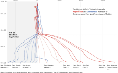
Republican and Democrat follower counts on Twitter
You might have heard that Elon Musk bought Twitter, and among the many…
Recently for Members
Second Edition
 Visualize This: The FlowingData Guide to Design, Visualization, and Statistics (2nd Edition)
 Visualize This: The FlowingData Guide to Design, Visualization, and Statistics (2nd Edition)
New tools, refined process.
Browse by Chart Type See All →


