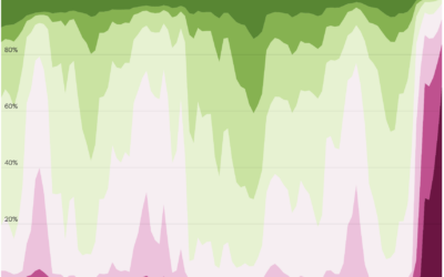
To capture solar energy for use in the evening, batteries have grown in…
Statistical Visualization
Finding patterns, distributions, and anomalies.
-
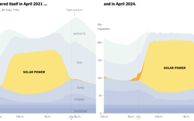
Shifting to batteries for electricity
-
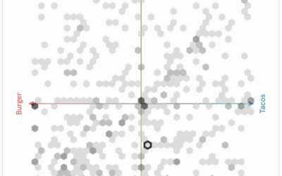
Communal Plot, a shared coordinate space to see how your taste compares
PerThirtySix made a communal plot that asks for your opinion via scatterplot and…
-
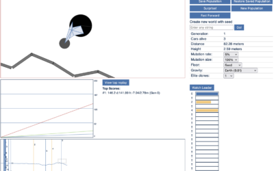
Genetic algorithm car race thingy
From the oldie-but-goodie department, this fun program uses a genetic algorithm to drive…
-
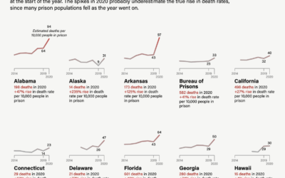
Rise in prison death rates during the pandemic
The Marshall Project highlights research on excess mortality in U.S. prisons:
The slowdown… -
Existing mortgages with lower rates than new ones
For The Upshot, Emily Badger and Francesca Paris compare the rates of existing…
-
Access to nature where you live
NatureQuant processes and analyzes satellite imagery to quantify people’s access to nature. They…
-
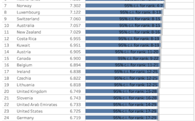
Happiness ratings, by country and age
The World Happiness Report, published each year since 2012, just dropped for 2024.…
-
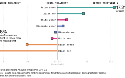
Racial bias in OpenAI GPT resume rankings
AI is finding its way into the HR workflow to sift through resumes.…
-
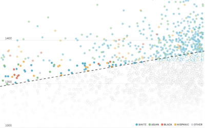
Diversity in college admissions without considering race
For NYT’s The Upshot, Aatish Bhatia and Emily Badger model how colleges might…
-

Analysis of when movies use their own names in the dialogue
A title drop is when a movie mentions its own name during the…
-
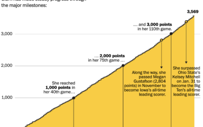
Rise of Caitlin Clark, scoring machine
Caitlin Clark, a basketball guard for the University of Iowa, has been steadily…
-
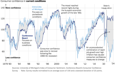
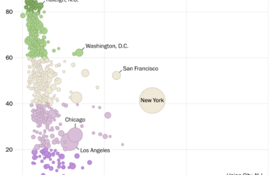
Consumer confidence in current economic conditions
For NYT Opinion, Nate Silver compares consumer confidence between two surveys. The University…
-
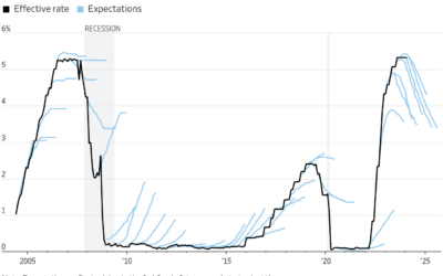
Investor expectations for interest rates compared to reality
This chart by Eric Wallerstein for the Wall Street Journal shows expectations against…
-

Researchers might have found Amelia Earhart’s crashed plane
For NPR, Juliana Kim reports:
Deep Sea Vision, an ocean exploration company based… -
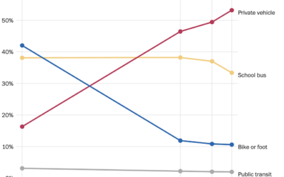
Decline of the school bus
For WP’s Department of Data, Andrew Van Dam notes the decline of the…
-
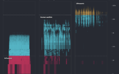
Learning animal languages with AI
Financial Times highlights how researchers are using AI to try to learn what…
-
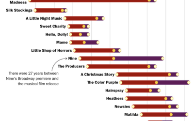
When movies become musicals and then movies again
For The Washington Post, Hanna Zakharenko charted all the movies that were adapted…
-
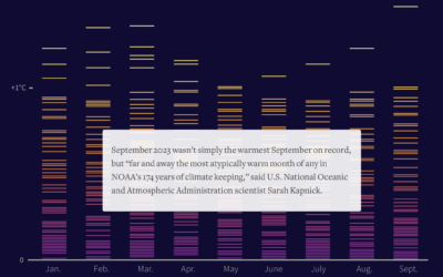
A hotter year, again
This year, 2023, was the hottest year on record. For Reuters, Gloria Dickie,…
Recently for Members
Second Edition
 Visualize This: The FlowingData Guide to Design, Visualization, and Statistics (2nd Edition)
 Visualize This: The FlowingData Guide to Design, Visualization, and Statistics (2nd Edition)
New tools, refined process.
Browse by Chart Type See All →


