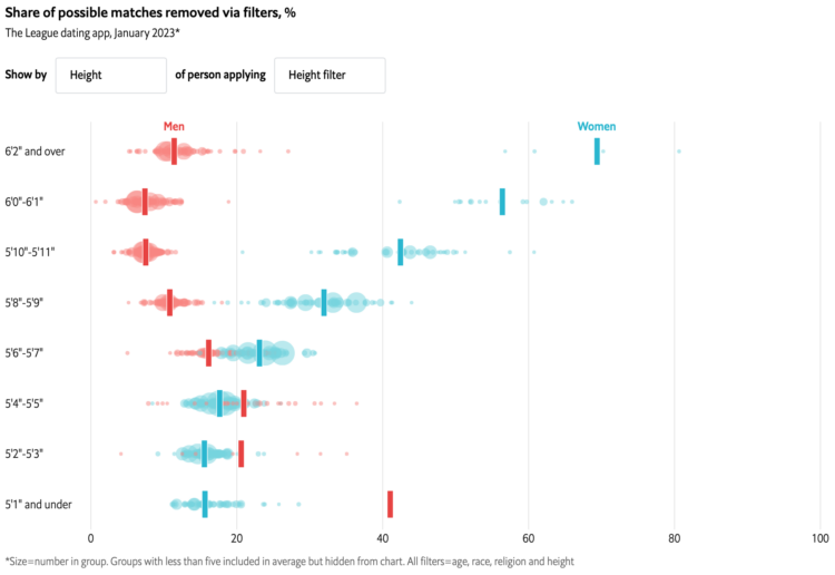
With online dating apps, you’re able to filter out potential matches based on characteristics like age and height. The Economist charted who’s filtering out what.
The chart took me a second to figure out, but I think I got it. Each bubble represents a demographic group. The x-axis represents the percentage of potential matches the group filters out, and the y-axis represents a characteristic of the searching group. For example, you can see in the above that taller women filter out more people with the height filter, whereas taller men don’t filter out as much.

 Visualize This: The FlowingData Guide to Design, Visualization, and Statistics (2nd Edition)