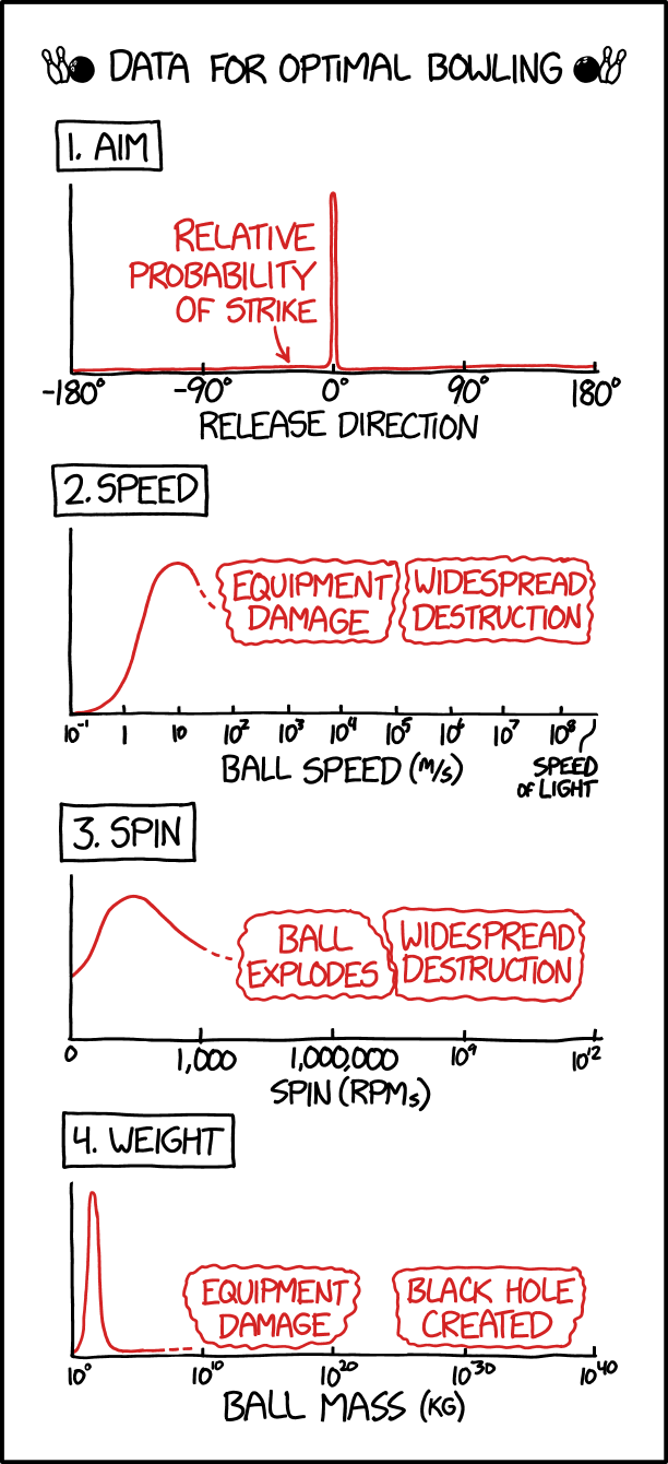
xkcd charted optimal bowling in terms of aim, speed, spin, and weight. This is very important.
xkcd charted optimal bowling in terms of aim, speed, spin, and weight. This is very important.
 Visualize This: The FlowingData Guide to Design, Visualization, and Statistics (2nd Edition)
New tools, refined process.