Cloud formation depends on temperature and moisture levels, so in places of high…
Maps
Intuitive to look at spatial patterns and great for distributing geographic data.
-
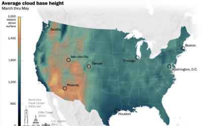
Where the clouds are the highest
-
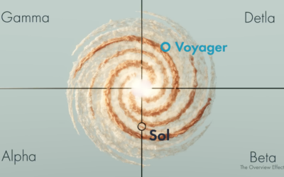
Real space location of Star Trek and other science fiction
Star Trek and related might be fictional, but they usually reference real stars,…
-

Mapping Israel and Gaza attacks
The New York Times is mapping rocket strikes, attacks, and ongoing conflict in…
-
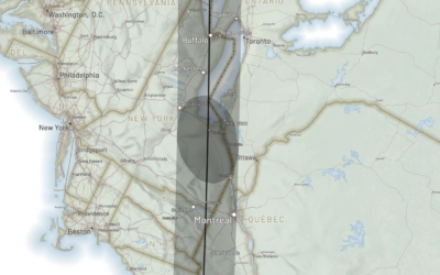
Following the path of the 2024 solar eclipse
There is going to be a solar eclipse on April 8, 2024. The…
-

Search the text in historical maps
The David Rumsey Map Collection has been home to tens of thousands of…
-
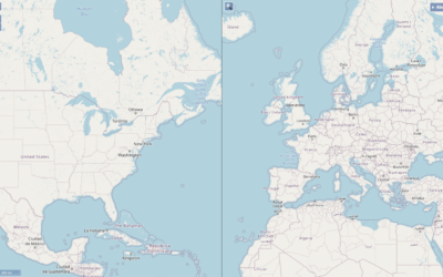
Two maps with the same scale
When you compare two areas on a single map, it can be a…
-
Very Expensive Maps
In the Very Expensive Maps podcast, cartographer Evan Applegate interviews other cartographers about…
-
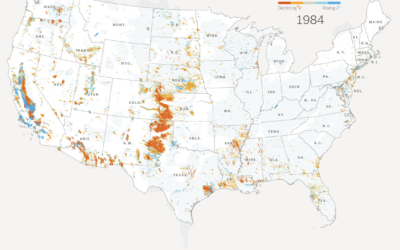
Declining groundwater
The New York Times analyzed water levels across the country since 1920. In…
-
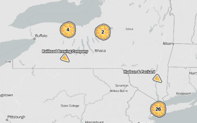
Looking for the best pizza for different styles in different places
Locating the best pizza depends on where you are and what kind of…
-
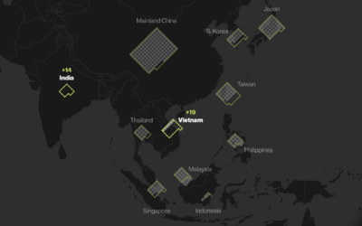
Apple’s global suppliers
Most of Apple’s suppliers and manufacturing happen outside the United States and in…
-

Cultural Midwest, not technically
The U.S. Census Bureau defines the Midwest as the region of twelve states…
-
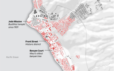
Map of Lahaina buildings destroyed in wildfire
Most of the Maui town Lahaina was destroyed by wildfire. The Wall Street…
-
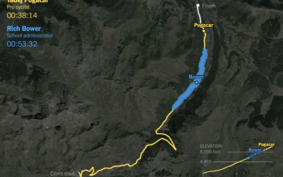
Racing amateurs against Tour de France cyclists
It takes strength and dedication to race in the Tour de France. It’s…
-
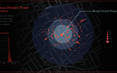
John Snow’s cholera map, an animated version
Sarah Bell made an animated version of John Snow’s classic map from 1854.…
-
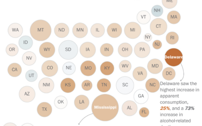
Increasing alcohol-related deaths
Alcohol consumption, based on ethanol volume estimates, has been rising over the past…
-
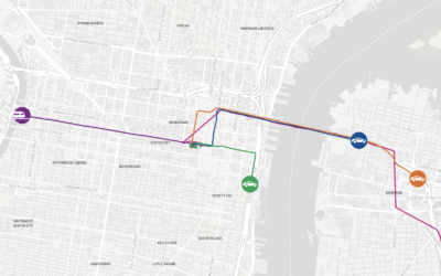
A race to find the best route to the Jersey Shore
To find the fastest route from Philadelphia to the Jersey Shore, The Philadelphia…
-
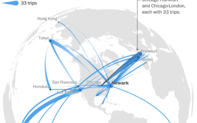
A year of flight paths, for someone with an unlimited pass
United Airlines sold a lifetime unlimited pass in 1990 for $290,000. Tom Stuker…
-
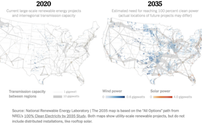
Map of electric grid required for cleaner energy
To power the United States with more clean energy, you might think it’s…
Recently for Members
Second Edition
 Visualize This: The FlowingData Guide to Design, Visualization, and Statistics (2nd Edition)
 Visualize This: The FlowingData Guide to Design, Visualization, and Statistics (2nd Edition)
New tools, refined process.
Browse by Chart Type See All →


