Where restaurant chains dominate
Aug 26, 2022

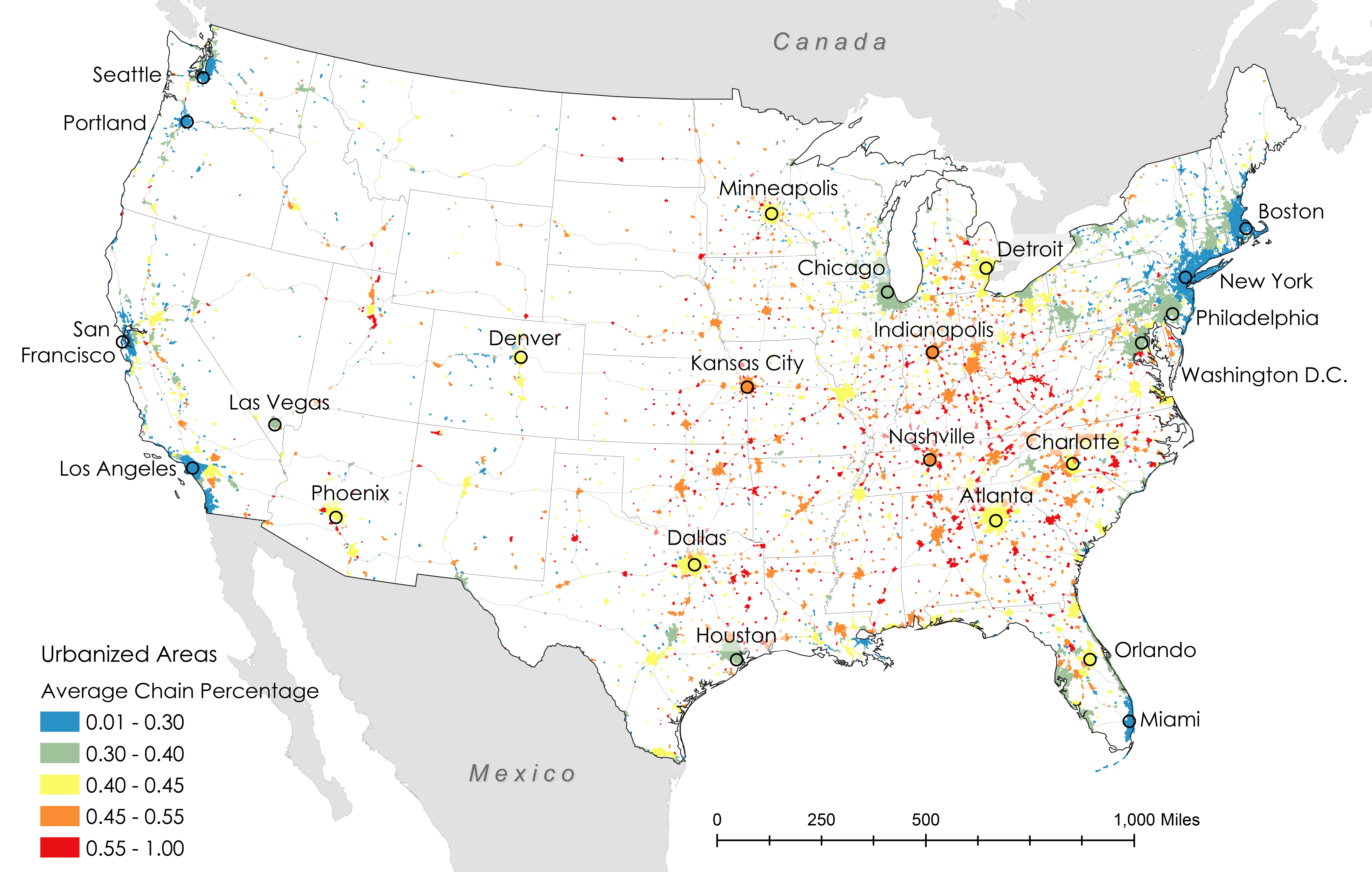
Researchers Xiaofan Liang and Clio Andris estimated the percentage of restaurants that are chains and independent to identify “McCities”:

These high chainness McCities are prevalent in the Midwestern and the Southeastern United States. Independent restaurants were associated with dense pedestrian-friendly environments, highly educated populations, wealthy populations, racially diverse neighborhoods, and tourist areas. Low chainness was also associated with East and West Coast cities.

Check out the interactive map here.

My only criticism is that they used a rainbow color scale instead of using a single hue or a diverging color scale that breaks at half.

Become a member. Support an independent site. Make great charts.

See What You Get

Learn to Visualize Data See All →

How I Made That: Searchable Time Series Chart

When there are too many options or categories, it can be helpful to make the data searchable.

How to Make a Bump Chart in R, with ggplot

Visualize rankings over time instead of absolute values to focus on order instead of the magnitude of change.

How to Make an Animated, Self-Sorting List

You have a list of things that can be ordered by different values. Let them sort themselves out.

How to Draw Maps with Hatching Lines in R

Fill areas with varying line density to give more or less visual attention. With geographic maps, the technique is especially useful to adjust for population density.

Favorites

The Most Gender-Switched Names in US History

We use some names mostly for boys and some mostly for girls, but then there is a small percentage that, over time, switched from one gender to another. Which names made the biggest switch?

Top Brewery Road Trip, Routed Algorithmically

There are a lot of great craft breweries in the United States, but there is only so much time. This is the computed best way to get to the top rated breweries and how to maximize the beer tasting experience. Every journey begins with a single sip.

Finding the New Age, for Your Age

You’ve probably heard the lines about how “40 is the new 30” or “30 is the new 20.” What is this based on? I tried to solve the problem using life expectancy data. Your age is the new age.

How Much Americans Make

Median income only tells you where the middle is. The distributions of income are a lot more interesting.