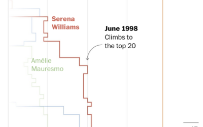
Serena Wiliams’ tennis career is impressive for its success and longevity, which are…
Nathan Yau
-
Serena Williams beat every Grand Slam champion
-
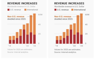
Choosing fonts for your charts
Changing the fonts you use for labels and annotation is one of the…
-
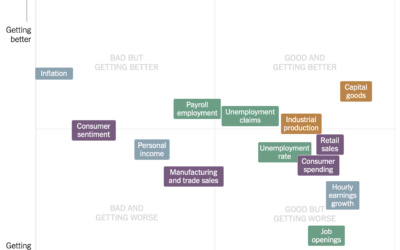
Estimating the condition of the economy
Measuring the condition of the economy is tricky, because there are many parts…
-
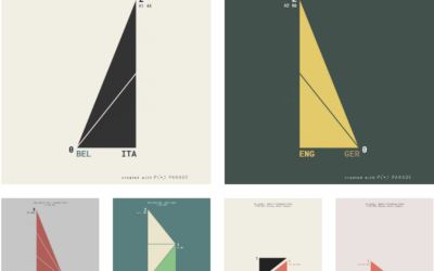
Animated charts to show sports results
Krisztina Szűcs likes to make animated charts to show sports results, from fencing,…
-
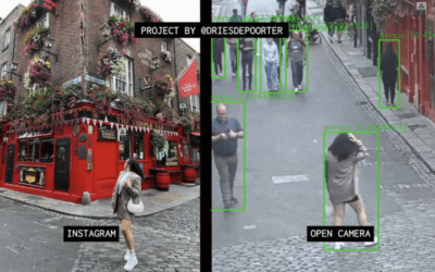
Open cameras and AI to locate Instagram photos
Dries Depoorter recorded video from open cameras for a week and scraped Instagram…
-
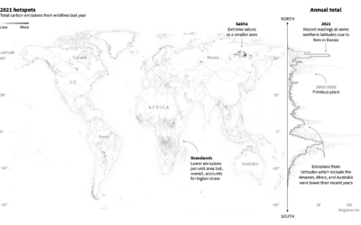
Emissions from fires in the Arctic
Reuters reported on the fires in the Arctic and the relatively high levels…
-
Members Only
Unrestricted Visualization
It’s nice that visualization has developed over the years to the point that there are dedicated classes for it, but I also like learning informally.
-
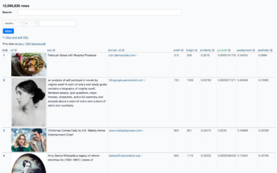
Images behind the generated images from Stable Diffusion
People have been having fun with the text-to-image generators lately. Enter a description,…
-
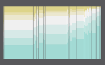
Color palette generator
In the never-ending quest to find the perfect color scheme for any given…
-
Science of the tennis toss
To serve the ball in tennis, a player first tosses the ball in…
-
Gerrymandering detection with simulations
Harry Stevens, for The Washington Post, how simulations can be used to detect…
-
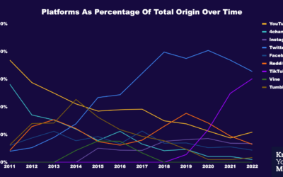
Where memes from the past decade came from
Know Your Meme analyzed a decade of meme data to see where the…
-
Members Only
Play With Your Data
Time for less work and more play.
-
Where We Find Meaning in the Everyday
Meaningfulness scores from the American Time Use Survey provide a hint of what we value.
-
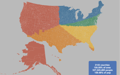
Splitting the US population evenly, with arbitrary shapes
By Engaging Data, this interactive map shows various splits of the United States…
-
China’s possible blockade around Taiwan
It appears China wants to impose a blockade around Taiwan with ships, submarines,…
-
Losses and comebacks of Serena Williams
We tend to celebrate the wins in sports and often forget about or…
-
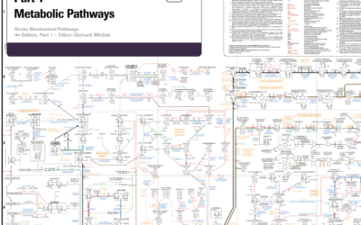
Big diagram of metabolic pathways
The contents of this diagram is not in my scope, but it is…
-
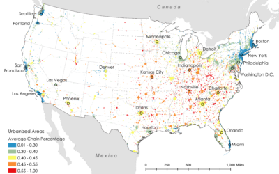
Where restaurant chains dominate
Researchers Xiaofan Liang and Clio Andris estimated the percentage of restaurants that are…
-
Introduction to Probability for Data Science, a free book
Introduction to Probability for Data Science is a free-to-download book by Purdue statistics…









 Visualize This: The FlowingData Guide to Design, Visualization, and Statistics (2nd Edition)


