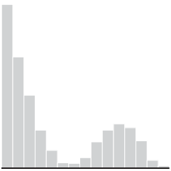
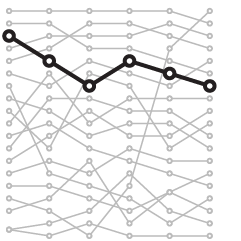
The visualizations are used and read differently, which requires that you approach their design differently.
Nathan Yau
-
Members Only
Visualization for Analysis vs. Visualization for an Audience (The Process #59)
-
Game: How many US cities can you name?
How many US cities can you name? Here’s a quick and fun game…
-

The ‘impeach this’ map has some issues
Philip Bump explains why the “impeach this” map is a bit dubious:
By… -

Animating a lot of dots with WebGL and REGL.js
A couple of weeks ago, The Washington Post visualized 13,000 school districts using…
-

Diverging line plot as the perfect comic
This is perfect. Willikin Wolf made characters out of two dots moving along…
-

Pixelation to represent endangered species counts
In 2008, the World Wildlife Fund ran a campaign that used pixelation to…
-

Detailed generative art in R
Thomas Lin Pedersen has been sharing his generative art pieces as of late:…
-
Members Only
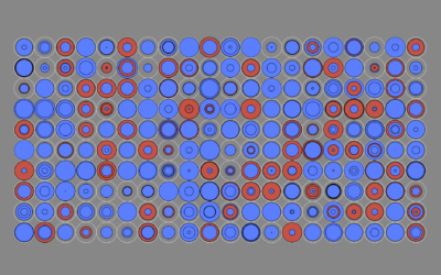
Visualization Tools and Resources, September 2019 Roundup (The Process #58)
Every month I collect the latest visualization tools and resources on how to make the most of your data. Here’s the good stuff for September.
-
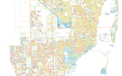
Street suffixes show the organization of cities
The suffixes on street names can say a lot about a neighborhood. A…
-
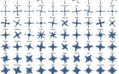
Analysis of street network orientation in cities
Continuing his analysis of street grid-iness in cities around the world, Geoff Boeing…
-
Statistical fallacies in the news
For UnHerd, Tom Chivers, talks about David Spiegelhalter’s new book and why every…
-
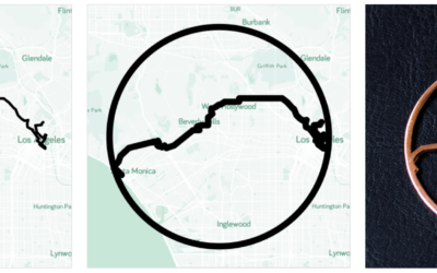
Jewelry based on your GPS traces
GPX Jewelry by Rachel Binx lets you turn your GPS traces into jewelry.…
-

AI-generated faces as stock photos
The Generated Photos project is a work in progress to provide realistic AI-generated…
-
History of Tetris randomizers
Tetris is a game with foundations in randomness. Pieces are distributed randomly to…
-
AI-generated voice used to fake phone call and steal money
Reporting for The Washington Post, Drew Harwell describes the case of the fake…
-
Members Only

Reddit Follow-up; Chart Like Nobody’s Looking (The Process #57)
Consider your audience. Yes. But at some point in the visualization creation process, you have to disregard all of the feature requests and design suggestions.
-
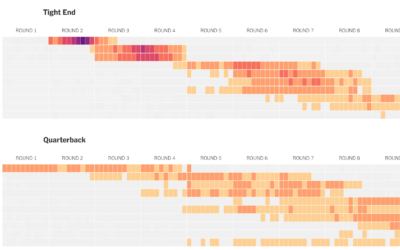
How well players drafted in fantasy football
For The Upshot, Kevin Quealy used a heatmap to visualize fantasy football draft…
-
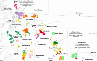
Who owns the most land in the U.S.
Bloomberg News mapped the land owned by the largest owners:
The 100 largest… -

Sprawling flood waters across the Midwest and South
The New York Times mapped the slow, wide-reaching flood waters this year so…
-
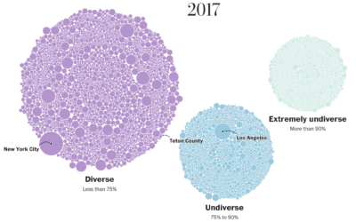
School diversity visualized with moving bubbles
The Washington Post visualized 13,000 school districts to show the change in diversity…
Recently for Members
Second Edition
 Visualize This: The FlowingData Guide to Design, Visualization, and Statistics (2nd Edition)
 Visualize This: The FlowingData Guide to Design, Visualization, and Statistics (2nd Edition)
New tools, refined process.
Browse by Chart Type See All →