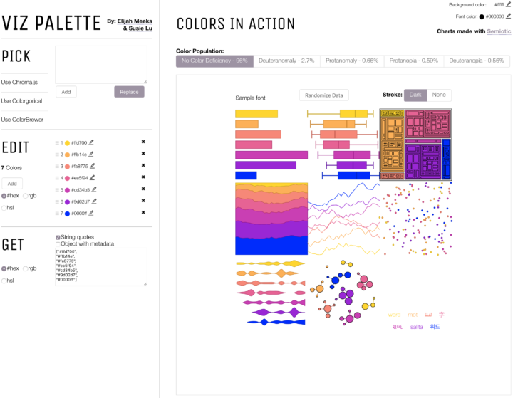
The colors you choose to visualize data can completely shift what you convey to a reader. With an ominous color palette, a graphic meant to be light and fun comes off the wrong way. Or the other way around. You wouldn’t use Comic Sans for your résumé (right…?), so choose colors that fit the topic. Viz Palette, made by Elijah Meeks and Susie Lu, aims to make the choosing part easier.
It’s still up to you to figure out the right overall scheme, but Viz Palette takes care of the stuff in between, such as designing for color blindness and perceptually evenly-spaced shades. It also includes a “color report” that points out shades that might look the same in various situations.
While there are many color-picking tools (I typically stick to four.), they are often too simple, overly-complicated, or research-centric. This one seems to strike a good balance for practicality.
 Visualize This: The FlowingData Guide to Design, Visualization, and Statistics (2nd Edition)