Another recent flip: Based on estimates from Ember, monthly solar-generated electricity reached an…
difference
-
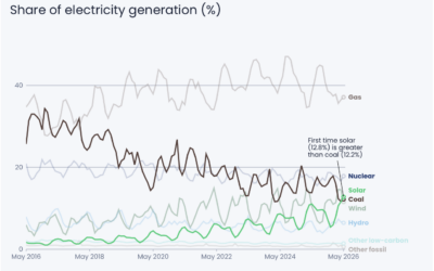
Solar passes coal for US electricity
-
Members Only
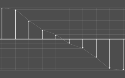
Showing when the data flips
This week, we focus on when there is a sudden change or flip in the data that you want to highlight.
-

Comparison of Trump and Putin visits to China
Trump visited China, and then Putin visited a week later. Reuters compared the…
-
Members Only
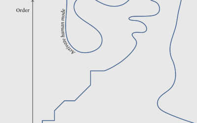
Off the axes
This week we look for ways to diverge towards the unexpected.
-
Members Only

Spot the difference
This week is about highlighting differences and visualizing characteristics over the data itself.
-
Members Only
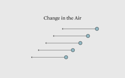
Visualizing Differences Between Two Points in Time
This week is about highlighting changes in data visually to make them glaringly obvious.
-
Members Only
Chart Options When the Differences are Small But Worthwhile
Small changes over time or small differences between categories can easily look insignificant, even if they’re worth noting in real life. Here are chart options for you.
-
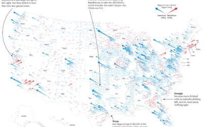
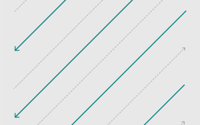
Midterm shifts versus the 2016 election
The Guardian goes with scaled, angled arrows to show the Republican and Democrat…
-
Visualizing Differences
Focus on finding or displaying contrasting points, and some visual methods are more helpful than others. A guide.
Recently for Members
Second Edition
 Visualize This: The FlowingData Guide to Design, Visualization, and Statistics (2nd Edition)
 Visualize This: The FlowingData Guide to Design, Visualization, and Statistics (2nd Edition)
New tools, refined process.
Browse by Chart Type See All →


