From Maastricht University:
What happens if a SARS-CoV-2 coronavirus enters your lung? This…
-

Life cycle of coronavirus at the molecular level
-
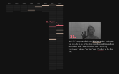
Tour through the greatest movies of all time
Every ten years since 1952, Sight and Sound, a British film magazine, has…
-

Digital face aging with neural network
Disney Research demonstrates their use of neural networks to seamlessly age and de-age…
-

Asteroid simulator for before the big one hits
Knowing the impact of an asteroid falling in your city might not seem…
-
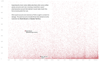
Who pays for Twitter
Twitter Blue is a subscription service from Twitter that primarily provided premium features…
-
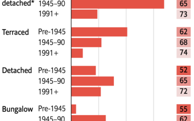
Retrofitting old British homes to improve energy efficiency
Speaking of old homes and energy efficiency in the UK, The Economist describes…
-

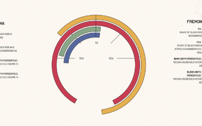
Managing temperature fluctuations through UK architecture
Philip Kennicott, Simon Ducroquet, Frank Hulley-Jones and Aaron Steckelberg, for The Washington Post,…
-
Members Only

Visualization Tools and Learning Resources, November 2022 Roundup
Here’s the good stuff for November.
-
Upward mobility through a personal lens
Aaron Williams, for The Pudding, shows upward mobility through his own experiences, moving…
-
On the Data Journalism Podcast
I had a short chat with Alberto Cairo and Simon Rogers on The…
-

Illustration of ranked-choice voting
Connie Hanzhang Jin and Kaitlyn Radde, for NPR, used illustrations to explain how…
-
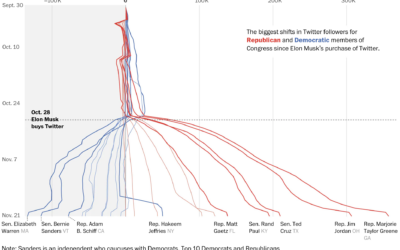
Republican and Democrat follower counts on Twitter
You might have heard that Elon Musk bought Twitter, and among the many…
-

Building a happy life, interpreted through data
How to Build a Happy Life from The Atlantic is a podcast on…
-

Depth of the underwater Tonga volcano
Mark Doman and Alex Palmer, for ABC News, show the depth of the…
-
Experimental Noisycharts sonifies data for improved accessibility
Nick Evershed, for The Guardian, describes Noisycharts, an experimental component for their in-house…
-
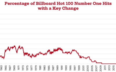
Decline of key changes in popular music
Chris Dalla Riva analyzed key changes in songs that made the Billboard Hot…
-
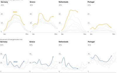
Shifts in European energy sources
Mira Rojanasakul, for The New York Times, dug into current and historical energy…
-

$300b World Cup seen through satellite imagery
Qatar spent $300 billion with a ‘b’ over the past twelve years to…
-
Members Only

Setting Axis Ranges
Set the scales to highlight the changes in the data without abandoning the accuracy of the data.
-

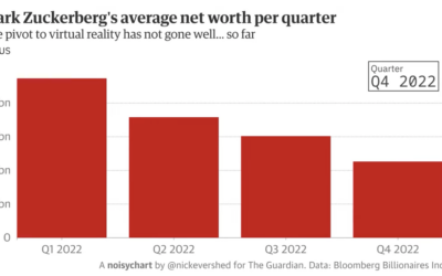
All the parts of daily life in India controlled by Mukesh Ambani
Mukesh Ambani has an estimated net worth of $90.7 billion, because his company…
Recently for Members
Second Edition
 Visualize This: The FlowingData Guide to Design, Visualization, and Statistics (2nd Edition)
 Visualize This: The FlowingData Guide to Design, Visualization, and Statistics (2nd Edition)
New tools, refined process.
Browse by Chart Type See All →


