Here’s a fun interactive from The Washington Post to earmark the world reaching…
-

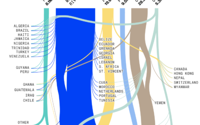
8 billion population visualized
-
New Visualization in R Course, and Other Updates
I have two course-related updates on FlowingData. First, there’s a new course on…
-

Sleuthing for birth dates, with just TikTok profiles as clue
TikTok user notkahnjunior figures out people’s birth dates through the psuedo-privacy of the…
-
Role of luck in football wins
NFL Football Operations calculated how much luck has contributed to team wins and…
-
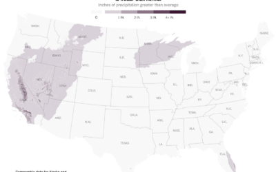
Exports through the Mississippi River
Drought has caused water levels to drop in the Mississippi River, which is…
-
Deleting your tweets with R
Twitter isn’t in a great place right now, so maybe you want to…
-
Members Only
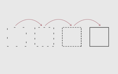
Using Visualization Feedback
The process of taking in visualization feedback to improve towards where you want to go.
-
Life Satisfaction and Age
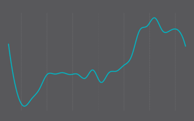
These life satisfaction scores might make you want to rethink life.
-
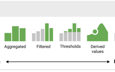
Dashboard Design Patterns
Dashboards aren’t really my thing, but we’ve seen, especially over the past few…
-

History of wars and power in Europe, animated from 1500 to present
Agar.io is a multiplayer game where people control cells in a Petri dish-type…
-
Chance of rain and election turnout
There’s rain in the forecast tomorrow in some areas of the United States,…
-
AI-based image generation ethics
AI-based image generation is having a moment. Time some text and you can…
-

Procedurally generated driving game
Sometimes you need to slow down and go on a drive with no…
-
Members Only
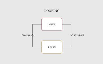
The Process of Choosing the Better Chart
This is how I pick charts.
-
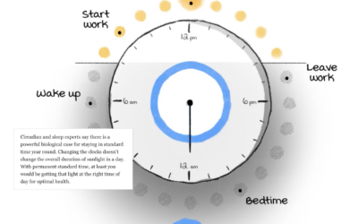
Daylight saving time and circadian rhythms
Daylight saving time ends in the United States this weekend and ended already…
-
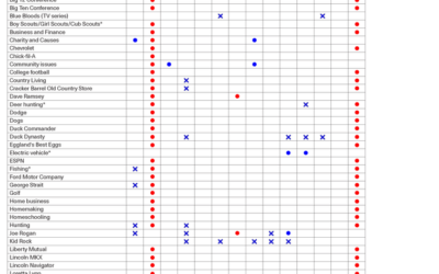
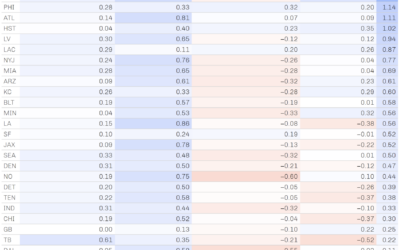
How you might vote based on what you like
By Angie Waller, this table shows how Facebook thinks you’ll vote based on…
-
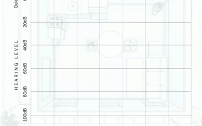
What hearing loss sounds (and looks) like
Using an audiogram as a backdrop, Amanda Morris and Aaron Steckelberg, for The…
-
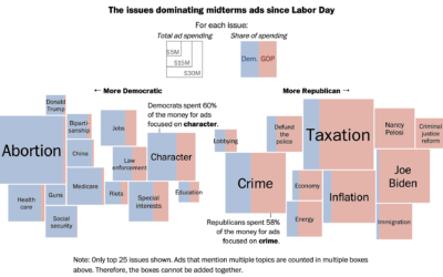
Election ad topics
Midterm election day is just about here in the U.S., so the political…
-
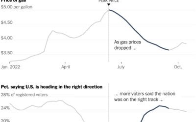
Gas prices and confidence
Everywhere you go, gas prices show up on big boards, like a proxy…
-
Members Only
Visualization Tools and Learning Resources, October 2022 Roundup
Here’s the good stuff for October.
Recently for Members
Second Edition
 Visualize This: The FlowingData Guide to Design, Visualization, and Statistics (2nd Edition)
 Visualize This: The FlowingData Guide to Design, Visualization, and Statistics (2nd Edition)
New tools, refined process.
Browse by Chart Type See All →


