Say you want to identify clusters in a scatterplot of points. K-Means is…
-
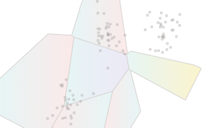
K-Means clustering visually explained
-

Coffee versus tea in charts
Anahad O’Connor, Aaron Steckelberg and Garland Potts, for The Washington Post, made charts…
-
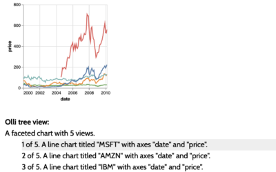
Accessible visualization with Olli JavaScript library
The Olli library aims to make it easier for developers to improve the…
-
Wide range of data exploration tools
Simon Willison asked a straightforward question about the tools people use:
If someone… -
Unemployed data scientist
It seems a lot of data scientists have either left or were laid…
-

Tree Talk
Kelton Sears used a vertical scroll upwards to think about trees and time.…
-
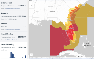
Mapping climate-related hazards in real-time
Bringing in data from various federal agencies:
Climate Mapping for Resilience and Adaptation… -
Members Only
Visualization Tools and Learning Resources, September 2022 Roundup
Here’s the good stuff for September.
-
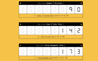
Days-since tickers for all the natural disasters
You know those signs in workplaces that keep track of days since injury?…
-
Members Only
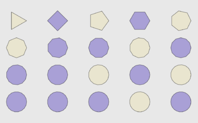
How to Draw and Use Polygons in R
R provides functions for basic shapes, but you can also draw your own for maximum fun.
-
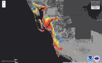
Potential storm surge flooding map
NOAA provides a map of potential flooding due to Hurricane Ian headed towards…
-
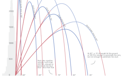
Trajectories of celebratory gunfire
When someone fires a gun into the air, the bullet travels thousands of…
-
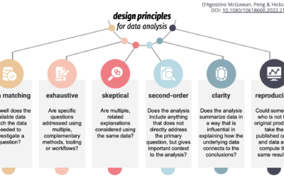
Design principles for data analysis
To teach, learn, and measure the process of analysis more concretely, Lucy D’Agostino…
-
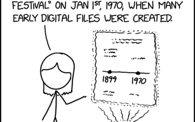
Historical data
Randall Munroe provides another fine observation through xkcd.
I often wonder what our… -
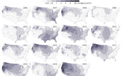
Maps of wildfire smoke pollution
Wildfire obviously damages the areas it comes in direct contact with, but wildfire…
-
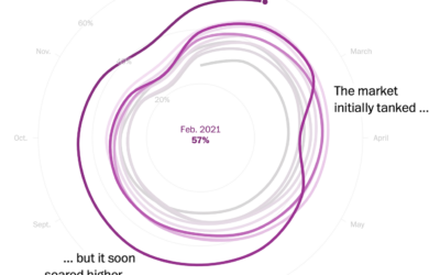
Housing market cooldown
I heard you like spiral charts when the data is seasonal. I think…
-

Data horror stories song
Rafael Moral sang a very nerdy data analyst song, to the tune of…
-
Members Only
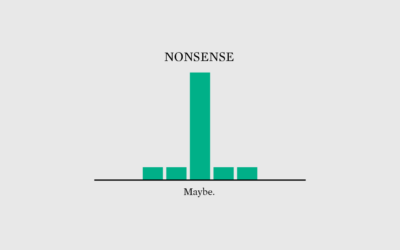
Nonsense
If you just always assume the data is right, you’ll probably finish with garbage.
-
Developing a data design language for the World Health Organization
In a collaborative effort with UX agency Kore, Moritz Stefaner describes work with…
-

Climate and the San Francisco fog
A reliable dense fog in San Francisco is a defining characteristic of the…
Recently for Members
Second Edition
 Visualize This: The FlowingData Guide to Design, Visualization, and Statistics (2nd Edition)
 Visualize This: The FlowingData Guide to Design, Visualization, and Statistics (2nd Edition)
New tools, refined process.
Browse by Chart Type See All →


