Drew Harwell, for The Washington Post, reporting on a growing database and who…
-
Border enforcement data collection
-

Sonic landscape of Mexico City
Aaron Reiss and Oscar Molina Palestina, for The Pudding, explore the sounds of…
-
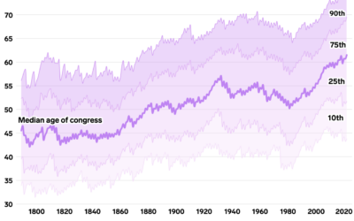
Oldest U.S. government
Annie Fu, Walt Hickey, and Shayanne Gal, for Insider, show the disproportionately aging…
-
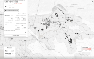
Map of mega warehouses in the United States
With the growth in online shopping over the years, companies required more space…
-
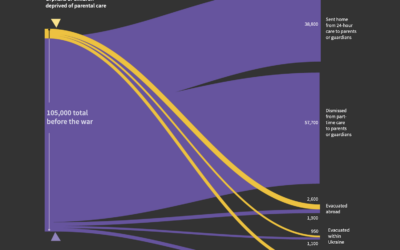
Untraced orphans in Ukraine since the war
Sarah Slobin and Joanna Plucinska, for Reuters, report on the challenges of counting…
-
Members Only
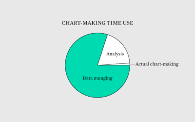
Munging Around
Time spent data munging is time well spent.
-

Serena Williams beat every Grand Slam champion
Serena Wiliams’ tennis career is impressive for its success and longevity, which are…
-
Choosing fonts for your charts
Changing the fonts you use for labels and annotation is one of the…
-
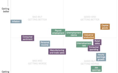
Estimating the condition of the economy
Measuring the condition of the economy is tricky, because there are many parts…
-
Animated charts to show sports results
Krisztina Szűcs likes to make animated charts to show sports results, from fencing,…
-

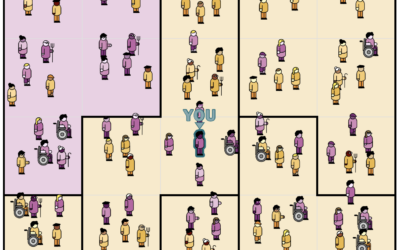
Open cameras and AI to locate Instagram photos
Dries Depoorter recorded video from open cameras for a week and scraped Instagram…
-
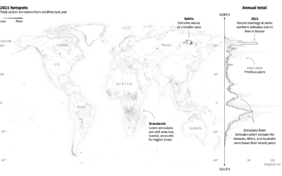
Emissions from fires in the Arctic
Reuters reported on the fires in the Arctic and the relatively high levels…
-
Members Only
Unrestricted Visualization
It’s nice that visualization has developed over the years to the point that there are dedicated classes for it, but I also like learning informally.
-
Images behind the generated images from Stable Diffusion
People have been having fun with the text-to-image generators lately. Enter a description,…
-

Color palette generator
In the never-ending quest to find the perfect color scheme for any given…
-

Science of the tennis toss
To serve the ball in tennis, a player first tosses the ball in…
-
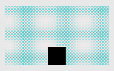
Gerrymandering detection with simulations
Harry Stevens, for The Washington Post, how simulations can be used to detect…
-
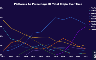
Where memes from the past decade came from
Know Your Meme analyzed a decade of meme data to see where the…
-
Members Only

Play With Your Data
Time for less work and more play.
-
Where We Find Meaning in the Everyday
Meaningfulness scores from the American Time Use Survey provide a hint of what we value.
Recently for Members
Second Edition
 Visualize This: The FlowingData Guide to Design, Visualization, and Statistics (2nd Edition)
 Visualize This: The FlowingData Guide to Design, Visualization, and Statistics (2nd Edition)
New tools, refined process.
Browse by Chart Type See All →


