We spend a lot of time working. It seems worth thinking about how we feel during all those hours.
-
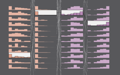
Feelings at Work
-
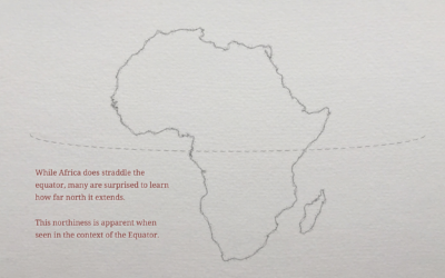
Geographic misconceptions about the location of continents
When you’re used to looking at the world through a certain lens, such…
-
Luxury surveillance
Chris Gilliard, for The Atlantic, describes self-surveillance that people pay for in exchange…
-
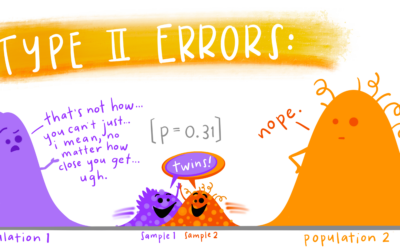
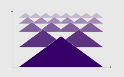
Educational statistics illustrations
Allison Horst often illustrates data science concepts and tools with anthropomorphized shapes and…
-
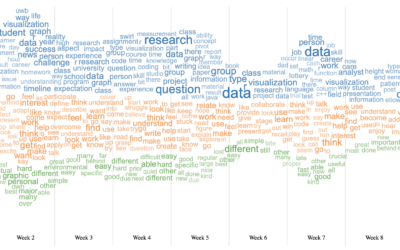
Word cloud + Streamgraph = WordStream
I hear it all the time from chart purists. “I love the streamgraph!”…
-
Members Only
The Process of Finding Data
You need data to visualize. Luckily, it’s not too complicated.
-
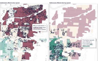
Slow internet for the same price as fast internet
When you pay for internet, it seems like a reasonable expectation that if…
-
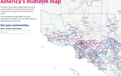
All the elections where you live
We tend to talk about elections as this uniform thing. People vote for…
-
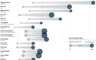
Less rich Covid billionaires
With Covid came sudden shifts in daily life and work, which gave rise…
-

Chartball is sports data visualized in a playful way
With Chartball, Andrew Garcia Phillips has visualized sports data for a while, publishing…
-
Algorithmic rent increase
It’s growing more common for landlords to use software to set the rental…
-
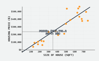
Linear regression visual explainer
MLU-Explain continues with their visual explainers for machine learning and statistical concepts. Most…
-
Members Only

Getting Better at Making Charts
There’s always room for improvement — no matter how long you’ve been at it.
-
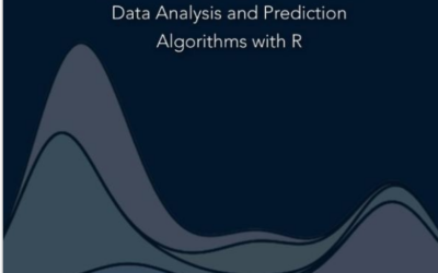
Introduction to Data Science, an open source book
Introduction to Data Science, by Harvard biostatistics professor Rafael A. Irizarry, is an…
-
Impossible or improbable lottery results
There was a government-run lottery in the Philippines with a $4 million jackpot,…
-
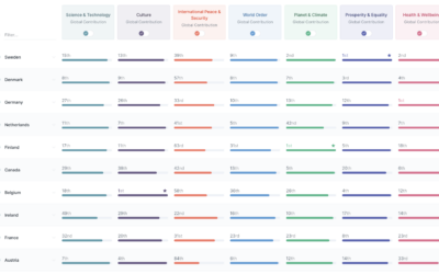
Good Country Index
The Good Country Index is an effort to highlight and rank the countries…
-
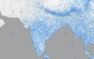
Future monsoon patterns
The monsoon season in South Asia brings water to the people and land,…
-
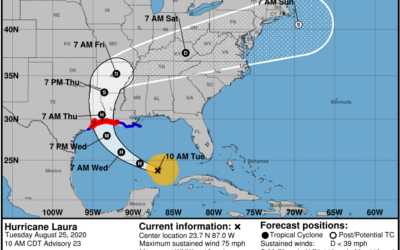
Difficulties reading the cone of uncertainty
It seems that there is always surprise when a hurricane makes landfall in…
-
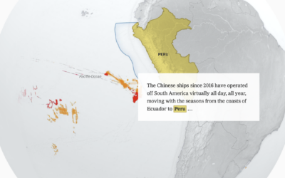
China’s fishing patterns shift globally
China’s fish supply is running low along its own coast, so they’ve shifted…
-
Members Only

Fun with Limitations
Create boundaries in your work for focus and depth.
Recently for Members
Second Edition
 Visualize This: The FlowingData Guide to Design, Visualization, and Statistics (2nd Edition)
 Visualize This: The FlowingData Guide to Design, Visualization, and Statistics (2nd Edition)
New tools, refined process.
Browse by Chart Type See All →


