Using data collected by Johns Hopkins University, Michelle McGhee and Will Chase for…
2021
-
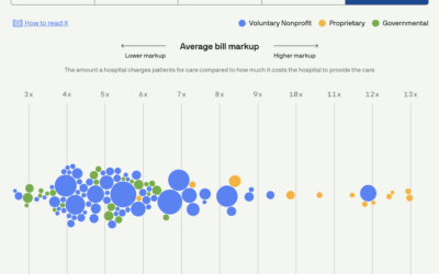
Scoring hospitals by billing quality
-
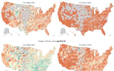
Delaying motherhood
The New York Times mapped birth rates, which are down almost everywhere, especially…
-
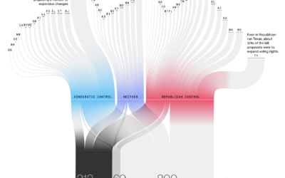
Passing restrictive voting bills
Bloomberg used a Sankey diagram to show the path of over a thousand…
-
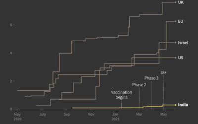
India vaccine procurement compared to other countries
Prasanta Kumar Dutta and Manas Mishra reporting for Reuters on the slow rollout…
-
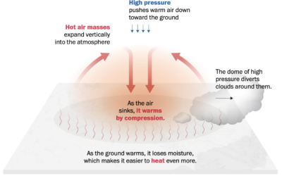
Welcome to heat dome
It’s hot here in the western United States, and it’s only mid-June. From…
-
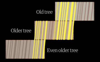
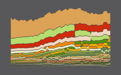
Measuring centuries-old droughts through tree rings
To measure drought in the present day, we use data from sensors that…
-
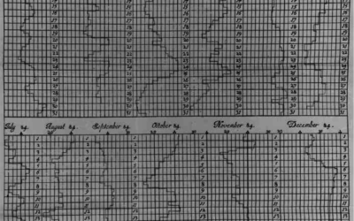
Graphs before anyone knew what they were
Michael Friendly and Howard Wainer have a new book out: A History of…
-
Members Only
Breaking Down a Chart Design – The Process 144
This week I broke down one of my projects and explained as many of the design choices as I could.
-
Spatula, a Python library for maintainable web scraping
This looks promising:
While it is often easy, and tempting, to write a… -
Members Only
How to Make Alluvial Diagrams
Here’s how to do it in R from start to finish, plus editing in illustration software. Make design choices and trade-offs for more readable charts.
-

Collapse of Mexico City Metro explained
The New York Times investigated the collapse of the Metro, which killed 26…
-
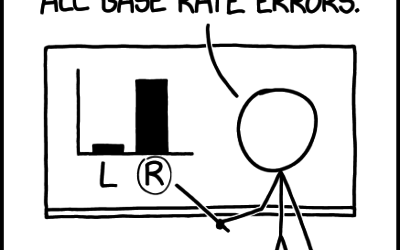
xkcd: Base Rate
xkcd points out the importance of considering the baseline when making comparisons:…
-

Scale of a mouse plague
There’s a mouse plague in Australia right now. The words alone don’t express…
-
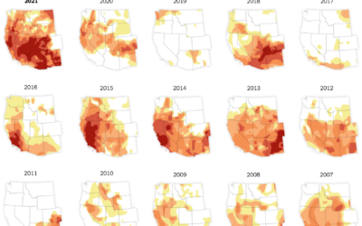
Drought in the Western United States
In what’s become a recurring theme almost every year, the western United States…
-

Tapestry for reflective data visualization
As a way to reflect on 2020, Catherine Madden wove tapestry to visualize…
-
Members Only

Slow – The Process 143
If you’ve got it, take the time to understand and explore your data in the places others rushed through.
-

All the passes in soccer visualized at once
This is a fun soccer graphic by Karim Douïeb. It shows 882,536 passes…
-
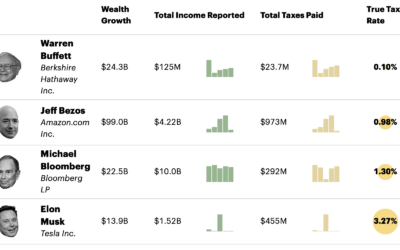
Billionaire tax rates
ProPublica anonymously obtained billionaires’ tax returns. Combining the data with Forbes’ billionaire wealth…
-
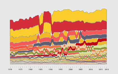
Seeing How Much We Ate Over the Years
How long will chicken reign supreme? Who wins between lemon and lime? Is nonfat ice cream really ice cream? Does grapefruit ever make a comeback? Find out in these charts.
-

Money-in-politics nonprofits merge their datasets
Center for Responsive Politics and National Institute on Money in Politics are merging…
Recently for Members
Browse by Chart Type See All →


Browse By Topic
Get the Book
 Visualize This: The FlowingData Guide to Design, Visualization, and Statistics
 Visualize This: The FlowingData Guide to Design, Visualization, and Statistics
Available now.