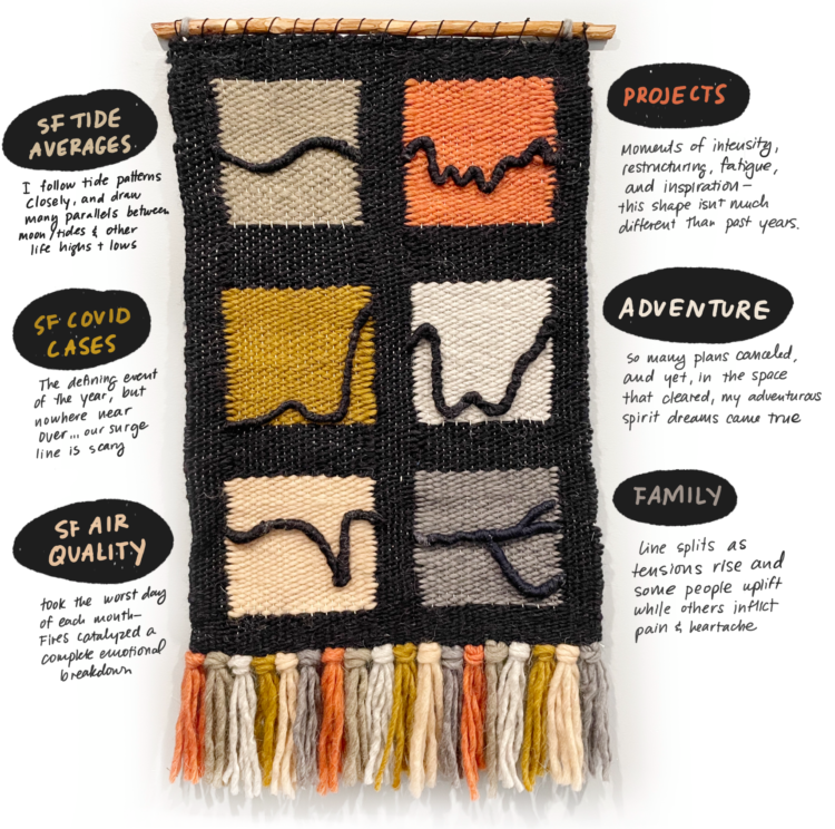
As a way to reflect on 2020, Catherine Madden wove tapestry to visualize six time series. So nice. [via Visualising Data]
Tapestry for reflective data visualization
Second Edition
 Visualize This: The FlowingData Guide to Design, Visualization, and Statistics (2nd Edition)
 Visualize This: The FlowingData Guide to Design, Visualization, and Statistics (2nd Edition)
New tools, refined process.