Seeing How Much We Ate Over the Years
The United States Department of Agriculture keeps track of food availability for over 200 items, which can be used to estimate food consumption at the national level. They have data for 1970 through 2019, so we can for example, see how much beef Americans consume per year on average and how that has changed over four decades.
So that’s what I did.
How long will chicken reign supreme? Who wins between lemon and lime? Is nonfat ice cream really ice cream? Does grapefruit ever make a comeback? Find out in the charts below.
The rankings are broken into six main food groups: proteins, vegetables, fruits, dairy, grains, and added fats.
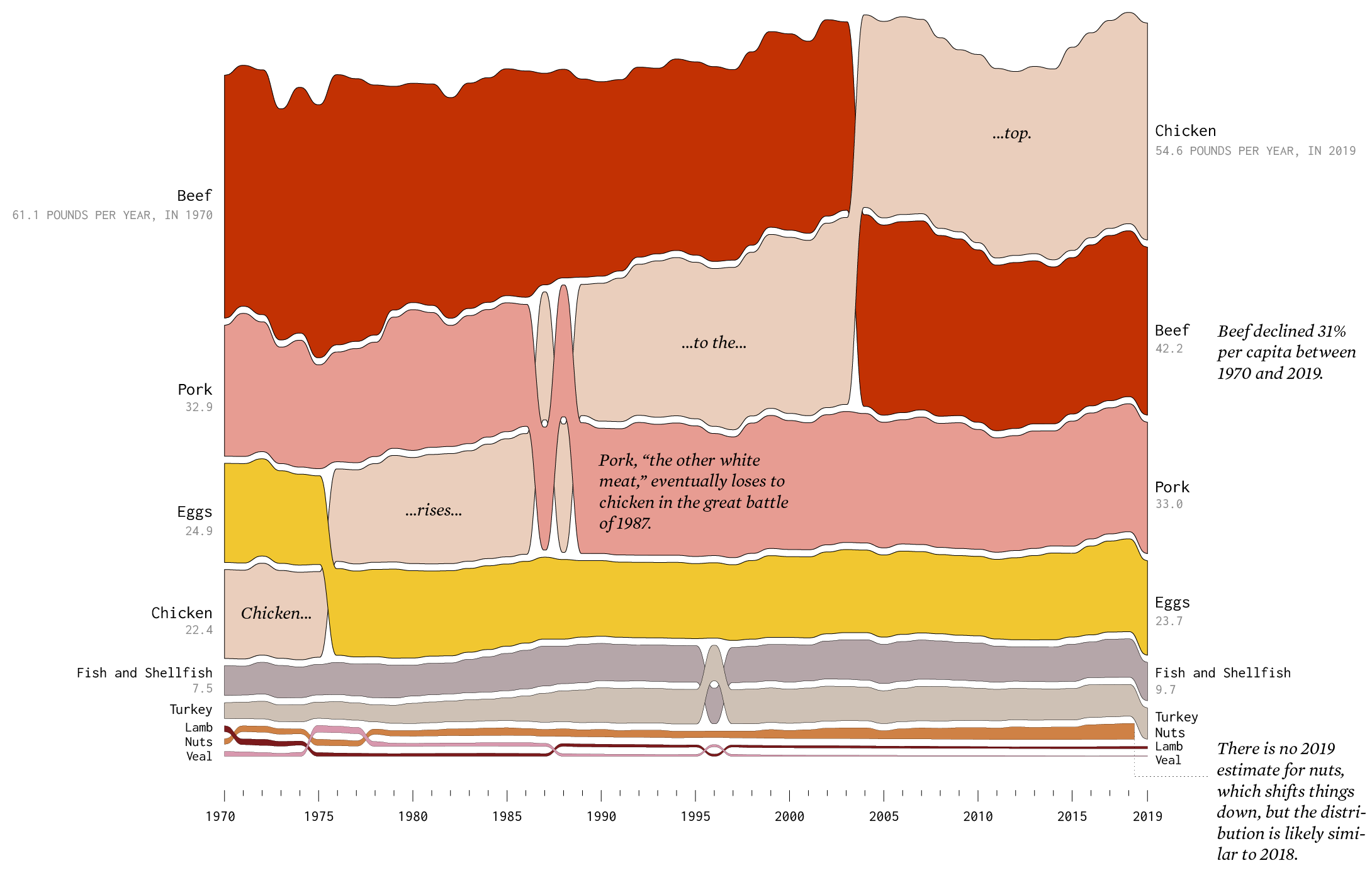
Proteins
Beef still makes up a large portion of protein consumed, but pounds per capita continues to decrease, whereas chicken continues to increase. Chicken took took away the top spot from beef in 2004 and has reigned supreme ever since.
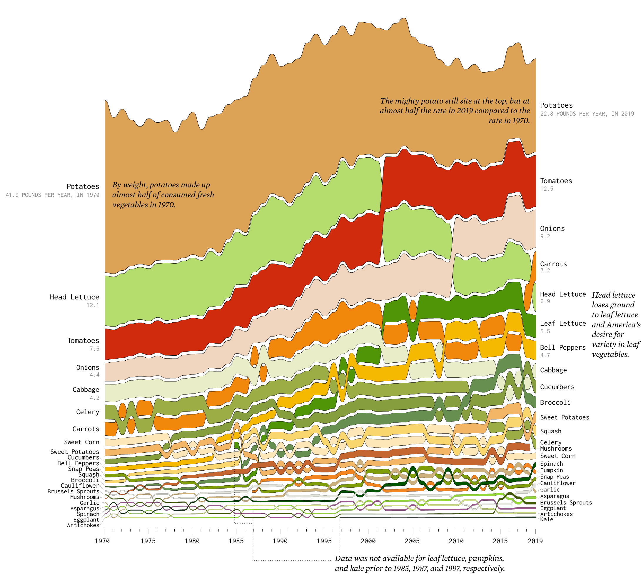
Vegetables
This chart shows the data for fresh vegetables (as opposed to canned or frozen). By pounds per day per capita, potatoes made up about half of all fresh vegetables in 1970. In 2019, that rate was about half, while overall vegetable consumption increased spread out through more varieties.
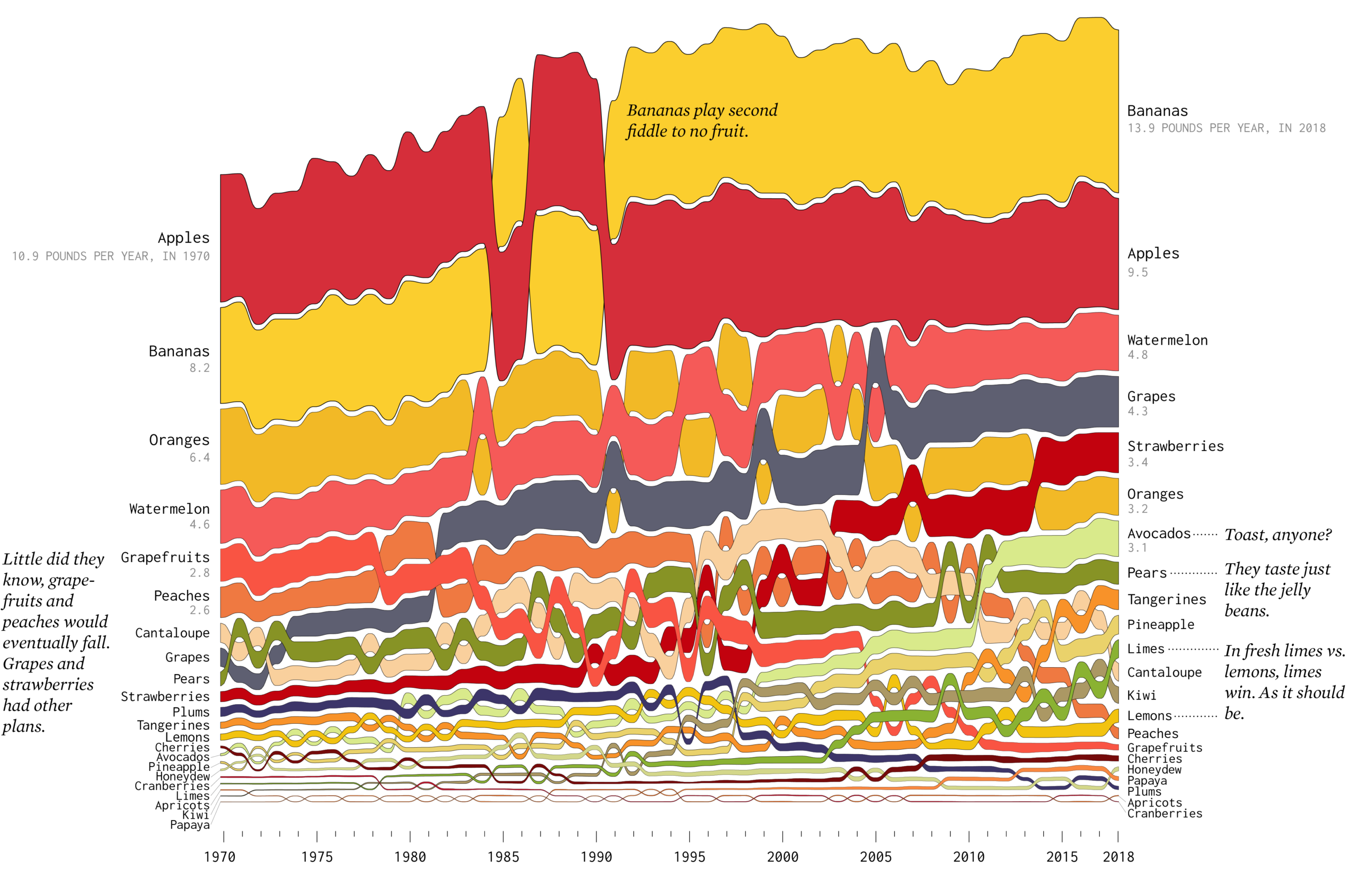
Fruits
Among fresh fruits, apple consumption didn’t change much, but bananas appear to have increased in popularity. Strawberries, grapes, and avocados started towards the bottom but are now higher up in the rankings. Oranges are down significantly.
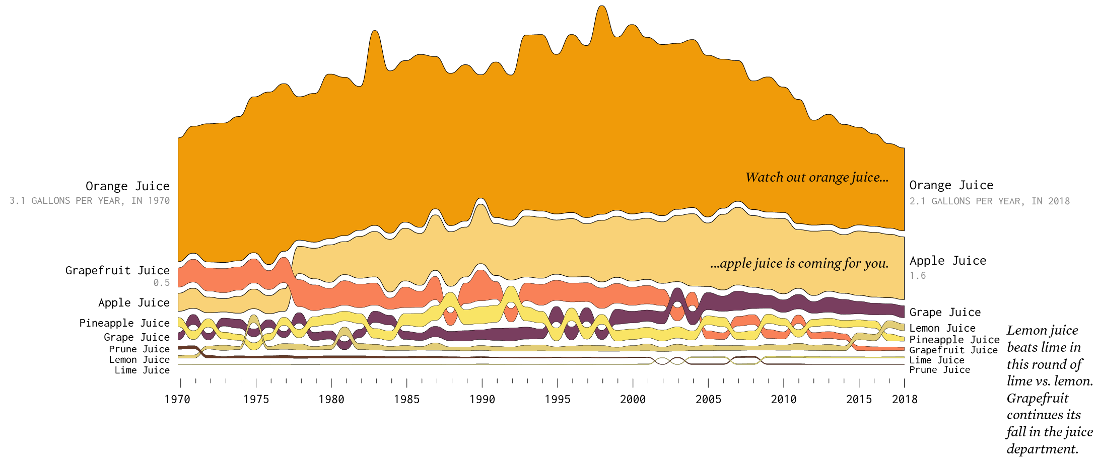
While fresh apples dipped a little, apple juice continues a stead climb in the fruit juice category. Grapefruit juice, which is the best kind of juice, continues to decline like its fresh counterpart. Same goes for orange juice.
Dairy
We split dairy into three categories: beverage, food, and frozen.
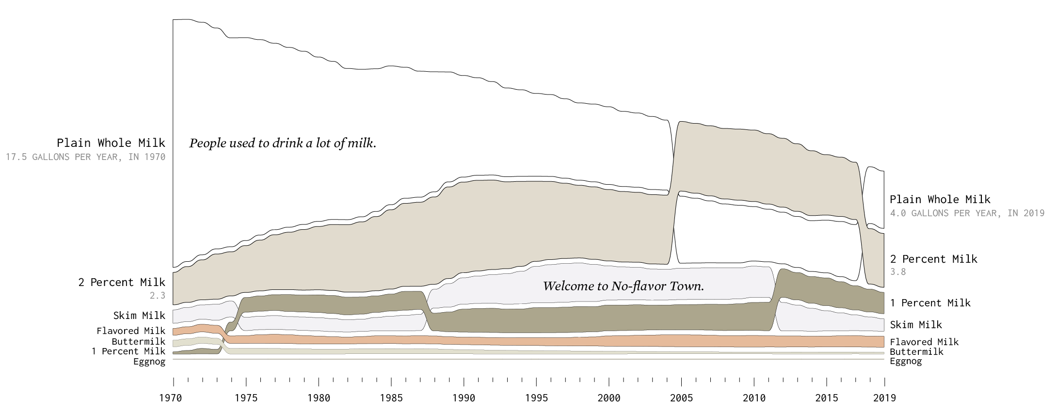
Whole milk used to be the most common dairy beverage by a lot, but volume is more evenly split between whole, two percent, one percent, and skim. Eggnog appears to remain a holiday treat.
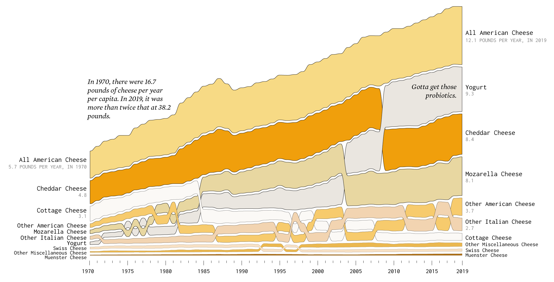
On the other hand, dairy food consumption is up, namely cheese and yogurt. Yogurt is especially more popular, which probably explains the wide variety at the grocery store.
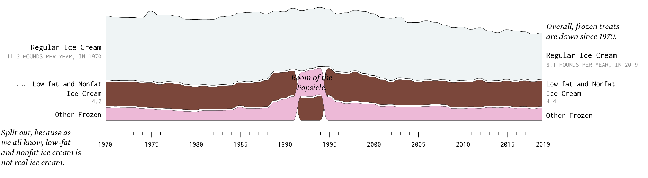
Ice cream and other frozen dairy has changed just a little, mostly in the regular ice cream department.
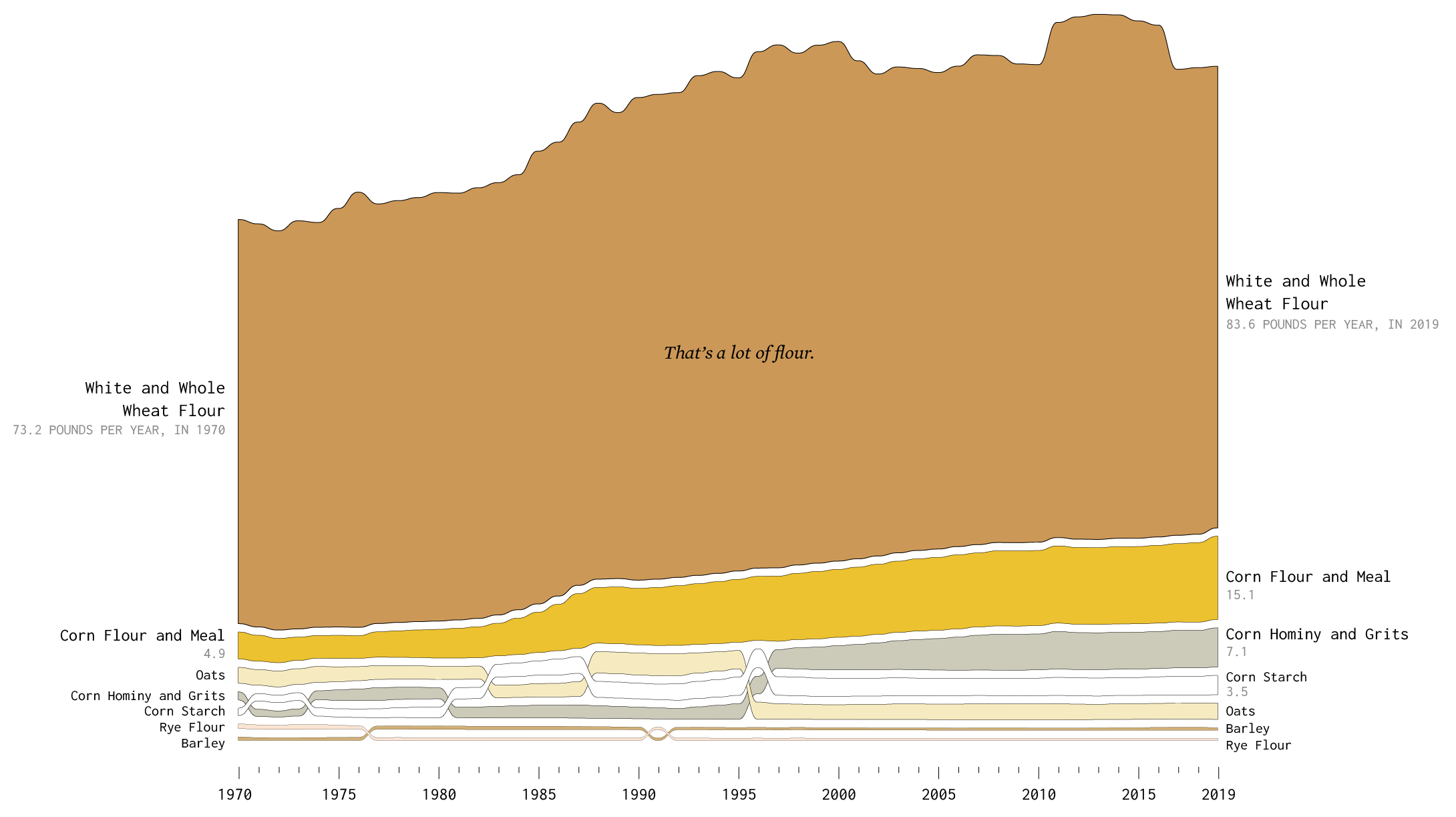
Grains
Flour is up almost across the board, with the exception of barley and rye flour. What was popular in 1970 is more popular now.
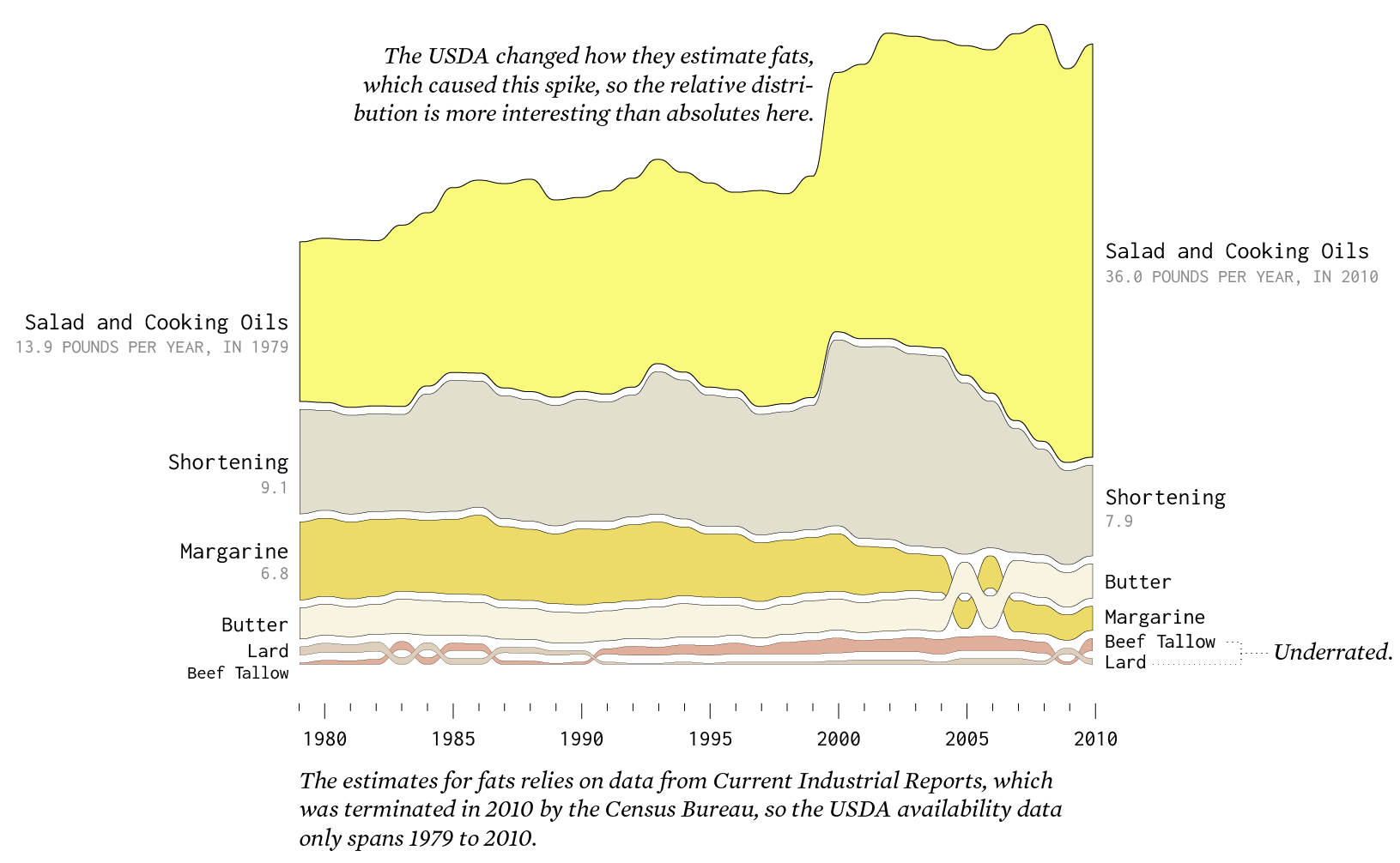
Added Fats
The changes for added fats is a bit more challenging to see, because estimates are only available from 1979 to 2010. The USDA also changed their methodology to estimate fats in 2000, so it’s probably more useful to compare relative distributions for pre-2010 against post-2010. The decrease for margarine and the bump for butter seems right though.
 The Changing American Diet
Here’s an animated version of this data from 2016.
Become a member. Support an independent site. Make great charts.
See What You GetFlowingData is made possible by supporting members. Since 2007, I, Nathan Yau, a real person, have been analyzing and visualizing data to help more people understand and appreciate it in their everyday lives.
If you liked this or want to make similar data things, please consider supporting this small corner of the internet. You get unlimited access to visualization courses, tutorials, and extra resources. Thanks. — Nathan
Chart Type Used
