How to Make Alluvial Diagrams
Here’s how to do it in R from start to finish, plus editing in illustration software. Make design choices and trade-offs for more readable charts.
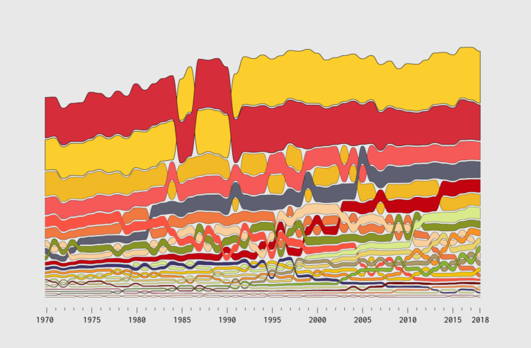
An alluvial diagram is a type of flow chart that is useful to show change over time. You see how individual categories and how the composition of the categories shift.
Incorporate ranking into the mix at each time segment, and you get a good idea of how order changes over time too. The geometry is like a combination of a stacked bar chart and a bump chart.
In this tutorial, I describe not only how to make a basic chart, but how you get from raw data all the way through the design process, to clear and readable graphics, and to the finished project.
Chart generation is the easy part. Everything before and after is what makes the charts better.
To access this full tutorial, you must be a member. (If you are already a member, log in here.)
Get instant access to this tutorial and hundreds more, plus courses, guides, and additional resources.
Membership
You will get unlimited access to step-by-step visualization courses and tutorials for insight and presentation — all while supporting an independent site. Files and data are included so that you can more easily apply what you learn in your own work.
Learn to make great charts that are beautiful and useful.
Members also receive a weekly newsletter, The Process. Keep up-to-date on visualization tools, the rules, and the guidelines and how they all work together in practice.
See samples of everything you gain access to:
About the Author
Nathan Yau is a statistician who works primarily with visualization. He earned his PhD in statistics from UCLA, is the author of two best-selling books — Data Points and Visualize This — and runs FlowingData. Introvert. Likes food. Likes beer.