Many hate pie charts. Others love them. I think they’re useful but have limitations. Most of these are just feelings though, maybe accompanied by an Edward Tufte quote. We need facts. Robert Kosara and Drew Skau provide some in their recent studies on how we read pie charts. There appears to be a good chance people don’t read the things correctly.
But I found Kosara’s follow-up more interesting. He dug up a paper that he and his student Caroline Ziemkiewicz wrote a few years ago on square pie charts. Instead of filling a circle to represent proportion, the square pie chart fills a — wait for it — square.
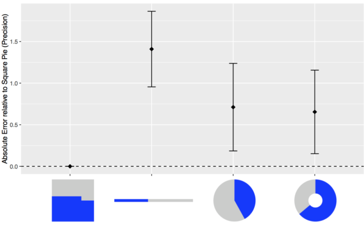
In terms of reading the actual represented proportion, the square one performed best, against the stacked bar, pie, and donut.
More surprising (to me at least) was that the stacked bar, which represented only two values in the study, performed worst. I know that stacked bars with several values can be tricky, but just two? That’s essentially a progress bar to show that a page is loading. People everywhere are misjudging the time left to load sites in their browsers everywhere. Gasp.


 Visualize This: The FlowingData Guide to Design, Visualization, and Statistics (2nd Edition)
