Self-tracking devices are all the rage these days. I went to the Apple…
-

Amiigo: The exercise tracker that identifies exercises
-
What data brokers know about you
Lois Beckett for ProPublica has a thorough piece on data brokers — companies…
-
Link
Quandl
Quandl is a search engine for time series data. Similar to DataMarket, but probably with more straightforward download.
-
FlowingData is brought to you by…
My many thanks to FlowingData sponsors who help keep the lights on around…
-

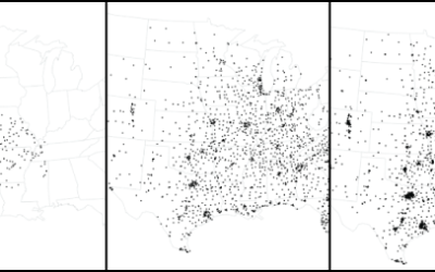
The world as one city
When we build models of the world, we often think of it broken…
-
Using search data to find drug side effects
Along the same lines as Google Flu Trends, researchers at Microsoft, Stanford and…
-
Link
General Social Survey
The General Social Survey has been running since 1972, and many questions have remain unchanged to make comparisons possible. The data from then to 2012 can now be downloaded in a variety of formats. [via]
-
Link
Hack D.C.
Hackathons to put open data to use.
-
Members Only
How to Make an Animated Growth Map in R
Although time series plots and small multiples can go a long way, animation can make your data feel more real and relatable. Here is how to do it in R via the animated GIF route.
-
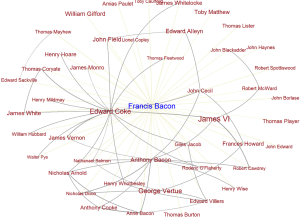
Six Degrees of Francis Bacon, a 17th century social network
These days it’s relatively easy to figure out connections between people via email,…
-
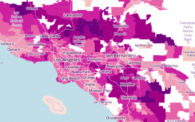
Average commute times mapped →
The United States Census Bureau just released county-level commute estimates for 2011, based…
-
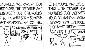
xkcd: Growing dating pool
An old one from xkcd. I’m not sure whether to laugh or cry,…
-
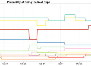
Bettings lines for becoming the next pope
Who’s going to be the next pope? I know all of you are…
-
Link
Teaching 2nd Graders About Maps
Cartographer Gretchen Peterson taught 70 second graders about maps. She talks about her positive experience and the kids’ excitement and makes the OSM index cards she used in the class.
-
Link
Three Decades of Decennial Data
The United States Census Bureau just made more data available via their API. You can now access decennial data for 1990, 2000, and 2010. The API isn’t especially advanced, but it’s a heck of a lot better than PDF tables.
-
Link
Visual Sedimentation
By Samuel Huron and Romain Vuillemot, Visual Sedimentation is “a JavaScript library for visualizing streaming data, inspired by the process of physical sedimentation.” Be sure to check out the examples.
-
SimCity 2013 is coming tomorrow
I’m not into video games, and my experience has been near zero since…
-
Netflix data and puppets
Andrew Leonard for Salon fears what might come of the creative process if…
-
Link
Meet the world’s top NBA gambler
ESPN profiled professional basketball gambler Bob Voulgaris. He shoots a lot of data into a predictive model for NBA games and then makes bets based on simulations. His ROI is falling.
-
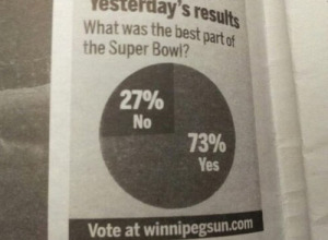
This pie chart is amazing.
From the Winnipeg Sun. Something isn’t right here. [via]…
Recently for Members
Second Edition
 Visualize This: The FlowingData Guide to Design, Visualization, and Statistics (2nd Edition)
 Visualize This: The FlowingData Guide to Design, Visualization, and Statistics (2nd Edition)
New tools, refined process.
Browse by Chart Type See All →


