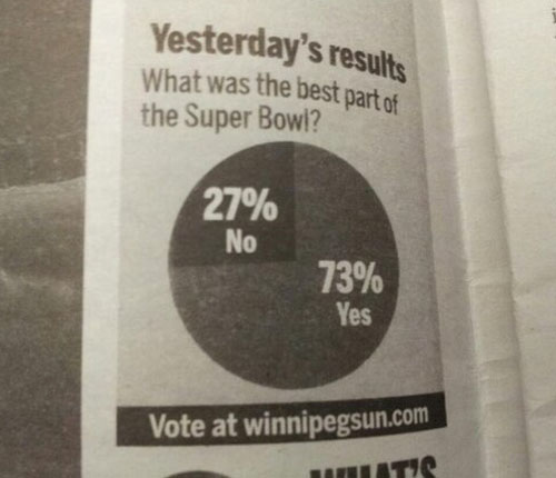
From the Winnipeg Sun. Something isn’t right here. [via]
This pie chart is amazing.
7 Comments
Second Edition
 Visualize This: The FlowingData Guide to Design, Visualization, and Statistics (2nd Edition)
 Visualize This: The FlowingData Guide to Design, Visualization, and Statistics (2nd Edition)
New tools, refined process.
I see the problem. Looks like the “no” wedge is really on showing 26%. Rookie mistake.
I’d have thought Benoce’s halftime show would be more popular.
73% of respondents think Yes – that “What” was the best part of the Superbowl.
First, no pie chart is amazing. Second, no graph depicting a single number is amazing. With that said, it is humorous in that the title is obviously wrong.
Here are some quality contributions from our top paper in Melbourne, Australia
http://i.imgur.com/K5yfmCn.jpg
http://i.imgur.com/w4GIYtZ.jpg
http://i.imgur.com/4XMQKnz.jpg
*laughs, then cries*
This made me chuckle, but Erik Jacobsen’s spot on identification of the problem made me laugh out loud.