Extract CSV data from PDF files with Tabula. A collaborative project from Mozilla Open News.
-
Link
Extract CSV data from PDF files with Tabula
-

Visualizing the Paris metro system
Data visualization group Dataveyes looks closer at the Paris metro system from a…
-
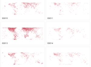
Locations of every photo from International Space Station
Over the last 12 years, astronauts have taken a lot of pictures from…
-
Doing good with data
Periscopic founders Kim Rees and Dino Citraro spoke with Co.Design on what makes…
-
Link
healthvis
The healthvis R package tries to make creation of interactive graphics easier by rendering in D3.
-
Link
Mining the Social Web
The example repository for Mining the Social Web if you’re interested in getting started. The Twitter examples rely on a soon to be defunct API, because the book was written in 2011, but the rest is still valid.
-
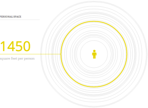
Personal space per person in various countries
How much space is there per person in different countries? Andrew Bergmann for…
-
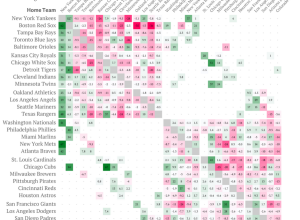
Analysis of baseball ticket pricing
If you’ve ever looked at ticket prices for sporting events, you probably noticed…
-
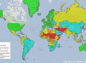
Map: Travel safety by country
As summer rolls around here on this side of the planet, CBC News…
-
Link
Looking for a data scientist?
Looking for a data scientist? Here’s what you should look for skills-wise.
-
I am away from my computer right now. brb.
I’m gonna be out of the country for a while. If all goes…
-
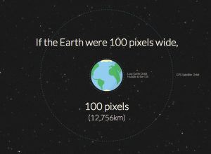
Distance to Mars
Long distances (and big numbers) can be difficult grasp. Designers Jesse Williams and…
-
A bar chart would be better
There’s a strand of the data viz world that argues that everything could…
-

Wall shelf represents water in snowpack
Melting snowpacks feed into streams and rivers and serve as a source of…
-
Introducing Data Points
Whoa, that was fast. Data Points is now available. Thanks to all of…
-
Data Points: Preview
This appeared at my door today. It’s awesome.
I suspect those who pre-ordered… -
Problematic databases used to track employee theft
Employee theft accounts for billions of dollars of lost merchandise per year, so…
-
How a cab driver makes money
According to the Bureau of Labor Statistics, cab drivers and chauffeurs make a…
-
Link
Imperative vs Declarative
Imperative vs Declarative programming. In the former you tell the computer how to do something, whereas with the latter, you tell the computer what to do. Worthwhile knowing with the recent launch of Vega. [via]
-
Link
The fallacy of new cartography
Cartographer Kenneth Field argues that mapping on the Web isn’t really new. The technology is new, but the underlying cartography needs to remain as foundation for the area to move forward.
Recently for Members
Second Edition
 Visualize This: The FlowingData Guide to Design, Visualization, and Statistics (2nd Edition)
 Visualize This: The FlowingData Guide to Design, Visualization, and Statistics (2nd Edition)
New tools, refined process.
Browse by Chart Type See All →


