From the Winnipeg Sun. Something isn’t right here. [via]…
oops
-
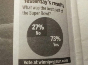
This pie chart is amazing.
-
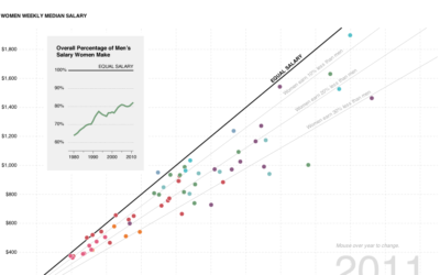
More on the pay gap graphic
A couple weeks ago, I looked at gender pay gap data to see…
Recently for Members
Second Edition
 Visualize This: The FlowingData Guide to Design, Visualization, and Statistics (2nd Edition)
 Visualize This: The FlowingData Guide to Design, Visualization, and Statistics (2nd Edition)
New tools, refined process.
Browse by Chart Type See All →


