Add another way to make state-level choropleth maps. Stately, a project by Intridea,…
-
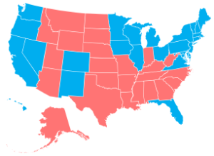
Stately: A simple map font
-
Link
CS547
The Stanford seminar lectures on human-computer interaction are all free to view online. They all look good, but lecture 6 on “living, breathing data” with Kim Rees from Periscopic should be of most interest.
-
Link
Finding and Making Sense of Geospatial Data on the Internet
Steven Citron-Pousty provides a thorough primer on finding and making sense of geospatial data on the Internet.
-
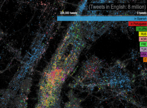
Languages of New York, via Twitter
In a follow-up to their map on most used languages in London, James…
-
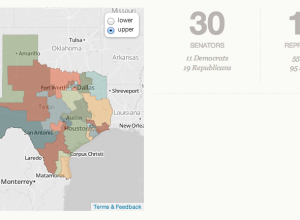
Learn about politics in your state with Open States
It’s not especially straightforward to know or find out what’s going on with…
-
Pope face composite
With Pope Benedict XVI’s resignation, 116 cardinals from various regions have to come…
-
Link
Advanced R development book
Hadley Wickham has been working on a book that covers advanced programming in R, namely programming concepts and workflow and package development. It goes to print later this year, but the contents are freely available for consumption now.
-
Link
The Art of Data-based Visual Narratives
Nicholas Felton, who you probably know from his annual reports, is giving a two-day workshop on May 27 to 28 in Berlin on designing data-based visual narratives. It’s limited to 20 participants, so it’ll probably be an up close and personal experience.
-
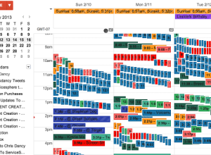
Over-the-top quantified self
Chris Dancy likes to track facets of his life. A lot. Above is…
-
Link
What Data Can’t Do →
A follow-up to this from David Brooks
-
Link
Curved Paths →
Possible path drawing in video games [via]
-
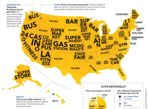
Map of Craigslist Missed Connections
On Craigslist there’s a section in the personals for “missed connections” which lets…
-
Link
Tech data journalism bootcamp →
A thorough recap of the event
-
Starting a New Stack
There’s a corner of my desk reserved for books, notes, papers, and other…
-
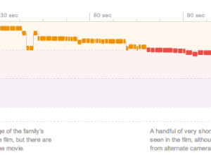
A dissection of movie trailers →
Shan Carter, Amanda Cox, and Mike Bostock for The New York Times, analyzed…
-
Link
MS in Data Science →
New 2-year program at NYU starting Fall 2013
-
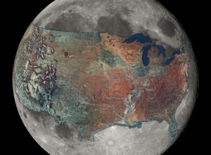
U.S. overlaid on the Moon for a sense of scale
How big is the Moon, really? Reddit user boredboarder8 provided some perspective with…
-
Link
Geocoding in Google Spreadsheets →
Nifty trick that uses Mapquest API as source
-
Link
Infographics and marketing: the good, the bad and the ugly →
Mostly ugly, but that’s not necessarily a bad thing
-
Members Only
Using Transparency in R to Improve Clarity
When you plot a lot of data at once, points and lines can obscure others and hide patterns. Transparency can help reveal what is really there.
Recently for Members
Second Edition
 Visualize This: The FlowingData Guide to Design, Visualization, and Statistics (2nd Edition)
 Visualize This: The FlowingData Guide to Design, Visualization, and Statistics (2nd Edition)
New tools, refined process.
Browse by Chart Type See All →


