Science graphics editor Jonathan Corum of The New York Times is great at distilling complex ideas for a wide audience. He gave a talk at Tapestry a while back. He also recently put up his deleted slides.
-
Link
Deleted Slides
-
A visualization of pi for high school math students
On Kickstarter: A project that uses a visualization of pi to connect Brooklyn…
-

Internet Census
Upon discovering hundreds of thousands open embedded devices on the Internet, an anonymous…
-
Link
We’ve Reached Peak Infographic, and We’re No Smarter for It
We’ve Reached Peak Infographic, and We’re No Smarter for It. Add another to the list of people who are tired of infographics that don’t say much. Again though, it’s best not to get too bent out of shape over low-quality work, and energy is much better spent working on things that shine.
-
Declining songwriter ratings with age
Do singer-songwriters age well like a fine wine, or does quality decline with…
-
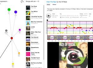
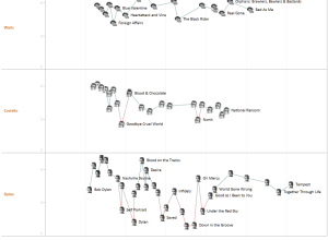
Interactive: Common chord progressions in 1,300 songs
If you listen to the radio long enough, you’ve probably noticed that many…
-
A new brand of cartographer
Emily Underwood on new cartographers and the growing field:
Geographers have traditionally studied… -
How to be Interesting by Jessica Hagy
Jessica Hagy, the one who made Venn diagrams on index cards popular, has…
-

Monitor your surroundings with these sensors
It wasn’t long ago that sensors and personal tracking seemed like pure nerdery.…
-
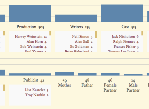
An exploration of how Oscar winners express gratitude
Each year, Oscar speeches seem to follow a similar format, with familiar names…
-
Link
Geo Point Plotter
Geo Point Plotter by Derek Watkins is a quick and dirty mapper. Copy and paste latitude and longitude coordinates, and you get a simple map with dots on it.
-
Link
John Snow’s Cholera data in more formats
John Snow’s Cholera data in more formats. Includes death locations, pump locations, the original map, and Ordinance Survey maps. This could be useful for a class or if you want to kick the tires on some mapping software.
-

App shows what the Internet looks like
In a collaboration between PEER 1 Hosting, Steamclock Software, and Jeff Johnston, the…
-
Other ways to follow FlowingData
With Google Reader closing its doors in July (which stinks because I use…
-
Link
A Globe Hack and Good Old Mercator
A Globe Hack and Good Old Mercator. An illustration of the Mercator map projection using pennies. There’s some distortion.
-
Feltron 2012 Annual Report
Today might be pi day, but yesterday was Feltron Report day. The theme…
-

Choosing the right seat →
It can be tricky picking the right seat at a dinner party. So…
-
Link
Nate Silver Discusses Data Bias, Strangeness of Fame
-
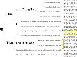
Word tree for any URL or Twitter username
In 2007, Martin Wattenberg and Fernanda Viégas created the word tree, a search…
-
Data hackathon challenges and why questions are important
Jake Porway, executive director of DataKind on data hackathons and why they require…
Recently for Members
Second Edition
 Visualize This: The FlowingData Guide to Design, Visualization, and Statistics (2nd Edition)
 Visualize This: The FlowingData Guide to Design, Visualization, and Statistics (2nd Edition)
New tools, refined process.
Browse by Chart Type See All →


