How to Make a Semicircle Plot in R
It’s the half cousin of the bubble plot with less overlap and more straight edges.
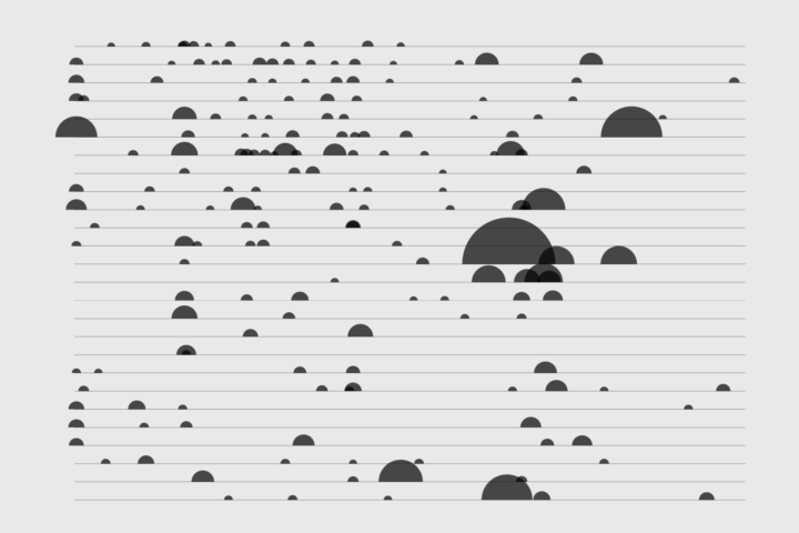
The semicircle plot isn’t used all that often, but in select cases it can be more useful than its full-circled cousin the bubble plot. Since a half circle represents each data point instead of a full one, there’s simply less overlap when you have more data to show.
The most recent example (and maybe the only one that I can think of off the top) from Kevin Quealy at The New York Times showed the cost of natural disasters form 1980 to 2017.
“The Cost of Hurricane Harvey” by Kevin Quealy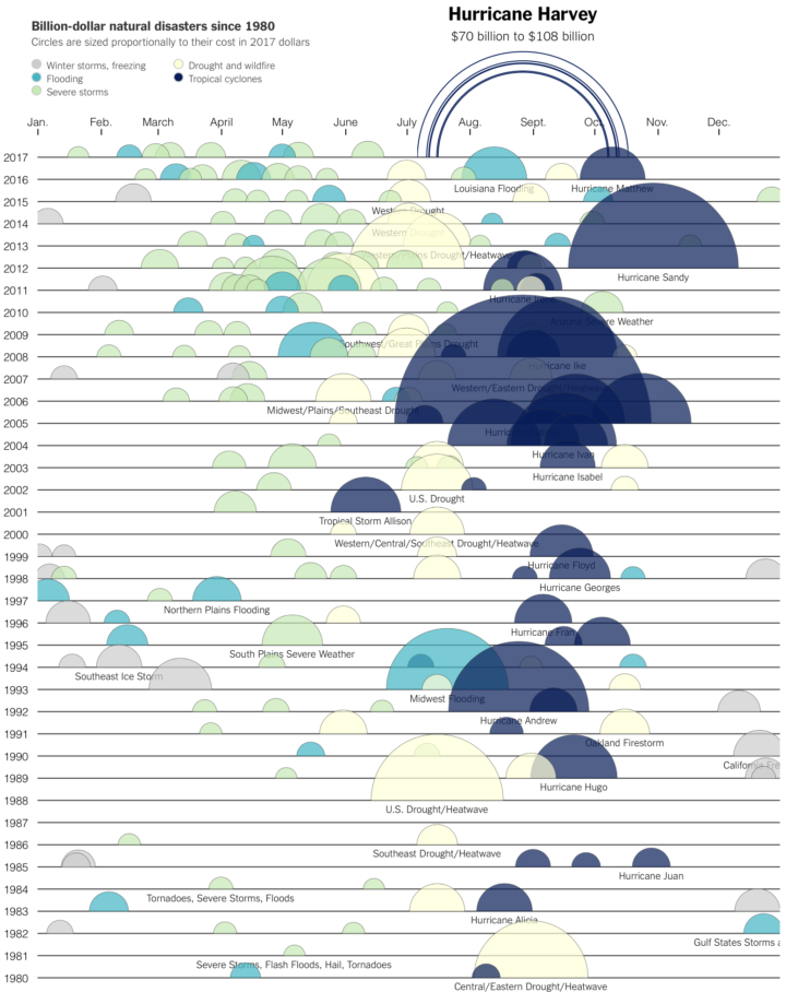
I like how the straight edge of each semicircle serves as an anchor for time. If a semicircle is on the same line as another, the two occurred during the same year. If full circles were used, there’d be a lot more overlap and the line of time wouldn’t look as obvious.
To access this full tutorial, you must be a member. (If you are already a member, log in here.)
Get instant access to this tutorial and hundreds more, plus courses, guides, and additional resources.
Membership
You will get unlimited access to step-by-step visualization courses and tutorials for insight and presentation — all while supporting an independent site. Files and data are included so that you can more easily apply what you learn in your own work.
Learn to make great charts that are beautiful and useful.
Members also receive a weekly newsletter, The Process. Keep up-to-date on visualization tools, the rules, and the guidelines and how they all work together in practice.
See samples of everything you gain access to:
About the Author
Nathan Yau is a statistician who works primarily with visualization. He earned his PhD in statistics from UCLA, is the author of two best-selling books — Data Points and Visualize This — and runs FlowingData. Introvert. Likes food. Likes beer.