How to Make Unit Charts with Icon Images in R
Make the unit chart less abstract with icons that represent the data, or use this in place of a bar chart.
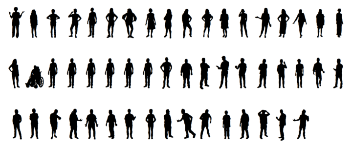
You’ve probably seen the charts where instead of dots, icons represent data points to provide a less abstract representation of the subject material. A lot of the time it’s people silhouettes, which is why there’s a People font.
The font is for the web though. There’s a straightforward way to do this in R. We’ll draw from a previous tutorial on unit charts for organization and grids, so the main task is figuring out how to load and place images on a plot.
To access this full tutorial, you must be a member. (If you are already a member, log in here.)
Get instant access to this tutorial and hundreds more, plus courses, guides, and additional resources.
Membership
You will get unlimited access to step-by-step visualization courses and tutorials for insight and presentation — all while supporting an independent site. Files and data are included so that you can more easily apply what you learn in your own work.
Learn to make great charts that are beautiful and useful.
Members also receive a weekly newsletter, The Process. Keep up-to-date on visualization tools, the rules, and the guidelines and how they all work together in practice.
See samples of everything you gain access to:
About the Author
Nathan Yau is a statistician who works primarily with visualization. He earned his PhD in statistics from UCLA, is the author of two best-selling books — Data Points and Visualize This — and runs FlowingData. Introvert. Likes food. Likes beer.