How to Make a Multi-line Step Chart in R
For the times your data represents immediate changes in value.
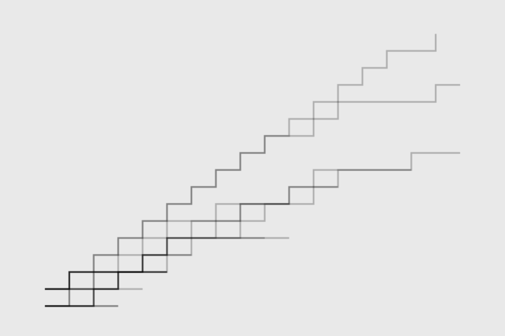
The step chart is a way to show immediate changes in value over time and can be good for discrete values. For example, postage prices change right away, but if you were to show it with a line chart, it would look like the price steadily rose.
In R, to show a single step line, you can use the plot() function and set the type to “s”. However, to draw multiple step lines, you take a few extra steps.
To access this full tutorial, you must be a member. (If you are already a member, log in here.)
Get instant access to this tutorial and hundreds more, plus courses, guides, and additional resources.
Membership
You will get unlimited access to step-by-step visualization courses and tutorials for insight and presentation — all while supporting an independent site. Files and data are included so that you can more easily apply what you learn in your own work.
Learn to make great charts that are beautiful and useful.
Members also receive a weekly newsletter, The Process. Keep up-to-date on visualization tools, the rules, and the guidelines and how they all work together in practice.
See samples of everything you gain access to:
About the Author
Nathan Yau is a statistician who works primarily with visualization. He earned his PhD in statistics from UCLA, is the author of two best-selling books — Data Points and Visualize This — and runs FlowingData. Introvert. Likes food. Likes beer.