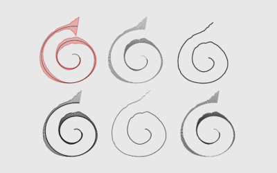
Now that we’ve discovered another way to annoy chart snobs, here’s how you can make your own spirals.
R
-
Members Only
A Quick and Easy Way to Make Spiral Charts in R
-
Members Only
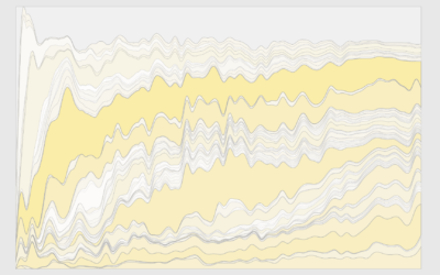
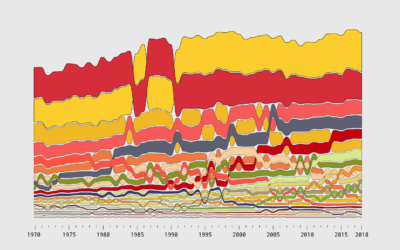
How to Make a Custom Stacked Area Chart in R
You could use a package, but then you couldn’t customize every single element, and where’s the fun in that?
-
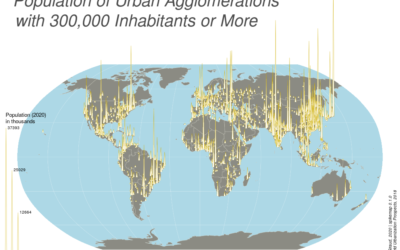
Spike maps in R
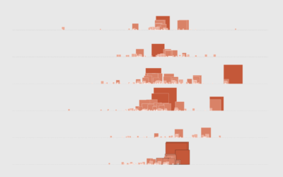
Spike maps use the height of spikes to encode data geographically. The format…
-
A Succinct Intro to R
Before you get into analysis and visualizing data with R, you need to…
-
Members Only
How to Make Print-ready Graphics in R, with ggplot2
You don’t have to use illustration software to polish your graphics. If keeping everything in R is your thing, this tutorial is for you.
-
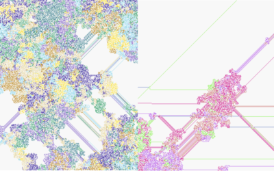
Generative art with R
Generative art seems to be having a moment right now, so it’s only…
-
Members Only
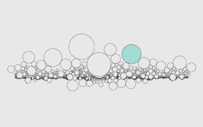
How to Use Packed Circles in R
Adjust coordinates, geometries, and encodings with packed circles to make various types of charts.
-
Value of R, the Statistics-specific language
Paul Ford has been learning R to better understand the field of Statistics.…
-
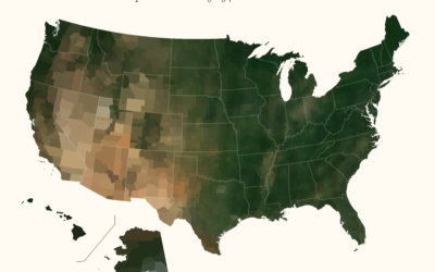
Average color of geographic areas
Based on satellite imagery, Erin Davis found the average color of places around…
-
Members Only
How to Make Alluvial Diagrams
Here’s how to do it in R from start to finish, plus editing in illustration software. Make design choices and trade-offs for more readable charts.
-
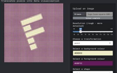
Transform an image into a pixel-ly visual
Here’s a fun interactive by Duc-Quang Nguyen. Upload an image and get back…
-
Members Only
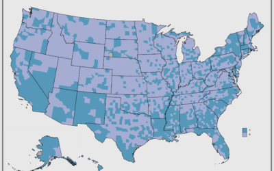
Making a Quick, Custom Prevalence Map – The Process 139
This week I’m describing my process behind a quick map. You can download the code at the end of this issue.
-
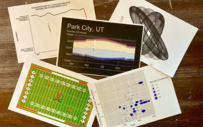
Send postcards of plots made in R
How many times have you made a plot in R and thought, “I…
-
Members Only
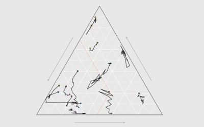
How to Make Ternary Plots in R, with ggplot2
When you want to compare between three parts of your data, ternary plots might be a good option. Here is how to make them.
-
Introducing a New Course on Mapping Geographic Data in R, with ggplot2
I’m happy to announce a new course on mapping geographic data in R,…
-
R graphics get modern text support, with ragg package
Thomas Lin Pedersen announced the ragg package, which makes font usage in R…
-
Parsing a table from an image
Thomas Mock explains how to extract and parse data tables in image files…
-
Turn images into LEGO builds in R
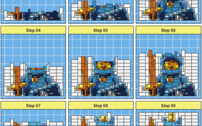
The brickr package in R by Ryan Timpe takes an image, converts it…
-
Members Only
How to Make Symbol-based Glyph Charts, with R Examples
Using geometric shapes as an encoding can provide another dimension to your charts.
-
Making map art in R
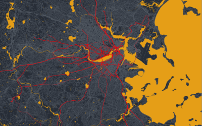
If you can make maps in your software and customize the aesthetics, you…


 Visualize This: The FlowingData Guide to Design, Visualization, and Statistics (2nd Edition)


