How to Make Ternary Plots in R, with ggplot2
When you want to compare between three parts of your data, ternary plots might be a good option. Here is how to make them.
You might not have heard about ternary plots, but in some fields they are quite popular. In chemistry, for example, they are used to show the characteristics of 3-component alloys and 3-component gas mixtures.
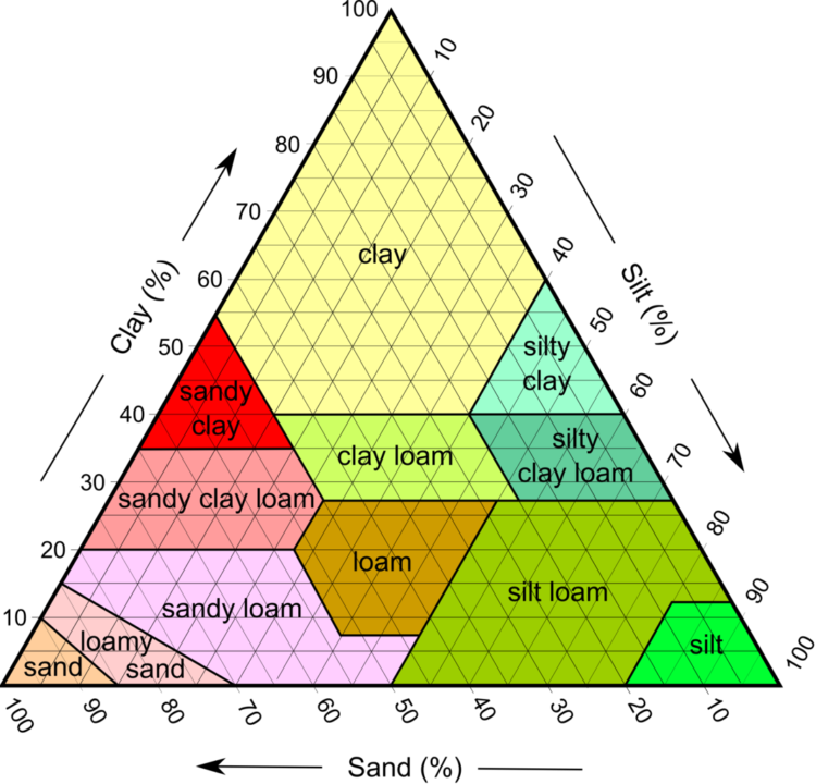
In soil sciences, they are ubiquitous. Soils are classified by the fractions of silt, clay and sand:
See Wikipedia for more.
Imagine a soil scientist wanting to classify a soil sample composed of 50 percent clay, 30 percent sand and 20 percent silt. Plotted on a ternary plot, the sample would be placed like this (take note of the colors):
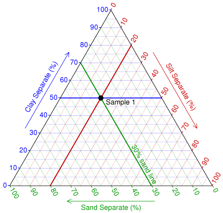
Looking back at the first ternary plot above, you can see that this sample would be classified as a clay soil.
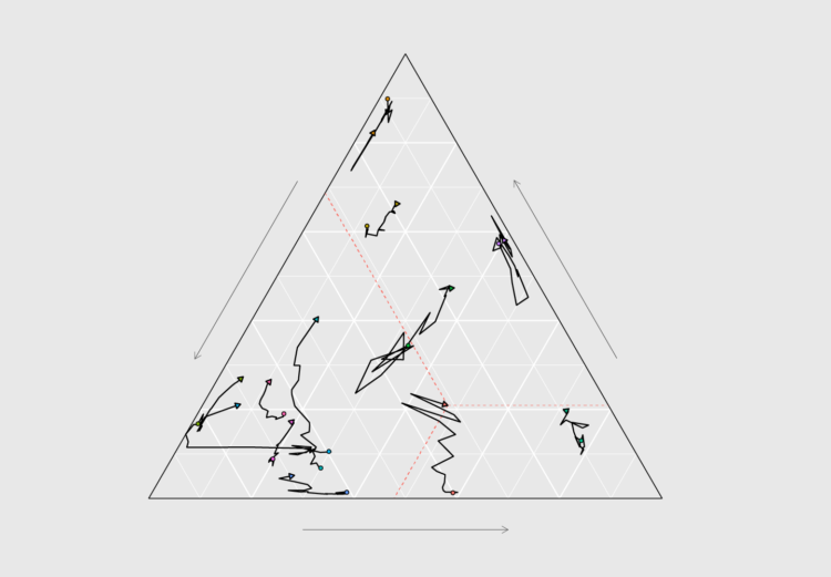
The way countries source energy from fossil fuels, renewables and nuclear energy is another 3-component mixture that lends itself very well to visualization with ternary plots. In this tutorial, you’ll learn how to read ternary plots, and how to make them with ggplot2.
To access this full tutorial, you must be a member. (If you are already a member, log in here.)
Get instant access to this tutorial and hundreds more, plus courses, guides, and additional resources.
Membership
You will get unlimited access to step-by-step visualization courses and tutorials for insight and presentation — all while supporting an independent site. Files and data are included so that you can more easily apply what you learn in your own work.
Learn to make great charts that are beautiful and useful.
Members also receive a weekly newsletter, The Process. Keep up-to-date on visualization tools, the rules, and the guidelines and how they all work together in practice.
See samples of everything you gain access to:
About the Author
Maarten is a data journalist and data visualization consultant from Belgium. He likes maps, ggplot and a good story.