Tutorials  / 

A Quick and Easy Way to Make Spiral Charts in R

Now that we’ve discovered another way to annoy chart snobs, here’s how you can make your own spirals.

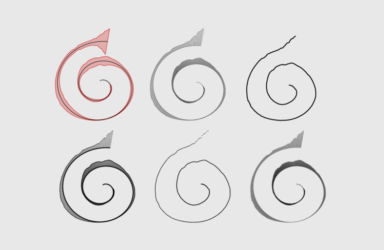
Many people were dismayed by a spiral chart that served as a header image for a New York Times Opinion piece:

The graphic was made by Gus Wezerek and Sara Chodosh.

I thought it was fine. Others had other opinions.

Disregarding whether or not it was the “best” way to visualize the data, clearly the more important question is how to make such a chart. Here’s how to make it in R.

Assuming you already have R installed, all you need is the spiralize package by Zuguang Gu. Bring the data, and it does all the spiraling calculations for you.

Install the package with the package installer (found via the main menus) or enter the following in the R console:

install.packages("spiralize")

Then load the package:

library("spiralize")

Load data

Like the original NYT chart, you’ll visualize the 7-day average of Covid-19 cases in the United States. I’ve included the relevant data in the download of this tutorial, but you can download it direct from Our World in Data.

Make sure your working directory in R is set to wherever you downloaded the tutorial source. The file path, in this case “data/owid-covid-data.csv”, is relative to your working directory.Load the data:

covid <- read.csv("data/owid-covid-data.csv", stringsAsFactors = FALSE)

Subset to just the United States, and create a column dt, which is a Date-Time object version of the date column:

us <- covid[covid$location == "United States" & !is.na(covid$new_cases_smoothed),]
us$dt <- strptime(us$date, format="%Y-%m-%d")

To match the NYT version, also subset to dates prior to January 7, 2022:

us <- us[us$dt < "2022-01-07",]

Get the maximum case count:

ymax <- max(us$new_cases_smoothed)

Make spiral

Initialize the spiral by setting the time range (January 1, 2020 to January 6, 2022), the units of time (days), and what each spiral round means (years):

# Initialize.
spiral_initialize_by_time(xlim=c("2020-01-01 00:00:00", "2022-01-06 00:00:00"), 
                          unit_on_axis = "days", period="years",
                          start=90, end=(709/365)*360+(28/365)*360+90,
                          flip="horizontal")

The start argument indicates that the spiral should start at 90 degrees. The end argument indicates in degrees where the spiral ends. Here’s what you get:

Then create the “track” of the spiral. This is where you specify the range of the data. If you’re thinking in Cartesian coordinates instead of polar, it’s like setting the y-range in your plot.

# Create the track.
spiral_track(ylim=c(0, ymax*.7),
             background=FALSE, background_gp = gpar(col = NA, fill = NA))

You might want to consult the stacked area chart tutorial for more on drawing polygons.Then draw the polygon, which puts half the case count on the bottom and the other half on top:

# Use a polygon.
spiral_polygon(x=c(us$dt, rev(us$dt)), 
               y=c(us$new_cases_smoothed/2, -rev(us$new_cases_smoothed/2)),
               gp = gpar(col="#d32e2b", fill="#d32e2b50"))

The result:

Almost there.

In the source, you can see how I extended the baseline to start at January 1, 2020. The U.S. data starts on January 28, 2020.Draw the middle line:

# Middle baseline.
spiral_lines(x=us$dt, y=0)

At this point, I’d export and bring into Adobe Illustrator to edit, which I’m pretty sure is what Wezerek and Chodosh did. But the spiralize package also provides a spiral_text() function if you want:

# Text.
spiral_text(x="2020-01-01", y=50000, text="2020", 
            facing = "curved_inside", just = "right",
            gp=gpar(cex=1, fontfamily="Courier"))
spiral_text(x="2021-01-01", y=50000, text="2021", 
            facing = "curved_inside", just = "right",
            gp=gpar(cex=1, fontfamily="Courier"))
spiral_text(x="2022-01-01", y=50000, text="2022", 
            facing = "curved_inside", just = "right",
            gp=gpar(cex=1, fontfamily="Courier"))

It seemed finicky in my testing though:

So do what you want with that information.

Wrapping up

I split this up into pieces so that you can understand the steps, but overall it’s only a few lines of code that do the following after loading the data:

  1. Setup the plotting area.
  2. Add the visual encodings.

Get all the details on the GitHub page.Nifty. There are also more options beyond the line and polygon. You can draw bars, dots, vertical lines, points and segments.

If you can draw a regular plot in R, then you can use the spiralize package to make the same plot in spiral form. Everyone will love it, I assure you.

If you’re interested in working with spirals in R from scratch (for maximum control), there’s another tutorial for that.

Made possible by FlowingData members.
Become a member to support an independent site and learn to make great charts.

See What You Get

About the Author

Nathan Yau is a statistician who works primarily with visualization. He earned his PhD in statistics from UCLA, is the author of two best-selling books — Data Points and Visualize This — and runs FlowingData. Introvert. Likes food. Likes beer.

13 Comments

  • Matthew Pausley February 4, 2022 at 9:26 am

    I think this is brilliant alternative to linear timelines. Is it something you’d put in a refereed article? Unlikely, but it has its place.

  • ylim=c(0, ymax*.7)
    why?

    • Kenny, good question. That’s me trying to get the reproduced chart to look closer to the original. When I was using spiral_polygon(), it wasn’t showing the negative coordinates as I expected at first, so I adjusted the limits of the track until I ended up with a ylim from 0 to 0.7.

      • This is a puzzling figure. If you choose the data of other countries as the sample, it will become another number, and it is difficult to find a value to make the graph symmetrical.

      • By symmetrical, do you mean on the same scale for every country? In this case, I’d set ymax to the maximum new_cases_smoothed in the dataset instead of just one country. That way you’d have a fixed y-scale across countries. Or am I misunderstanding?

        Testing it out now, you can also set ylim to -ymax/2 to ymax/2 and that’ll work. But again, I was trying to match the original and needed the end up the spiral to go wider.

      • Well done, ylim=c(-ymax/2,ymax/2) is a good solution. About symmetry, I thought at first that the negative coordinates of the polygon would be symmetric with the positive coordinates, but then I thought about it and found that asymmetry is normal.

      • Ah, I get you. Yeah, it won’t quite be symmetrical in this polygon case since the base radius on the negative side is always going to be smaller than on the positive side.

      • Yes. Anyway, thanks a lot.

  • Ann Lowney April 10, 2023 at 6:20 am

    Hi Nathan,

    Thanks for this tutorial. I followed along fine until the text part! I have a very simple file with two columns. Column 1 is months from March – November and Column 2 is total absenteeism per month.

    I want to be able to add the months on the corresponding tracks so; March, April, May, June, etc. I am pulling my hair out trying to make it work. I’d rather do it in R then export to Figma to edit, any tips?!

    • Hi Ann! It sounds like you got the spiral part going with your data? If so, I’m guessing you might want to look at the xlim and ylim that you give to spiral_track(). Then adjust the coordinates of your text with spiral_text() to be within those limits.

      For example, in the above snippet with spiral_text(), the y value is set to 50000, because that’s the middle of the y-range of the dataset.

  • Nathan, thank you so much for the prompt reply! Your guidance was exactly what I needed, you’re a great teacher!

Add Comment

You must be logged in and a member to post a comment.