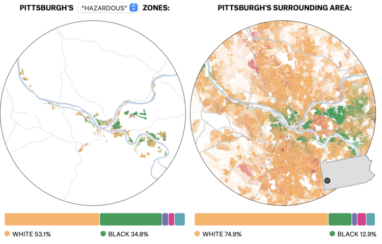
Niko Kommenda for The Guardian used small multiples to show 90 of the largest glaciers in the world and how they have melted over many decades. The animation transitions between two time periods for each glacier, showing what was there earlier and what is left.
-
The Census Bureau released state population counts for 2020. Here’s how each state gained and lost population and seats.
-
Since 1972, the General Social Survey has asked people about their happiness. It never changed much — until 2020 happened.
-
The Census Bureau announced their state population totals, so we can see who gained and lost seats:
The tables aren’t accessible yet, but during the live conference, the bureau noted that the difference between New York losing a seat (which they did) and staying the same was only a difference of 89 people. It’ll be interesting to see these small deltas for all the states.
-
The 2020 Census count at the state level is set for release this afternoon, April 26 at 12pm PST. While we wait, Gregory Korte and Allison McCartney, reporting for Bloomberg, show which states are expected to lose and gain representation.
I appreciate the streamgraph that shows how the distribution of seats changed over the decades, along with the bar chart mouseover so you can see the shift for each state individually.
-
In another look at migration through the lens of USPS change of address data, Bloomberg CityLab shows where people moved during the pandemic, focusing on movement in and out of metro areas. With the exception of San Francisco and New York, most areas didn’t see much movement distance-wise:
Even in the biggest metro areas, most people didn’t go very far. In the country’s 50 most populous cities, 84% of the moves were to somewhere within the perimeter of the central metro area, down just slightly from pre-pandemic levels. Many of the most local moves were likely related to the economic downturn: A February Pew Research Center survey of those who moved during the pandemic found that the most common reason people cited was financial distress including job loss.
See also similar conclusions by The New York Times and Financial Times.
While there wasn’t the mass exodus that some imagined, the pandemic did seem to speed up some trends. So as we wait for the 2020 Census count, which comes out out this afternoon, it’ll be interesting to see if the rate of change continues in the coming years.
-
Oftentimes visuals generated through code can seem cold and mechanical when you’re after something more warm that breathes life. Introducing organized noise into the mix is one path. Varun Vachhar describes how you might use noise in the context creative coding.
-
Riffing on the Ever Given Ever Ywhere, which lets you place the Ever Given container ship anywhere on a map, Stamen built Scale-a-Tron, which lets you place anywhere on a map, well, anywhere on a map.
Just draw a polygon around an area and then pan to compare the scale of your selected area against anywhere in the world. It’s scale-rific.
-
Members Only
-
Nate Sloan and Charlie Harding, for NYT Opinion, look at how the structure of songs have changed to fit with the current methods that people consume media:
It’s inescapable that today’s aspiring artists and songwriters must operate, for survival, in a landscape of streaming services and social media. From Spotify to TikTok, the goal is to create music that will grab a listener’s attention from beginning to end. You’re not just competing against other creators. You’re also competing against everything else that takes up our time: podcasts, TV, apps and more. So to keep streaming consumers engaged, it is increasingly common for songs to begin in medias res — with a hook, followed by a hook and ending with another hook.
Put your headphones on and turn the volume up for maximum effect. The combination of the songs, visual breakdown, and words work well together to help you understand song structure.
Now I know why my brain is often confused when I hear a full song, instead of a looping chorus on TikTok.
-
Steven Bernard for Financial Times, in a report by Claire Bushey and Steff Chavez, mapped net inflows (paywalled), based on property searches on home listing site Redfin. This shows a slightly different angle from NYT’s analysis, which showed less change year-over-year.
-
This past year has seen a rising interest in long-lost hobbies due to shelter-in-place, social distancing, and lockdown orders. Google Trends and Polygraph charted the hobbies that saw the biggest spikes each day of the year.
I’m surprised that sourdough or bread-making is on there, but maybe they didn’t fall under the hobby definition they used.
-
With the restrictions of the pandemic, you might expect an unusually big wave of people leaving cities for more open space. Using USPS’s change of address data, Jed Kolko, Emily Badger and Quoctrung Bui, for NYT’s The Upshot, show that this was not quite the case.
This surprised me, because I live in a suburban area that saw a flux of home buyers, which made prices approach ridiculous ranges. I wonder what in- and out-migration look like separately, on relative and absolute scales.
-
Researchers from NVIDIA and Cornell University made GANcraft:
GANcraft aims at solving the world-to-world translation problem. Given a semantically labeled block world such as those from the popular game Minecraft, GANcraft is able to convert it to a new world which shares the same layout but with added photorealism. The new world can then be rendered from arbitrary viewpoints to produce images and videos that are both view-consistent and photorealistic.
This is impressive, but what amazes me more is that Minecraft is still very much a thing after all these years.
-
Danielle Ivory, Lauren Leatherby and Robert Gebeloff for The New York looked at voting from the 2020 election and vaccination rates at the state and county levels. The strength of correlation is surprising. The existence of the correlation is not.
-
The CDC says it’s safe to travel now if you’re vaccinated, so you may or may not want to see this, but The New York Times shows how air particles circulate through an airplane.
-
Mel Dollison and Liza Daly made a fun interactive that lets you upload an image, and it spits out a vintage-looking color analysis a la Vanderpoel:
This generator is based on the works of Emily Noyes Vanderpoel (1842-1939), who hoped her original color analyses would inspire others to study “whatever originals may be at hand in books, shops, private houses, or museums.” We hope you are similarly inspired by her abstract, modernist style employed in the context of everyday objects and photos.
Originally conceived as a Twitter bot, you can find the Python code behind the project on GitHub.
-
Quoctrung Bui and Sarah Kliff for NYT’s The Upshot used difference charts to show how current airfare prices are approaching 2019 prices, based on data from travel app Hopper. This seems to indicate that people are getting ready to travel again.
Because airfare is typically purchased weeks or months in advance, it can be a barometer of how the public is feeling about the pace of recovery. The prices in the Hopper data, which includes fares displayed over three years of searches (representing billions of flight queries), now suggest a travel recovery that could be in full effect as early as this summer.
The red shade between each line shows the difference between prices year-over-year. Usually the area color in difference charts reflects the metric that is greater, but in these, the area reflects the metric that is less. That confused me for a second. But I’m curious if you’re not familiar with difference charts, do you just see the pattern correctly right away?
-
Members Only
-
For Politico, Beatrice Jin provides an illustrated guide on stopping a pandemic before it starts. Some scientists suggest going to the source, which often is from interacting with animals, and as you’d expect, cutting off the livelihood of millions around the world would be a complex process.