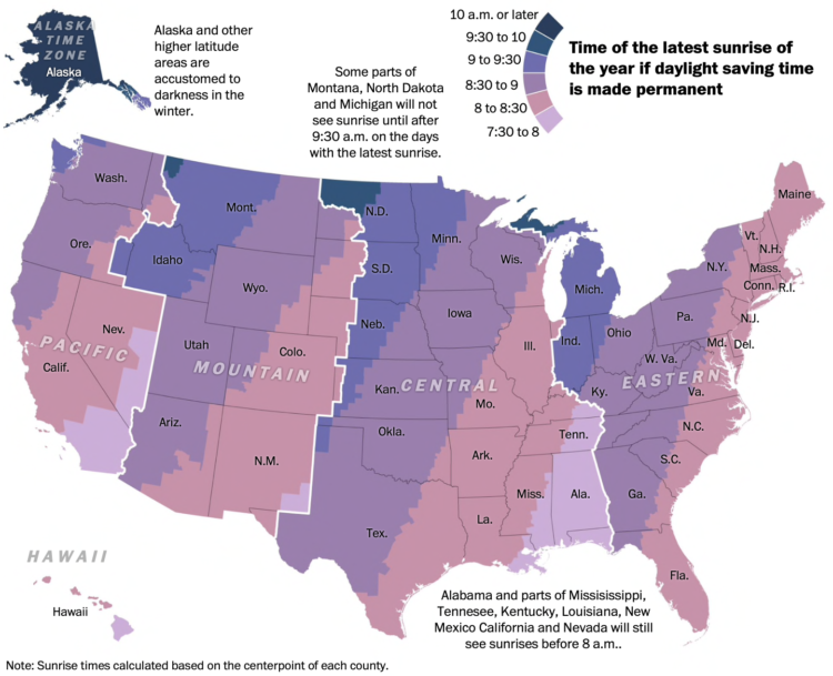
• Membership
  • Newsletter
  • Projects
  • Learning
  • About
  • Member Login
  • Scale of ocean depths

    November 12, 2021

    Topic

    Infographics  /  3-d, depth, MetaBallStudios, ocean, scale

    [arve url=”https://www.youtube.com/watch?v=Q5C7sqVe2Vg” loop=”no” muted=”no” /]

    We know the oceans are deep, but it’s difficult to grasp the scale of just how deep, because, well, it’s underwater. MetaBallStudios, a YouTube channel that focuses on perspective and 3-D animation, guides you through the depths of major bodies of water. You’ll pass notable on-land monuments along the way. [via kottke]

  • Optimizing retail spaces

    November 12, 2021

    Topic

    Statistics  /  New York Times, optimization, privacy, retail, shopping

    Patrick Sisson for The New York Times reports on the growing popularity of tracking customer movement in stores:

    Complicating efforts to address privacy concerns is a lack of regulatory clarity. Without an overarching federal privacy law or even a shared definition of personal data, retailers must sort through layers of state and municipal rules, such as California’s Consumer Privacy Act, said Gary Kibel, a partner at the law firm Davis+Gilbert who specializes in retail privacy.

    Technology companies counter the pushback by noting that their systems are designed to limit what they collect and anonymize the rest. For instance, Standard AI’s system does not capture faces, so they cannot be analyzed with facial recognition technology.

    Uh huh.

  • Members Only

    Goodbye, Chartjunk – The Process 164

    November 11, 2021

    Topic

    The Process  /  chartjunk

    A term to indicate that visual elements add nothing meaningful has itself become nonessential to making and discussing charts.

  • Palm oils and rainforest destruction

    November 11, 2021

    Topic

    Statistical Visualization  /  Bloomberg, palm oil, rainforest

    Palm oil is in our food, cosmetics, cleaning supplies, and biofuels, but it has no flavor or color, so we’re not really aware of how much we use — on average 8 kilograms per year. Bloomberg explains why this is problematic, starting with the farmers, to the producers, to the consumers.

  • Commuting calculator

    November 10, 2021

    Topic

    Infographics  /  commute, scale, Sergio Peçanha, Washington Post

    Sergio Peçanha and Yan Wu for The Washington Post made a calculator that shows how much time you spend commuting in a year and what you could do with that time instead. The input, interaction, and calculations are straightforward. Just use the slider to specify your roundtrip commute time, and the numbers update.

    The easiest thing to do would be to just provide the total hours. You commute for an hour per day? That’s 250 hours in a year. That seems like a lot of time, but on its own it’s an abstract calculation. The interactive takes the natural next step with what you could do with that time, which makes the calculation more tangible.

    I do the same thing when describing money saved. A few dollars here and there doesn’t seem like much, but extrapolate that to Jack in the Box tacos, and you’re getting somewhere.

  • Data Underload  /  work

    How Much Women and Men Work

    This chart shows the shifts since 1960.

    Read More
  • Painbow color scale

    November 8, 2021

    Topic

    Statistical Visualization  /  color, humor, xkcd

    xkcd poked fun at the sometimes questionable color choices of researchers.

  • Rising prices of everything

    November 5, 2021

    Topic

    Statistical Visualization  /  coronavirus, prices, spending, Washington Post

    Using Consumer Price Index, Alyssa Fowers and Rachel Siegel for The Washington Post show how the prices of everyday things rose since 2019. A set of baseline charts show lines moving up much more than one would hope, due to coronavirus and supply chain issues.

  • Members Only

    Not the Best List of Visualization Tools – The Process 164

    November 4, 2021

    Topic

    The Process  /  list, tools

    All the tools are a product of visualization’s many uses, which isn’t so terrible. But not all the tools are champions.

  • Sonified animation of London Covid-19 rates

    November 4, 2021

    Topic

    Data Art  /  coronavirus, London, sonification

    [arve url=”https://vimeo.com/571217327″ loop=”no” muted=”no” /]

    Valentina D’Efilippo, Arpad Ray, and Duncan Geere visualized and sonified Covid-19 rates and vaccinations in London Under the Microscope. Best viewed with headphones on. Geere on the sound:

    Here’s how it works. There are two melodic saw wave drones separated by an octave – the higher represents cases, and the lower represents deaths. The chords that make them up each reflect the balance of different variants over time. As the data spikes, so does the filter cutoff.

    The bassline reflects movement data. When people are moving around the city a lot, you hear the bassline move faster. During lockdown, when people were confined to their homes, it slows to a single beat for each bar.

  • Where cancer risk is greater due to air pollution

    November 3, 2021

    Topic

    Maps  /  cancer, pollution, ProPublica

    Based on five years of data from EPA models, ProPublica mapped areas in the United States where cancer risk is higher due to air pollution:

    In all, ProPublica identified more than a thousand hot spots of cancer-causing air. They are not equally distributed across the country. A quarter of the 20 hot spots with the highest levels of excess risk are in Texas, and almost all of them are in Southern states known for having weaker environmental regulations. Census tracts where the majority of residents are people of color experience about 40% more cancer-causing industrial air pollution on average than tracts where the residents are mostly white. In predominantly Black census tracts, the estimated cancer risk from toxic air pollution is more than double that of majority-white tracts.

    Interact with the full map here.

  • Tracking the Lenna image

    November 2, 2021

    Topic

    Statistics  /  Jennifer Ding, Lenna, Pudding

    If you’ve taken classes that cover image processing, you’ve likely come across the Lenna image. It’s a headshot of Lena Forsén taken from Playboy Magazine in 1972. For The Pudding, Jennifer Ding, with Jan Diehm and Michelle McGhee, looked at use of the image in research over the years — despite copyright claims and Forsén’s wish for researchers to move on to a different image.

    Ding used a straightforward bar chart to show the pattern over time, but the annotation provides a layer of context that tells you what those peaks and valleys mean.

  • Check the frequency of salmonella in your chicken

    November 1, 2021

    Topic

    Statistical Visualization  /  chicken, food, ProPublica, salmonella

    The USDA recommends that you cook your chicken to at least 165°F to kill salmonella bacteria (time is also a factor), which appears to be more common than I would hope. ProPublica has a Chicken Checker so that you can find out. Look up the poultry product number on your pack of chicken, and you can see what percentage of USDA samples from the respective processing plant had salmonella.

    A beeswarm chart shows how the plant’s rate compares to other plants that process the same type of poultry.

    All I can think about now is that trend on social media from a while back where people cooked their chicken to rare. Mmm, salmonella.

  • alt.VIS

    October 29, 2021

    Topic

    Visualization  /  conference, IEEE

    The IEEE VIS 2021 conference is running virtually this week, and there’s a lot of work that’s caught my eye but I haven’t had the chance to look through it all yet. One of those things is the alt.VIS workshop that lead into the conference. The papers included such topics as Towards a Theory of Bullshit Visualization, Visualization for Villainy, and Manifesto for Putting Chartjunk in the Trash 2021!.

    I’m giving this a hard bookmark to read later.

  • Members Only

    Visualization Tools and Resources, October 2021 Roundup

    October 28, 2021

    Topic

    The Process  /  roundup

    Here’s the good stuff for October.

  • Bend the emissions curve

    October 28, 2021

    Topic

    Statistical Visualization  /  climate change, emissions, New York Times

    There has been progress since the Paris climate agreement in 2014, but there’s still more to do. Brad Plumer and Nadja Popovich for The New York Times look at the possible paths we could take.

  • How to Make a Custom Stacked Area Chart in R

    You could use a package, but then you couldn’t customize every single element, and where’s the fun in that?

  • Mapping the probable heat around the world

    October 28, 2021

    Topic

    Maps  /  climate, global warming, Probable Futures, temperature

    Earth is getting warmer, and the previously abstract concept seems to grow more concrete every day. Probable Futures mapped increasing heat, decreasing cold, and shifting humidity under different warming scenarios.

    You have the global view shown above, and then when you zoom in enough, you can click on grid cells for the model estimates. Dots on the map point to a handful of short stories on how warming has changed daily life, which I feel like could use more attention.

    Next to the zoom navigation buttons is a camera button, which lets you download the view that you’re looking at. This feature is probably new to me but has been around a for a while. I like it.

  • Drought extent by region

    October 27, 2021

    Topic

    Statistical Visualization  /  drought, Scientific American

    For Scientific American, Cédric Scherer and Georgios Karamanis charted drought extent by region using a grid of stacked bar charts. Each cell represents a year for a corresponding region, and color represents drought intensity.

    Compare this view to more map-centric ones. This version focuses more on time than it does geography. One isn’t better than the other. Just different.

    See the full version here.

  • Data Underload  /  genre, imdb, television

    Television Genres Over Time

    Here’s how the distribution of genres has changed since 1945 up to present.

    Read More
  • Page 72 of 392
  • <
  • 1
  • ...
  • 69
  • 70
  • 71
  • 72
  • 73
  • 74
  • ...
  • 392
  • >

Analyze, visualize, and communicate data usefully, beyond the defaults.

Become a member →

Recently for Members

May 8, 2025
When the data is not what it seems

May 1, 2025
Finding the Right Charts

April 24, 2025
Visualization Tools, Datasets, and Resources – April 2025 Roundup

April 17, 2025
Breaking Out of Chart Software Defaults

April 15, 2025
Line Chart with Decorative Neon Accents

Browse by Chart Type See All →

Choropleth Map Beeswarm Packed Bubble Chart Ternary Plot Stacked Area Chart Variable Width Bar Chart Box Plot Parallel Coordinates Line Map

Browse By Topic

  • Visualization

    Seeing data

  • Maps

    Seeing geographic data

  • Infographics

    Explaining data

  • Networks

    Connecting data

  • Statistics

    Analyzing data

  • Software

    Working with data

  • Sources

    Getting data

  • Design

    Making data readable

Get the Book

Visualize This: The FlowingData Guide to Design, Visualization, and Statistics

Available now.

Order: Amazon / Bookshop

Made by FlowingData

  • The Process

  • Data Underload

  • Chart Everything

  • Guides

  • Books

  • Shop

  • About
  • Contact
  • Newsletter
  • LinkedIn
  • Instagram
  • Bluesky
  • RSS
Copyright © 2007-Present FlowingData. All rights reserved.