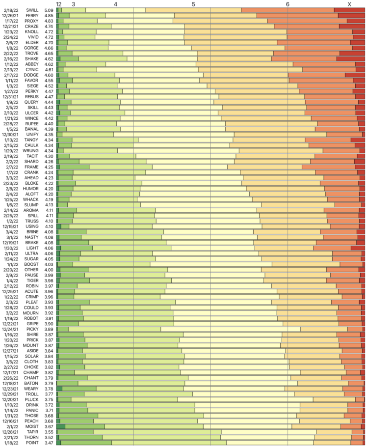
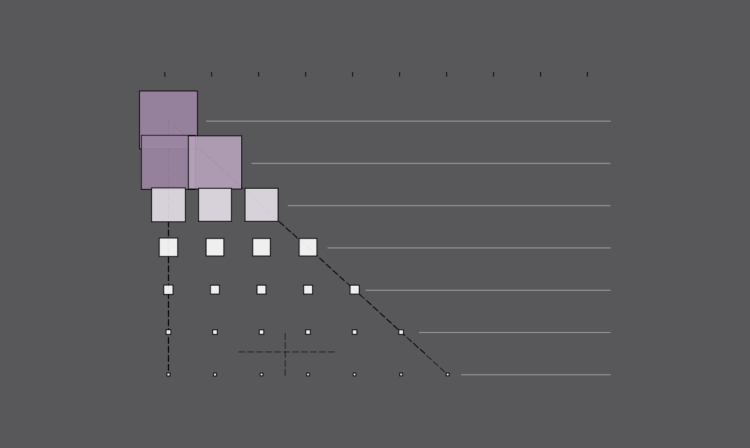
There has been progress since the Paris climate agreement in 2014, but there’s still more to do. Brad Plumer and Nadja Popovich for The New York Times look at the possible paths we could take.
-
How to Make a Custom Stacked Area Chart in R
You could use a package, but then you couldn’t customize every single element, and where’s the fun in that?
-
Earth is getting warmer, and the previously abstract concept seems to grow more concrete every day. Probable Futures mapped increasing heat, decreasing cold, and shifting humidity under different warming scenarios.
You have the global view shown above, and then when you zoom in enough, you can click on grid cells for the model estimates. Dots on the map point to a handful of short stories on how warming has changed daily life, which I feel like could use more attention.
Next to the zoom navigation buttons is a camera button, which lets you download the view that you’re looking at. This feature is probably new to me but has been around a for a while. I like it.
-
For Scientific American, Cédric Scherer and Georgios Karamanis charted drought extent by region using a grid of stacked bar charts. Each cell represents a year for a corresponding region, and color represents drought intensity.
Compare this view to more map-centric ones. This version focuses more on time than it does geography. One isn’t better than the other. Just different.
-
Here’s how the distribution of genres has changed since 1945 up to present.
-
Mona Chalabi has a new podcast Am I Normal? and it’s very good:
We all want to know if we’re normal—do I have enough friends? Should it take me this long to get over my ex? Should I move or stay where I am? Endlessly curious data journalist Mona Chalabi NEEDS to know, and she’s ready to dive into the numbers to get some answers. But studies and spreadsheets don’t tell the whole story, so she’s consulting experts, strangers, and even her mum to fill in the gaps. The answers might surprise you, and make you ask: does normal even exist?
There are two episodes so far: the first on how long it takes to get over a breakup and the second on how many friends people have. A takeaway from both is that defining “normal” is a fuzzy matter and the data only gets you part of the way there.
-
Margot Sanger-Katz and Alicia Parlapiano for NYT’s The Upshot broke down a Democrat spending proposal. I like the lead-in treemap that shows the proposed components and the box that it needs to squeeze into:
I’ve seen treemaps that transition into different sizes, but I don’t think I’ve seen a box drawn on the outside of the treemap for comparison. It feels natural.
-
Members Only
-
The New York Times used radar data to create a 3-D model of the Dixie fire smoke clouds:
The raw data was collected every 10 minutes in radial sweeps around the radar stations, each at a higher altitude. The Times combined and reformatted the data using Py-ART, a collection of algorithms and utilities used regularly in radar analysis. We then filtered it to reduce noise.
We applied color and texture to the 3-D volume to approximate a smoke- and cloud-like look. And we interpolated the sequence in time to create a smoother video animation.
The data comes from the NOAA Next Generation Radar (seems to be down right now), and the rendering was inspired by Neil Lareau’s more barebones chart.
-
I’m not sure how long this has been around, but the USPS has a tool where you can see the mail route in any geographic area. Just search for an address and you can see where they go. It’s meant for businesses interested in direct mail, so it also shows average income, number of houses, and how much it’d cost to send mail on that route.
I had no idea it was that easy to focus on a geographic area, but it makes sense now that I think about the type of ads I get in the mailbox.
-
[arve url=”https://www.youtube.com/watch?v=aD1OQ9UBwuU” loop=”no” muted=”no” /]
NASA Goddard visualized the point of view from the south pole of the Moon, based on years of data collection to map the Moon’s surface. The result is a data-based time-lapse that shows Earth moving up and down and long shadows because the run shines at a low angle.
It’s a neat contrast to what we see from Earth and makes me wonder what other points of view there are.
-
The Digital Story Innovation Team for ABC News in Australia looked at political donations from the gambling industry. The piece goes all-in with treemaps in a scrollytelling format to show categories and individual donations.
It starts with an individual point and keeps zooming out more and more. Then when you think it’s done, it zooms out more.
-
Most television shows don’t get past the first season, but there are some that manage to stick around. These are the 175 longest running shows on IMDb that have ratings.
-
Members Only
-
Yuhao Du, Jessica Nordell, and Kenneth Joseph used simulations to study the effects of small gender biases at entry level up to executive level. It doesn’t take much to skew the distribution. For NYT Opinion, Yaryna Serkez shows the simulation in action with moving bubbles and stacked area charts for each work level.
The simulation imagines a company where female performance is undervalued by 3 percent. Each dot represents an employee, and they either move up with promotions or stay still. The distribution of men and women start even but end very uneven.
-
[arve url=”https://www.youtube.com/watch?v=2p3NIR8LYoo” loop=”no” muted=”no” /]
Vox shows how the 3-point line is “breaking” the game.
The basic math says a 3-point shot is more efficient for scoring points than a 2-point shot if the team can make a high enough percentage of attempts. It’s why the mid-range shot has fallen out of favor.
But it’s more an evolution than a breaking. Defense adapts, and then offense adjusts to that, etc. Stephen Curry making double-digit threes is still way more exciting than Curry not making threes.
-
When plotting Russian election results, a structured grid patterns appear. From The Economist:
When Dmitry Kobak and Sergey Shpilkin, two researchers, analysed the results, they found that an unusually high number of turnout and vote-share results were multiples of five (eg, 50%, 55%, 60%), a tell-tale sign of manipulation. According to Messrs Kobak and Shpilkin, there were at least 1,310 polling stations (out of 96,325) with results that were suspiciously tidy, with rounder numbers than you would expect to see by chance.
I’m not familiar with Russian elections, but this seems like lazy cheating. Are they just making up numbers by hand or what?
Check out the full results of Kobak and Shpilkin’s analysis in Python notebook form.
-
Nightingale is a publication from Data Visualization Society that offers more depth for many topics in the field of visualization. They’re working on a print magazine of the same name.
Subscribed.
-
Tim Harford warns against bad data in science:
Some frauds seem comical. In the 1970s, a researcher named William Summerlin claimed to have found a way to prevent skin grafts from being rejected by the recipient. He demonstrated his results by showing a white mouse with a dark patch of fur, apparently a graft from a black mouse. It transpired that the dark patch had been coloured with a felt-tip pen. Yet academic fraud is no joke.
-
We often hear about increased CO2 in the context of global warming. Hayley Warren and Akshat Rathi for Bloomberg show why we should talk more about methane:
In the fight against global warming, methane has flown under the radar for too long. But there’s increasing recognition that tackling the invisible, odorless gas is one of the easiest, cheapest, and most feasible ways to make a real difference in slowing climate change. It’s the rare climate problem with a fix that can be felt by those alive right now, not their great-grandchildren.