Tie in the real bits among the abstract shapes, colors, and geometries of charts to make the latter easier to understand.
Tie in the real bits among the abstract shapes, colors, and geometries of charts to make the latter easier to understand.
Grocery stores with loyalty programs collect data on what and when you buy at their stores. Then they sell that data, because of course they do. For The Markup, Jon Keegan delves into why that matters when two big companies, Kroger and Albertsons, plan to get together:
In October 2022, Kroger and another top supermarket chain, Albertsons, announced plans for a $24.6 billion merger that would combine the top two supermarket chains in the U.S., creating stiff competition for Walmart, the overall top seller of groceries. U.S. regulators and members of Congress are scrutinizing the deal, including by examining its potential to erode privacy: Kroger has carefully grown two “alternative profit business” units that monetize customer information, expected by Kroger to yield more than $1 billion in “profits opportunity.” Folding Albertsons into Kroger will potentially add tens of millions of additional households to this data pool, netting half the households in America as customers.
As part of the Knowing Machines research project, A Critical Field Guide for Working with Machine Learning Datasets, by Sarah Ciston, offers advice for working through the life cycle of complex and large datasets:
Machine learning datasets are powerful but unwieldy. They are often far too large to check all the data manually, to look for inaccurate labels, dehumanizing images, or other widespread issues. Despite the fact that datasets commonly contain problematic material — whether from a technical, legal, or ethical perspective — datasets are also valuable resources when handled carefully and critically. This guide offers questions, suggestions, strategies, and resources to help people work with existing machine learning datasets at every phase of their lifecycle. Equipped with this understanding, researchers and developers will be more capable of avoiding the problems unique to datasets. They will also be able to construct more reliable, robust solutions, or even explore promising new ways of thinking with machine learning datasets that are more critical and conscientious.
Plus points for framing the guide in a spreadsheet layout.
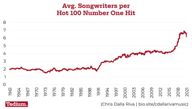
For Tedium, Chris Dalla Riva examined why the number of credited songwriters per song appears to have increased so much over the past decade:
Between 1960 and 1980, 48 percent of number ones had at least one common person get both a songwriting and production credit. Between 2010 and 2020, that percentage had risen to over 99 percent. Songwriting just isn’t what it used to be. And I don’t mean that in a condescending way. I mean that we are using the same word to describe two very different things.
It’s not about a decline in skills and instead about a change in process.
In celebration of the most romantic day of the year that is sometimes comedic, Sam Hart, with illustrations by Catherine Tai, for Reuters, tours the genres within the genres of romantic comedy. You had me at analysis.
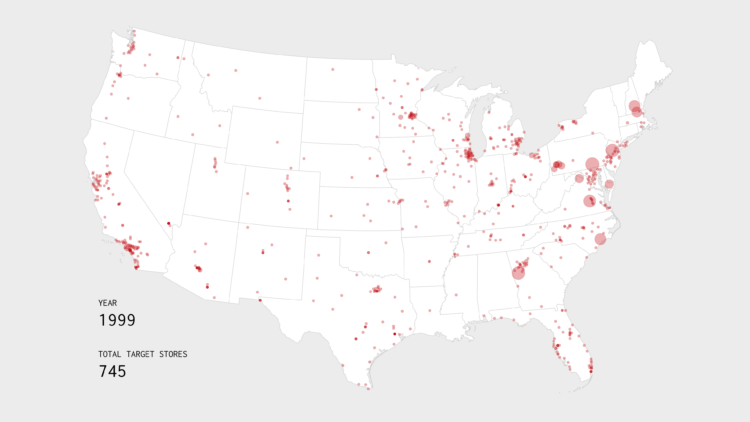
Watch the growth strategy behind Target stores, starting with the first location in 1962 in Minnesota.

AI-based image generation take bits and pieces from existing people-made images and tries to smartly mash sources together for something new. However, that something new often looks a lot like someone else’s work. It’s why Getty Images is suing Stability AI, the company behind Stable Diffusion.
Stable Attribution goes in the opposite direction of image generation, and instead tries to identify source images of a given AI-generated image. Load an image and Stable Attribution looks for the most similar images in the Stable Diffusion training data.
The explainer on the Stable Attribution homepage is a nice abstraction of how the process works.
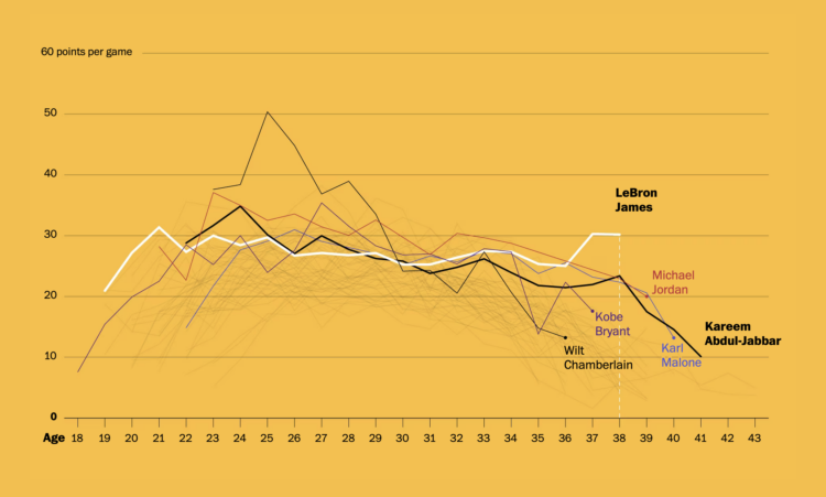
Okay, one more LeBron James thing, mostly because I like seeing different looks at the same data and topic. For The Washington Post, Artur Galocha and Ben Golliver focus on the longevity and consistency of James’ scoring. You expect scoring ability to decline with age, but James, at 38 years old, is still holding steady.

After a big earthquake, such as the 7.8 that hit Turkey and Syria, it is important that search and rescue be carried through in an organized way when everything around is chaos. For Reuters, Adolfo Arranz, Simon Scarr, and Jitesh Chowdhury illustrate the guidelines recommended by the International Search and Rescue Advisory Group.
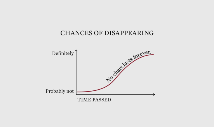
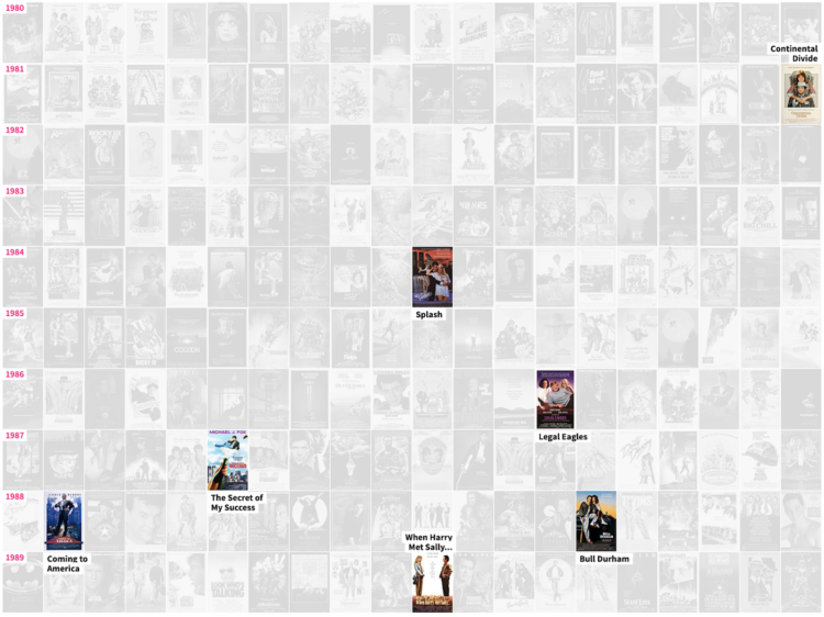
Not everything has to be permanent, but it would be nice if the best visualization projects were still available many years from now.
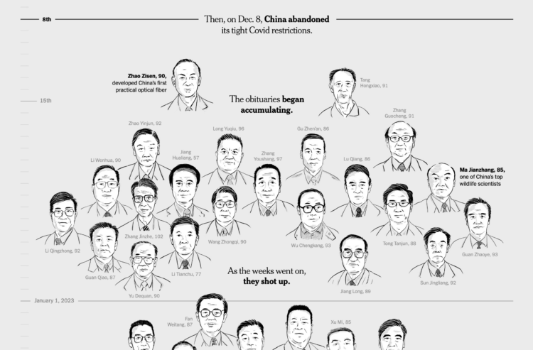
China reported 80,000 Covid deaths since lifting restrictions in early December 2022. But researchers believe the count is much higher, because the figure only includes hospital deaths and the country does not require Covid testing as strictly as before. So, for The New York Times, Pablo Robles, Vivian Wang, and Joy Dong evaluated the change in scale of scholars’ obituaries, which appears to correlate with China’s restriction timeline.
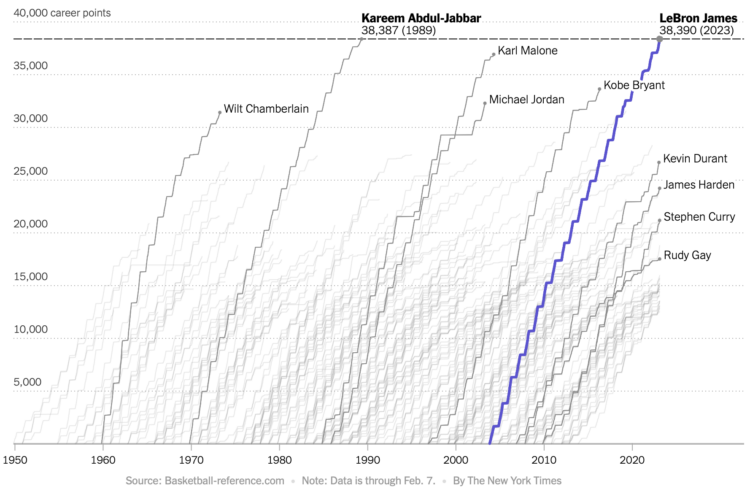
Never fear, Sopan Deb, K.K. Rebecca Lai, and Eve Washington, for The New York Times, are on the case with a comparison of LeBron James’ scoring timeline against other top scorers. They also provide breakdowns of how James scored his points, which show an all-around game rather than a hard skew towards a single type of shot.
All The King’s Buckets. pic.twitter.com/lzIultYSee
— Kirk Goldsberry (@kirkgoldsberry) February 8, 2023
LeBron James passed Kareem Abdul-Jabbar for all-time points in the NBA, and somehow I did not see a single cumulative line chart that shows James against previous players. This 3-D animation by Vanna Bushong and Kirk Goldsberry will have to do.

For South China Morning Post, Victor Sanjinez and Dennis Wong used a visual story to show why Pele was so great at football and in life. Illustrations mixed with a few charts makes for a good explanation of the-man-the-legend’s career.
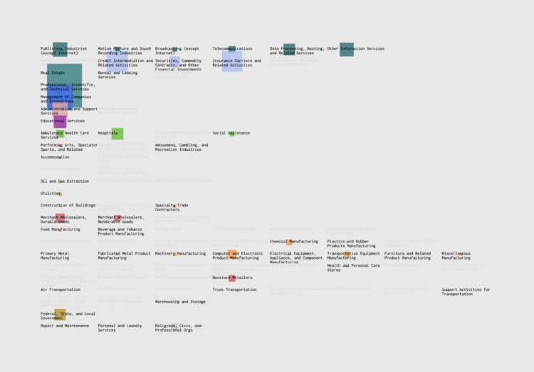
If you’re searching for a new job, it’s worth looking in different industries — instead of doing more of the same elsewhere, or in the other direction, switching to a completely new occupation. Maybe your current industry is saturated, but a different industry might require your skills.
This searchable chart shows the industries that people work in, given a specific job.
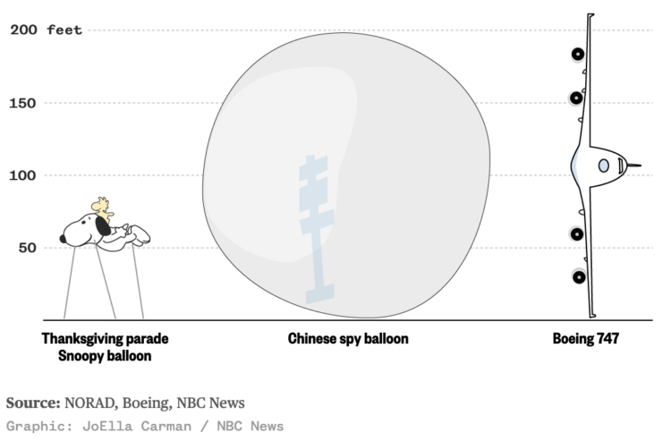
I wasn’t paying much attention to the Chinese balloon that the U.S. shot down — until this graphic by JoElla Carman for NBC News floated by. The balloon was 200 feet tall, which makes the Thanksgiving parade Snoopy balloon look tiny and about equivalent to the wingspan of a Boeing 747.
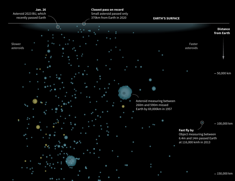
NASA’s Center for Near Earth Object Studies tracks large objects, such as asteroids, that have passed Earth or are headed towards it. Reuters visualized the nearest objects in the database.
The graphic starts at Earth’s surface, and you get farther away as you scroll down. Speed is plotted on the horizontal, symbols are scaled by the object’s minimum diameter, and yellow indicates objects on the way.
Illustrations after the initial graphic do a good job of providing scale for if any of these objects hit us.

You know those funny or weird screenshots from Google Street View that enter your feed every now and then? Sometimes there’s an odd-looking building or a person in a puzzling situation. Neal Agarwal put those in one place so that you can randomly find find yourself in the Wonders of Street View.
That is a big chair.
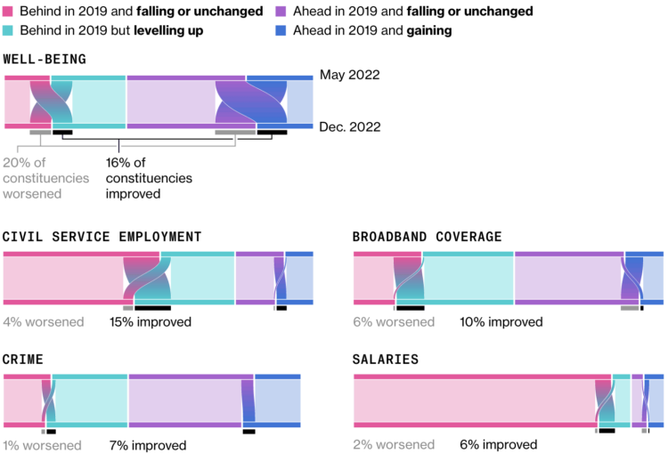
For Bloomberg, Joe Mayes, Andre Tartar, and Demetrios Pogkas show shifts in public opinion in the UK, based on Bloomberg UK’s Levelling Up Scorecard. I’m into the gradients to show the opinion switches within groups.


 Visualize This: The FlowingData Guide to Design, Visualization, and Statistics
Available now.