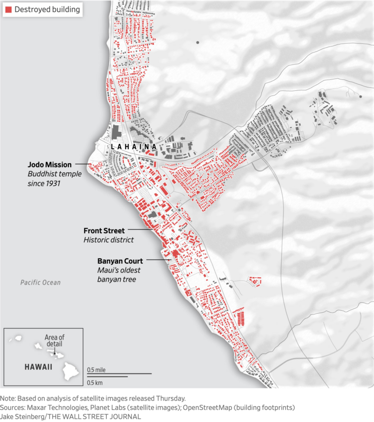
Most of the Maui town Lahaina was destroyed by wildfire. The Wall Street Journal reports. The map shows the buildings that were destroyed in red.
Terrible. Here is a list of reputable sources to donate to help people affected.
Most of the Maui town Lahaina was destroyed by wildfire. The Wall Street Journal reports. The map shows the buildings that were destroyed in red.
Terrible. Here is a list of reputable sources to donate to help people affected.
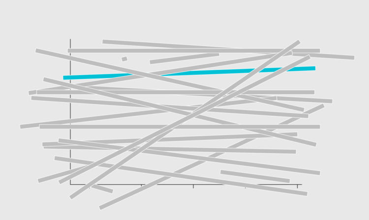
A long bar chart can be a bit much, so here are simple options to make it less jumble-ish.
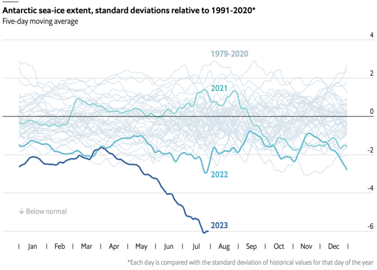
In this chart from The Economist that shows ice extent from 1972 up to present, that falling line for 2023 looks not good.
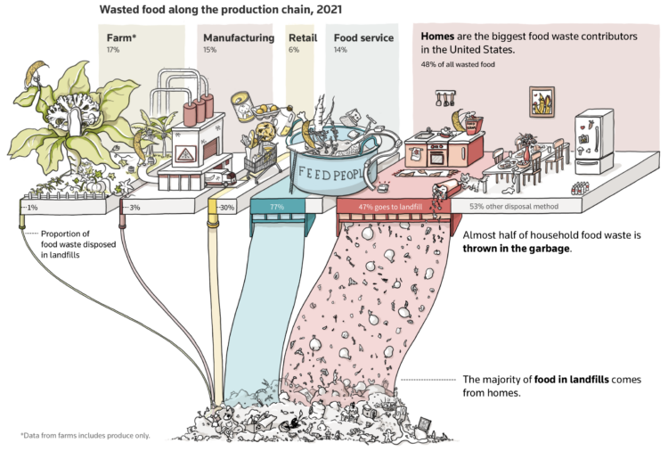
Almost half of wasted food comes from homes, and almost half of that goes to landfills. The rotting food then produces methane. For Reuters, Ally J. Levine and Daisy Chung illustrate why that’s an issue and why we should minimize the amount of food we throw away:
Methane produced by food decomposing in landfills makes up 1.6% of all human-made Greenhouse Gas emissions. While that may not sound like much, it’s a large percentage for such a specific pollutant. When scientists look at hyper-specific categories, Karl says, anything over 1% is significant.
“Any action that can prevent food waste from sitting in untreated piles will directly lead to climate impacts being reduced.”
I appreciate the illustrations that make the data less abstract, which have become standard from Reuters Graphics.
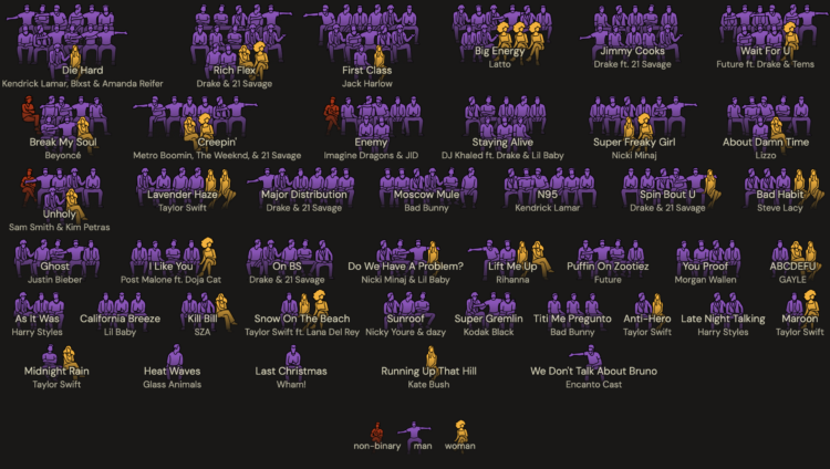
It’s common to see singers who are women, but the people who write the songs that end up in the Billboard Hot 100 are still mostly men. For The Pudding, Chris Dalla Riva, with design by Ashley Cai, highlights the rarity of women on songwriting teams over the past decade.
 A troll kept leaving comments on a woman’s TikTok videos, so she figured out who he was by following bits of public information.
The sleuthing genre of videos that find something by tracing digital footprints continues to fascinate. Plus, this one is really satisfying. Although it also makes me wonder about privacy and people using the bits of information for bad things.
Yums, by Matthew Phillips, is a quick and simple way to save recipes via email:
Yums is a recipe storage system built on top of email. Content on the web disappears with time, but email you have control over forever.
To use Yums, find a recipe you like and send an email to [email protected]. In the body paste the link to the recipe you want to save. You can paste as many links as you like, separated by new lines.
Super easy and the email is just the recipe without the backstory. I understand why people include all the wordage and pictures before the actual recipe, but it’s gotten out of hand.
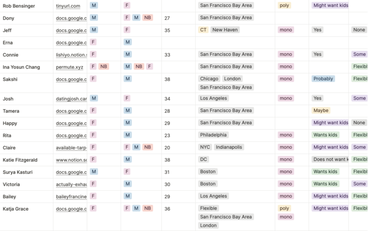
Instead of using dating apps, some have turned to the date-me doc, which is a single, view-only page about the individual. It’s appealing, because it’s a flexible format that lets you include what you want and how you want. With the surge in interest, of course someone started to tabulate the docs.

In Statistics, analysis is more often about finding a range of possible answers than it is about finding a precise one.
Research by Dan Ariely and Francesca Gino suggested that people were more honest in a survey when you ask them about honesty at the beginning. The problem is that the data in the analysis was likely faked. The research was over ten years ago, and Ariely suggested that the insurance company that supplied the data did something to it prior to him receiving it, but the insurance company recently stated that the data was faked after they supplied it.
In any case, there’s fake data in there somewhere. Planet Money broke it all down.
See also the analysis by Data Colada, which is why the fraud came to light.

Taylor Swift has been filling up stadiums across the United States and will head overseas soon to fill more seats. For Reuters, Clare Trainor and Dea Bankova break down the songs, albums, and ticket sales with a heavily stylized piece resembling a Swift fan’s scrapbook.
In hot places, the ground can heat to higher temperatures than the air, which causes severe burns to someone who stumbles or accidentally touches a surface. For Reuters, Mariano Zafra describes the absorption and release of energy with a series of graphics.
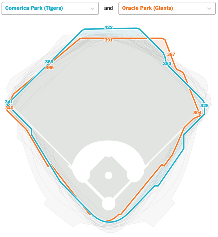
In Major League Baseball, a player hits a home run when the ball flies over the outfield fence. However, the distance between the hitter and the outfield fence varies by stadium, which means a home run in one stadium might not be far enough for a home run in a different stadium. For The Washington Post, Kevin Schaul made a thing that lets you compare stadiums.
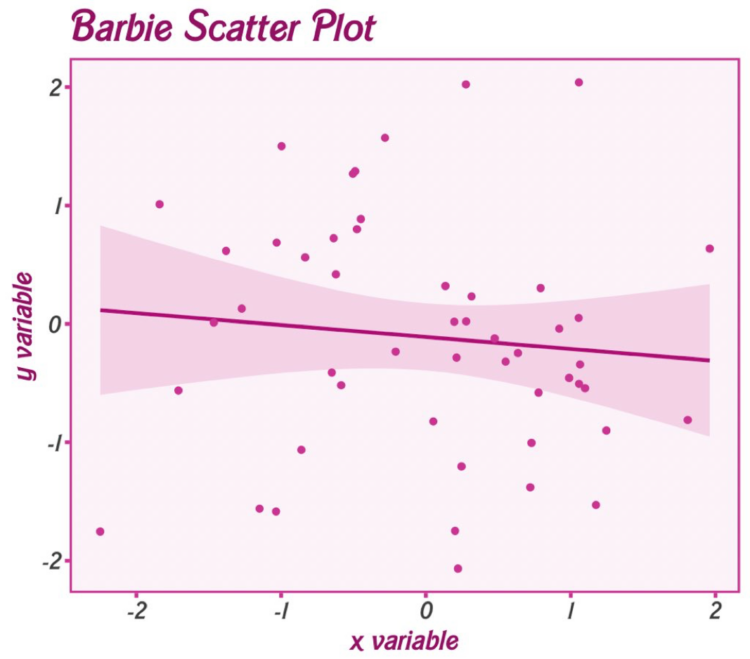
Matthew Jané made a small R package called Theme Park, which is meant to supply movie-based themes for ggplot. For now, it just has Barbie and Oppenheimer themes.

This is the good stuff for July.
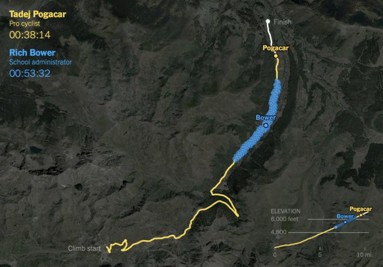
It takes strength and dedication to race in the Tour de France. It’s just that when you see the leading cyclist alone on a steep climb, they kind of look the same as some random person riding up a hill. For NYT’s The Upshot, K.K. Rebecca Lai and Ben Blatt provide a point of comparison.
Data from Strava was used to show how a caterpillar-like group of amateurs rode against a professional. As you might have guessed, the professional climbs much faster. Just a tad.
Sarah Bell made an animated version of John Snow’s classic map from 1854.
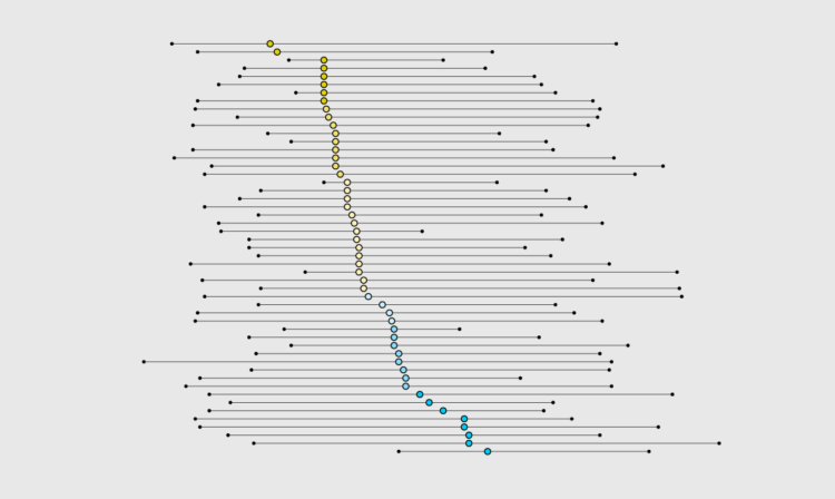
I know dinner time varies around the world, but I wanted to know if dinner time was different within the United States, and if so, by how much. Who eats the earliest? Who eats the latest?
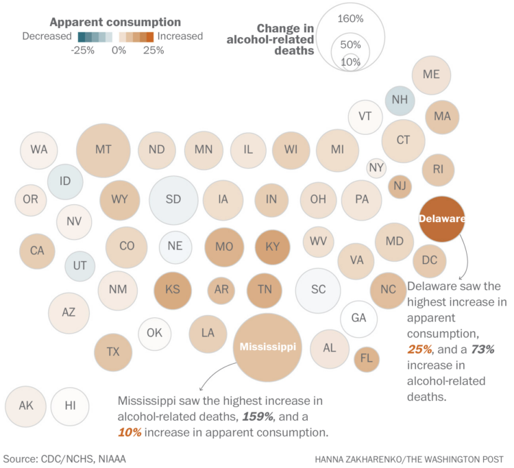
Alcohol consumption, based on ethanol volume estimates, has been rising over the past couple of decades. The pandemic appears to have sped that up, leading to more deaths. For The Washington Post, Caitlin Gilbert, David Ovalle and Hanna Zakharenko report:
At the same time, the number of deaths caused by alcohol skyrocketed nationwide, rising more than 45 percent. In 2021, alcohol was the primary cause of death for more than 54,000 Americans, causing nearly 17,000 more deaths than just a few years before, in 2018, according to data from the Centers for Disease Control and Prevention.
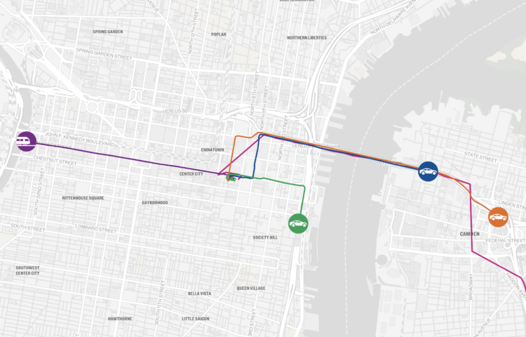
To find the fastest route from Philadelphia to the Jersey Shore, The Philadelphia Inquirer got five of their reporters to race via different routes and modes of transportation. Overlaid on a map of moving dots, the mix of text, video clips, and photos from the racers had me rooting for my pick all the way through even though I know little about the area and have never wondered about reaching the Jersey Shore.


 Visualize This: The FlowingData Guide to Design, Visualization, and Statistics
Available now.