When is Dinner, by State
I know dinner time varies around the world, but I wanted to know if dinner time was different within the United States, and if so, by how much. Who eats the earliest? Who eats the latest?
Using data from the American Time Use Survey, between 2018 to 2022, we can see the percentage of households in the country who were eating during a given time. The chart below focuses on evening times after 4p.
When Americans Eat Dinner
Most households eat dinner between 5:07p and 8:19p, with peak dinner time at 6:19p.
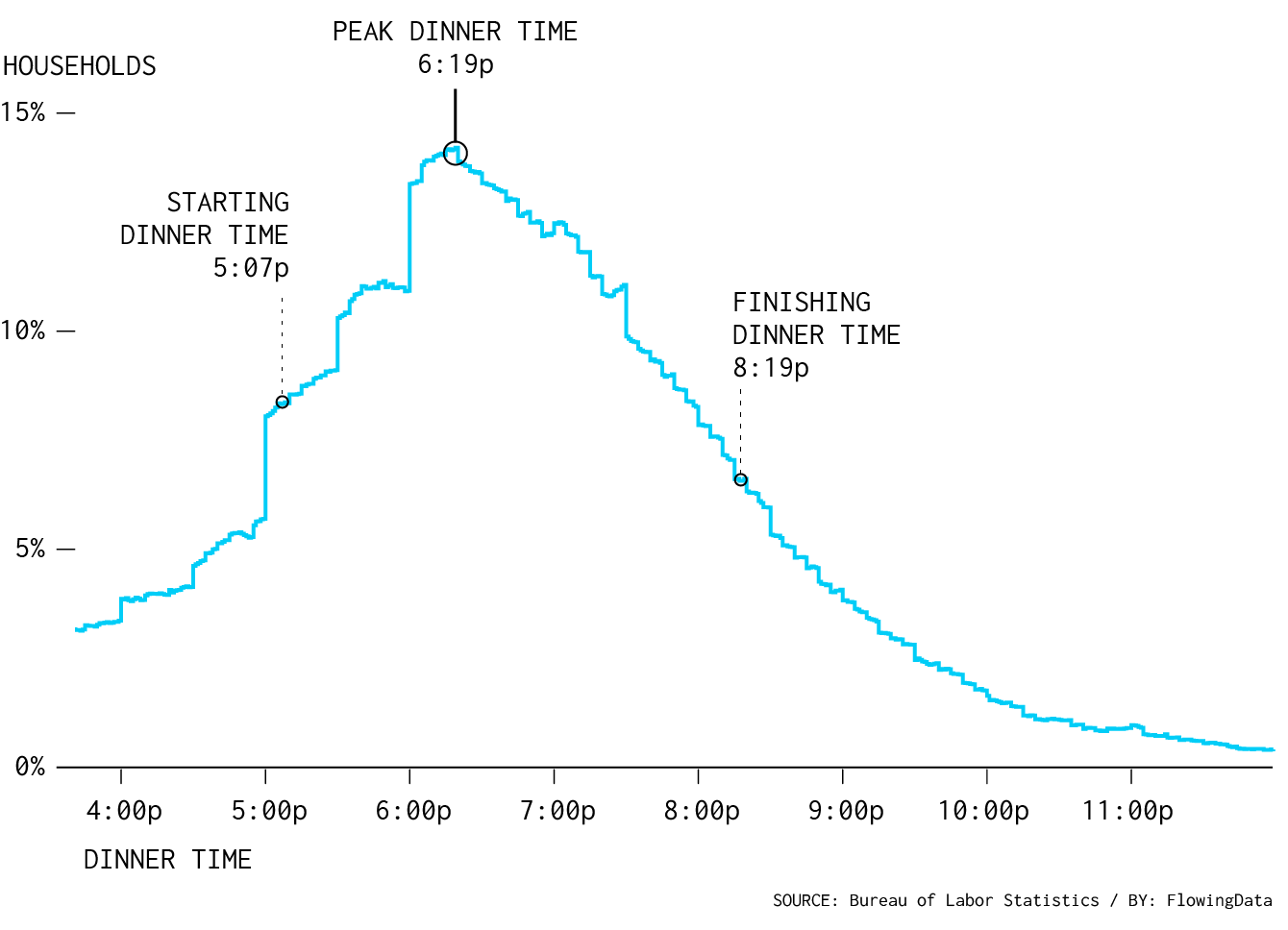
I defined the start and end times as when there are half as many households eating dinner off the peak, within a 15-minute window.
So we have a span of time when most households eat dinner and when dinner time peaks. I calculated the times for each state.
Dinner Time in Each State
About an hour and a half separates the earliest eating state from the latest.
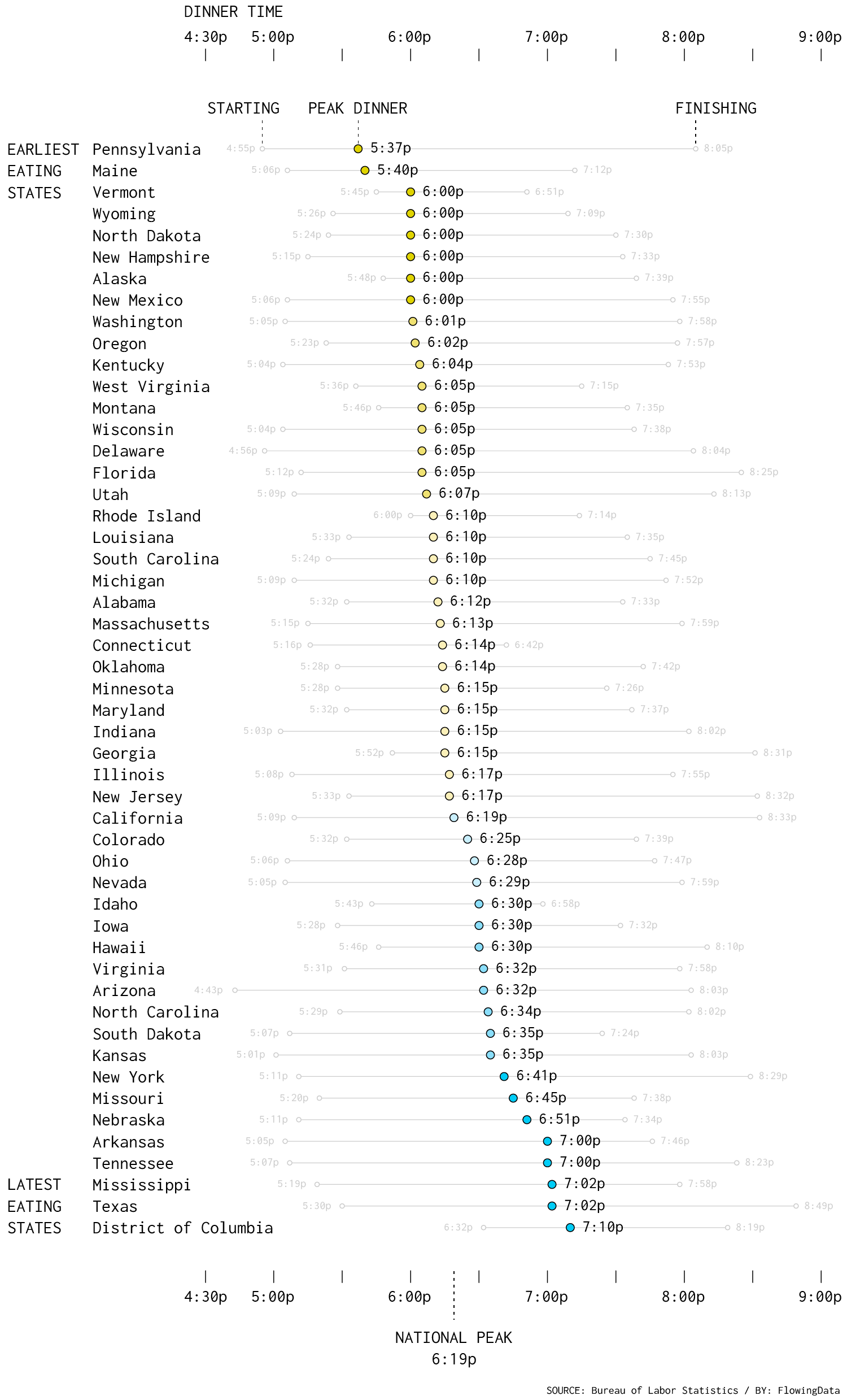
I haven’t been to all the states, but the times seem to make sense. The California peak time at 6:19 was my feeding time growing up. New York peaks about half an hour later. The District of Columbia, which covers a smaller geography and probably less variation in work schedules and commute, has a narrower range than most of the states.
However, I’m wondering: Do people really eat that much earlier in Pennsylvania and Maine? Is it an age thing? A sunlight thing? I’ll have to look into that more.
I also expected start and end times to match more tightly with the peaks. The time spans seem somewhat random. Although an eyeball test seems to suggest that range is related to the variation of cities and population densities in the state.
Anyway, it looks like dinner time varies by state, which is made more surprising when lunch time seems to be heavily concentrated around noon everywhere. Pennsylvania and Maine households eat earliest. D.C. and Texas households eat the latest.
Notes
The calculations are based on survey data from the American Time Use Survey, from 2018 through 2022. I downloaded the data via IPUMS. I did not include data from 2020, because the sample is incomplete due to the pandemic.
To calculate the start and end times, I used a moving average with a 15-minute window to compare against the peak percentages. Most of the state time series had multiple spikes, so this let me better pick out when dinner actually started and ended over the full time range.
Become a member. Support an independent site. Make great charts.
See What You GetFlowingData is made possible by supporting members. Since 2007, I, Nathan Yau, a real person, have been analyzing and visualizing data to help more people understand and appreciate it in their everyday lives.
If you liked this or want to make similar data things, please consider supporting this small corner of the internet. You get unlimited access to visualization courses, tutorials, and extra resources. Thanks. — Nathan
Chart Type Used
